POP CHART LAB, REVISITED


A couple of years ago I wrote about a poster compendium of historical camera models, designed by Pop Chart Lab, that I was pining after. Recently I stumbled across an article on Design Milk chronicling the epic talents of the design duo behind Pop Chart Lab—Patrick Mulligan and Ben Gibson—and I immediately went back to check out the latest goodies they have in their shop. I immediately fell into a pit of infographic inspiration and, commensurately, now have a lot more Pop Chart items on my to do list. Below are a couple of my favorites.


Which one would you pick? There are so many more to choose from over at their shop here.


MOMA: ASAP


This Saturday I placated my color-loving soul with a visit to MOMA's "Color Chart" exhibition open through May 12.  Not surprisingly, the powers-that-be moved this glorious sculpture, Donald Judd's "Untitled", to the entrance of the exhibition and a huge visual lasso.  There were about 1,000 works both in the show and in the permanent collection that I HAVE TO SHARE, but, alas, they will have to wait until tomorrow.  Sickness takes precedent and I have to get some rest . . . until tomorrow, enjoy Mr. Judd and check out the Color Chart exhibition online here (the website adheres wonderfully to the color purity theme).

FEELING CHIC


I am finally moved into my new apartment--which, by the way, is far fancier than my old place--and can happily say I am finally feeling New York cool. This is all despite the fact that my living room has no furniture and I am currently writing this post while sitting on a large throw pillow on the floor. In my pajamas. Watching reruns of Law & Order: SUV. Snazzy huh?

Anywho, in keeping with my new-found feeling of coolness, I thought I would do another post about the ultimate purveyor of NYC cool: the Sartorialist. I recently stumbled across an awesome parody of the Sartorialist, created by the geniuses at the Pipeline, which consists of a flow chart detailing how you can get photographed by this amazing fashionisto! (Click on the chart for a larger view).

In other sartorial news, the Sartorialist (Scott Schuman) is publishing is own book of portraits! Love it! The best part? The reasonable price of $16.50. Check it out here (or the $100+ bespoke edition here).


MEASURE UP

SWEET FINE DAY

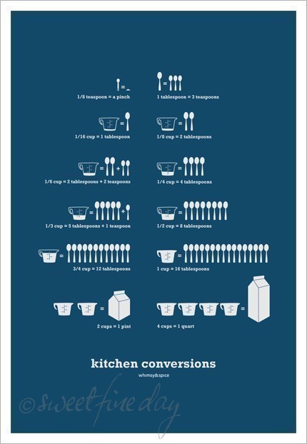
In my apartment, when figuring how many teaspoons fit into a cup, I use these conversion magnets. But wouldn't it be cool to have the lovely poster hanging on your kitchen wall instead? I love the color, font, design and, at $30, even the price.

Check it out (in several more colors!) at the Etsy store SweetFineDay here.


MEASUREMENT CONVERSION APRON


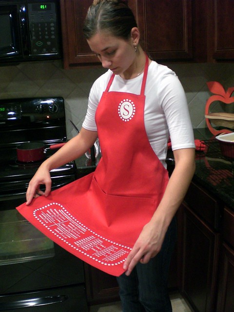
No wall space? How about a conversion chart printed on your apron? This one cleverly has the chart printed upside down, so you read it while you are wearing it! Smart!

Get your own (also in more colors), for $18.95, at the Etsy store Distinctgraphicz here.

Now let's get to baking!


"CHART ART" BY WEAVERSOFSOUTHSEA


I have long been a fan of what I colloquially call "chart art"—a poster or print laid out in a simple geometric grid featuring bold, graphic illustrations (see here, here, here, here or here as proof). So, needless to say, I instantly fell in love with the works on offer at the Etsy shop WeaversofSouthSea. It doesn't hurt that their designs on based on some of my favorite things like dogs (exhibit a) and Eames designs (exhibit b). Plus they have several gorgeous illustrations of city landscapes, including beautiful renditions of my own New York City at night and during the day. The icing on the cake? All of the prints are priced insanely reasonably at $19. Good design + great prices = a win win!

Check out all the graphic goodies on sale at WeaversofSouthSea here.


PICTURING THE PAST 10 YEARS

PICTURING THE PAST 10 YEARS


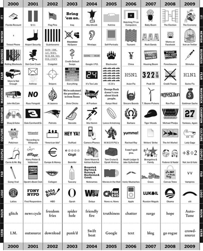
I meant to post this super cool infographic in January, but somehow it escaped me. Still, it was too good not to share with you. As part of an Op-Ed column for the New York Times written by Phillip Niemeyer this chart was designed to track the trends of the first century of the millennium year by year. Want to know the biggest couple of 2003? The verb of 2006? The logo of 2009? This chart will tell you! Not only is it well designed, but its also pretty funny; the drawings that illustrate the info are quite clever!

Check it out (larger) on NYTimes here.


TYPEFACE TEMPLATE

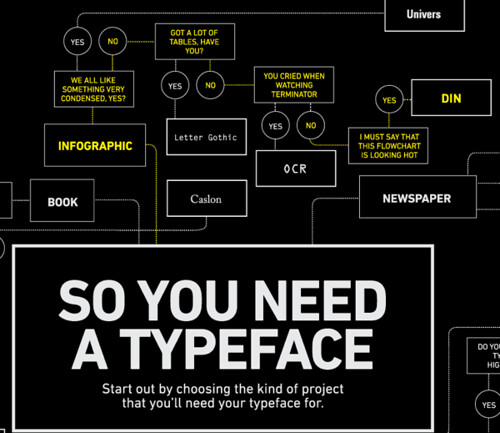
SO YOU NEED A TYPEFACE


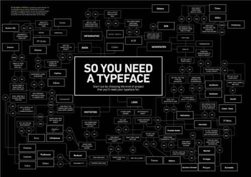
I have been seeing this chart everywhere recently . . . and with good reason! Julia Hansen designed this awesome flow chart to help designers choose a typeface to suit their project and personality. Love it! It has the right combination of cheeky humor and insights. Brilliant!

See it (super) large here.


RONALD DAVIS: DODECAGONS

RONALD DAVIS
RONALD DAVIS
RONALD DAVIS
RONALD DAVIS

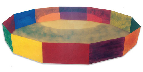
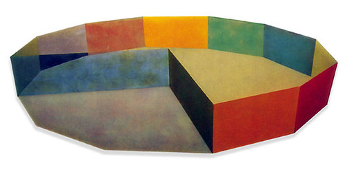
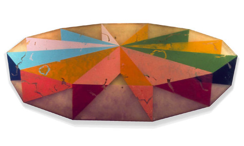
Yesterday in class my professor lectured on '60s California artist Ronald Davis. I first saw Davis' incredible work at MoMA's Color Chart show in 2008 and was super happy to be reminded of him again. All of the above pieces are among,

"Davis's "plastic paintings," which marked a departure from his works on canvas. The artist made these work "the same way one makes a fiberglass boat or car body"—by layering translucent polyester resin, fiberglass, and pigment in a Formica mold. The machine-polished surface recalls the fiberglass surfboards of 1960s Los Angeles, while the painterly brushstrokes and illusion of receding space are traditional pictorial conventions, making Ring an intersection of painting, sculpture, and the manufactured object."

Needless to say I am totally in love with their bright color palette and milky finish. I want one!

Learn more about Davis (and see more of his work) at his website here, at the Tate Modern's site here, and at MoMA's site here.

(Images from here, quote from here.)


WARBY PARKER ANNUAL REPORT

I got a really nice email from A.C. at Warby Parker this week giving me a little tip: WP just came out with this year's Annual Report. You may remember my excitement last year about this yearly report because Warby Parker has a way of making utilitarian things incredibly cool and fun (as I recount in this post!). 

Well this year's may be a new high. Instead of a static document recounting facts about the company the 2014 Annual Report is all about you! Yes, you!


When you head to view the report (here), you are (brilliantly!) prompted to created a retelling of your year.

Just answer some fun questions and before you know it you are presented with . . . 


 . . . . a chart that records your chuckling percentage for the last twelve months . . .   


. . . . your 2014 spirit animal and an accounting of the dance moves you learned . . . 


. . .  and, of course, a take on what you have to look forward to for 2015. :) 

This is King's Random signing off . . . 


Try out your own report here and check out all the other cool stuff Warby Parker is doing here.


ROYAL WEDDING RIDICULOUSNESS

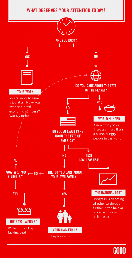
WHAT DESERVES YOUR ATTENTION


Did you get up early to watch the Royal Wedding today? Not me! Honestly it seems like I am the only one but really all I needed to see what a picture of Kate's dress, her walking down the aisle and a picture of Will. I think the news show run a highlight reel for people like me, in and out.

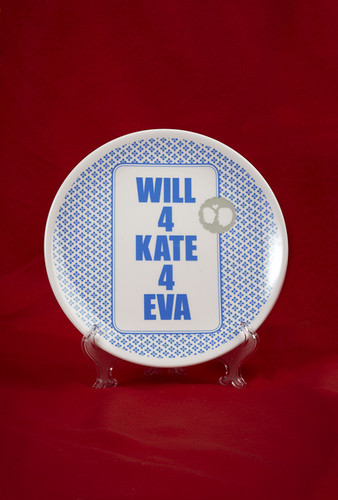
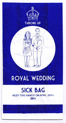
So I am sharing some of the cheekier wedding paraphernalia this morning. The above chart (which we should follow!) is from my fabulous friend Ian's blog.


ROYAL WEDDING PLATEROYAL WEDDING SICK BAG


THE WEDDING FILES: MELANGERIE INC.

MELANGERIE INC. MELANGERIE INC. MELANGERIE INC. MELANGERIE INC. MELANGERIE INC. MELANGERIE INC. MELANGERIE INC.


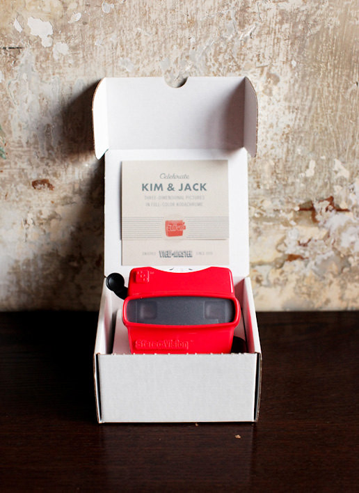
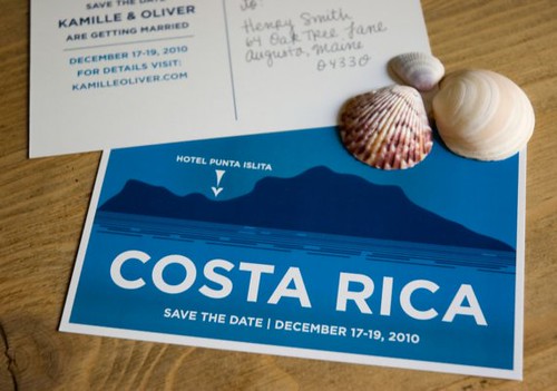
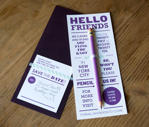
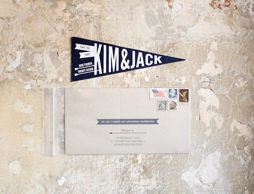
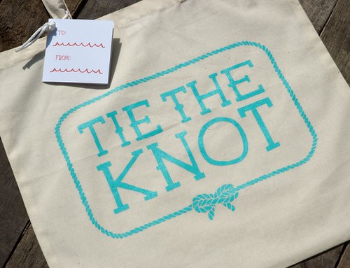
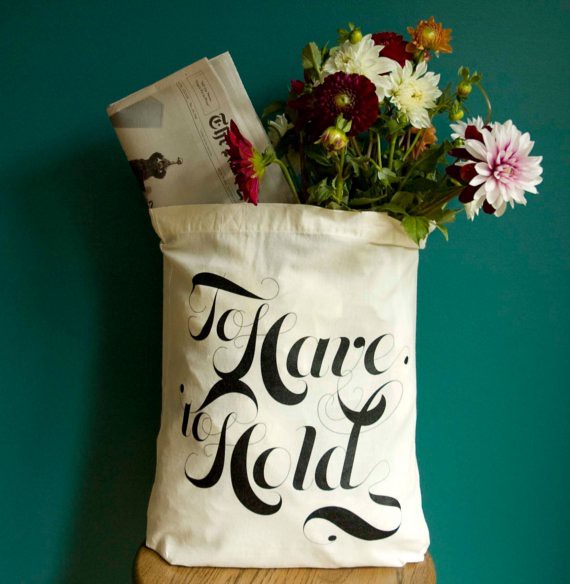
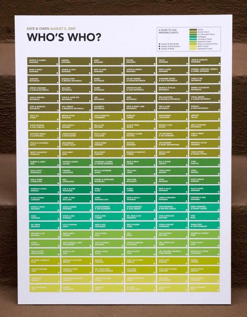
Melangerie Inc. is a bride-to-be's dream!  It's an incredible Etsy store full of creative invitations (like the top four: with viewmasters, travel postcards, pencils, and pennants), adorable tote bags and a fabulous chart to introduce your guests to each other.  Because the prices are a bit steep, I think all of these would be perfect for smaller fetes but that doesn't mean I can't mine the site for ideas . . .

Check it all out here.


BACK IN ACTION! PLUS AN UNCOMMON GOODS GIVEAWAY!


So I am somewhat ashamed to see that it has been weeks since I promised to get back into regular posting, all without much word from me. Whoops! My apologies. Turns out that there was a bit of a dip in energy after finishing the dissertation (shocking, I know) and that combined with re-adjusting to  working full time again (when do 9 to 5 people do errands again?) has meant that I am a little behind on my O. I. plans.

But, but, but! I am making up for it today with a super awesome post. Not even just a post, a giveaway! From none other than the super impressive company Uncommon Goods. Have you heard of Uncommon Goods? I just got on their trail last year when my Dad hooked me up with some awesome gifts at Christmas (Thanks, Dad!). Uncommon Goods is an online shop, headquartered in Brooklyn, that focuses on connecting shoppers with new, exciting craftsman who create decorative, practical and personality-filled products. Given my personal mantra—why buy boring when you can buy beautiful?—I thought a little giveaway from them would be right up our alley.

So one lucky reader will be getting a generous $125 gift certificate from Uncommon Goods to buy what they like—holiday gifts, thanksgiving decor or just a little treat or two for yourself.

Since there are about a million things to catch your eye in their shop, I thought I would narrow down some of my favorites for you to get your gears turning, specifically pointing you to top picks in my major categories of expertise: art and home goods. Read on to find out how you can use that dinero towards one of these (or many other) sweet items.


Not surprisingly, the shop already carries many artists and objects already featured on the blog in the past (or works that resemble them). Here are just a couple of highlights:

ONE | "All the Surfboards in CA" by James Gulliver Hancock (reminds me of Jason Polan!)

TWO | "A Grand Treasury of Shakespearean Insults" by Tim and Aurelia Saunders

THREE | "State by State Seasonal Food Guide" by Jessica Haas (chart art, my favorite!)

FOUR | "City Prints" by Carolyn Gavin (maps and vintage illustration, what's not to love?!)


Of course you can never have too many fun-cum-functional decor items in your home either. Here are some surefire conversation starters that would look great in any house (or gift box):

ONE | eye clock (perfect for a Halloween display!)

TWO | custom state pillows

THREE | suspension bridge shelf (what a cool idea)

FOUR | cork globe (great idea for a minimal study)

FIVE | giraffe family bookends (would be super cute in a baby's room)

SIX | handmade herringbone knitting basket (so pretty!)

SEVEN | caterpillar bud vase 

EIGHT | hand-embroidered central park pillow (a new take on a classic style, #wishlisted)


So by now you are probably itching to get in on the giveaway action, right? You can do so through any of the following manners (each method will get you one entry; multiple your chances of winning by entering in various ways!):

ONE | Like Uncommon Goods on Facebook

TWO | Like the obsessive imagist on Facebook

THREE | Sign up for the Uncommon Goods mailing list

FOUR | Follow the obsessive imagist on instagram

FIVE | Follow the obsessive imagist on twitter


Enter in one (or all!) of these ways and leave a note about your entry method in the comments section below. One winner will be granted a $125 gift certificate next Monday morning (October 26th). Good luck!


(top photo of little miss sunshine from here)


INSPIRATION BOARD

DAMIEN HIRST

ELLSWORTH KELLY

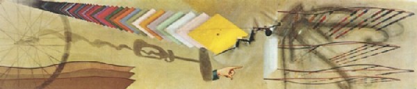
MARCEL DUCHAMP

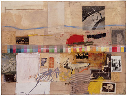
ROBERT RAUSCHENBERG


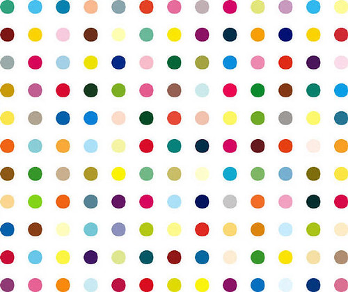
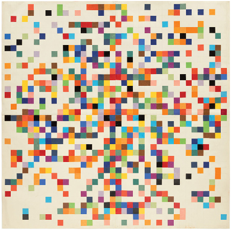
I wanted to do a quick post to share some of the artwork that served as inspiration for my blog header makeover. I have been pondering the idea of incorporating a color chart for some time (see this post), but always felt too attached to my old hexagon version.

From top to bottom:

Damien Hirst, Pharmacy Series, 2000s
Ellsworth Kelly, Spectrum Colors Arranged by Chance II, 1951
Marcel Duchamp, Tu M', 1918
Robert Rauschenberg, Small Rebus, 1956