POPVILLE

POPVILLEPOPVILLE
POPVILLE


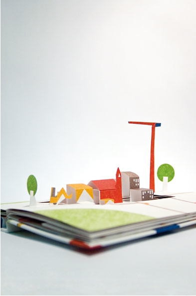
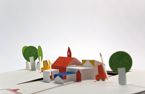
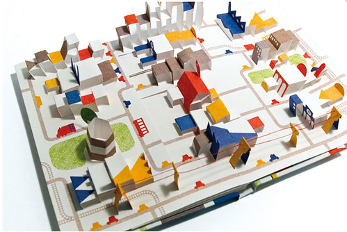
I love kids books (in fact, that was my first post on this blog). So imagine my utter delight when I discovered this cityscape pop up book, entitled "Popville", featuring countless mini neighborhoods in bright primary colors. As the alphabet pop up book proved, these books aren't just for kids!

Get your own Popville for €18 at the Italian website Corrini here.

BUILT CASES

BUILT CASES

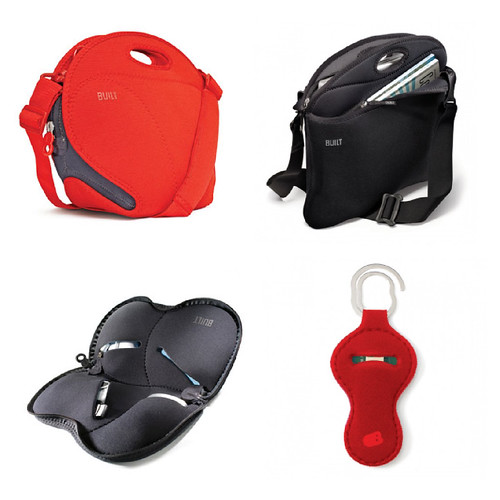
Last week I shared my birthday wishlist with you all, a list which included a Built lunch bag. Well, I have spent some time perusing the rest of the Built website and have found some other awesome products I thought I would post about. I love their neoprene cases! Particularly since they stretch to accommodate everything from your file folders to your digital camera. All of these are a bit on the pricey side, but I am pretty sure the quality makes the purchase totally worth it.


From top to bottom, left to right:

KALLA TEXTILE DESIGN


KALLA


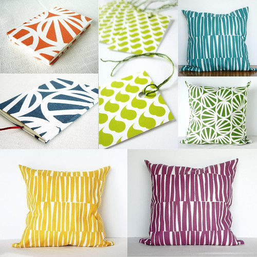
I have had my eye on the Etsy store 'Kalla' for a long time. The shop is full of bright, brilliantly patterned textiles that have been made into everything from coasters, pillow covers, table runners, book jackets, tea cozies and more. For those crafters out there Kalla also offers fabric remnants for sale. Everything is reasonably priced and pretty much guaranteed to provide a pop of color to any room.


Check out the goodies here.

SUPER iPAD?

FOXTROT iPAD


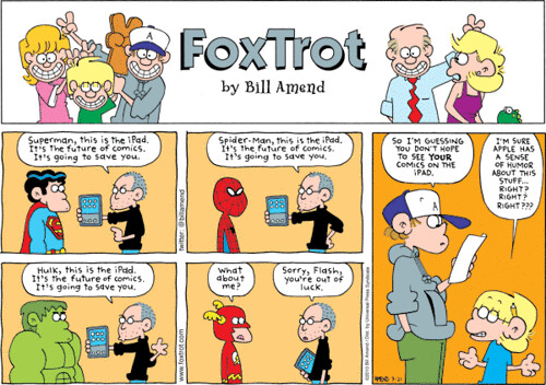
I read this Foxtrot comic this week and I had to share it with you (though it is slightly out of the blue for this blog). It makes fun of the fact that the iPad, like the iPod Touch and the iPhone, does not have a flash player. So I guess it does fit in to my obsession with the iPad.

Click on the image to see it in a bigger size.


FROM THE ARCHIVES: PATTERN POLAROID


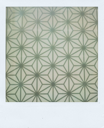
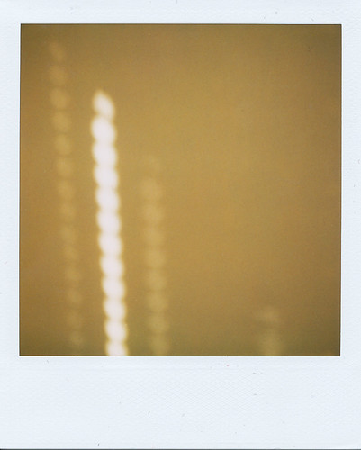
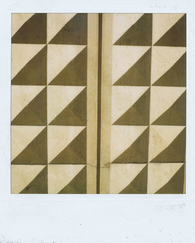
Just a quick post today to share some of my favorite polaroids from my portfolio: a selection of shots focusing on pattern and light. The top is a window in Amsterdam; the middle was taken last summer in my apartment; the bottom is a wall in Berlin. You can find more pattern photos here and more polaroids here.

METHOD & LIBMAN: GOING DOTTY

METHOD & LIBMAN: GOING DOTTY


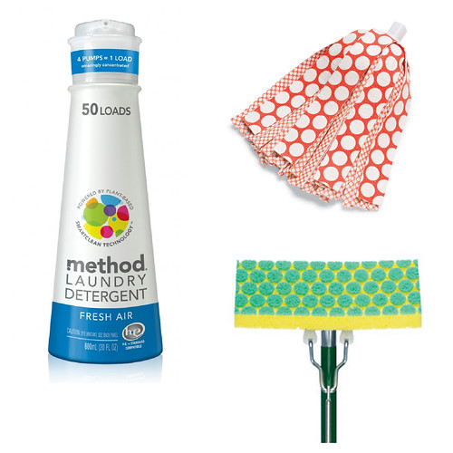
I have noticed a lot of cleaning products are starting to feature really bold designs, especially polka dots. I saw a commercial for this Method laundry detergent last week and I almost fell over at the sight of their new 'dotty' logo. I LOVE the brightly colored overlapping circles and would probably wallpaper my whole apartment with that pattern if my boyfriend would let me (though really a pillow or two might be kinder on the eyes and look better with my couch). I also LOVE the red and white polka dot pattern on the new Libman wonder mop (I feel like a commercial voice-over just typing that). The old mop only had the small dot pattern, now seen on the inside. The new mop uses the scale of the polka dots to represent different absorbencies in the fabric, giving bigger dots to the more absorbent strips on the outside. The result is a bright modern twist on an otherwise retro 1950s-era pattern. Awesome! This dot patten has also been used for the scrubbers of this green and yellow mop -- a clever and attractive solution to the intersection of form and function.

If you are interested in buying these prettily designed cleaning products check out the Method website here and the Libman website here.

TURNING 25!

BIRTHDAY WISHLIST


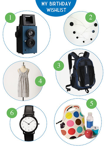
So my birthday is coming up. And my family members have started dropping hints that they might like some suggestions about presents. And although this blog pretty much chronicles everything I have fancied over the last two years, I thought I would put out a more specific list. Hope you like it!

  1. Blackbird Twin-Reflex Camera, $118, Amazon (posted about before here)
  2. Circles Mobile by Ekko, $125, Hanging Mobile Gallery
  3. North Face Recon Backpack, $89, North Face
  4. Slate Stripes Shift, $128, Anthropologie
  5. Gourmet Getaway Lunch Tote in Multidot, $25, Built
  6. M & Co. Watch Bidoni, $105, MoMA Store

(Click on the image for a bigger view on Flickr.)

IN THE CLASSROOM: OLYMPIC DESIGN

OLYMPIC POSTERS


OLYMPIC LOGOS


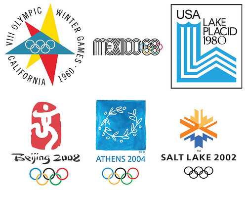
Because I am on spring break from grad school this week, this 'In this Classroom' is taking a slightly different tack. Instead of chronicling what we would have discussed in class yesterday, I wanted to tell you a little bit about what I am researching for my final paper. While my actual argument is still undefined, I will give you a general idea of what I am interested in studying. Having watched the Vancouver Olympics religiously (as noted here), I started to realize the importance of the overall graphic design program to the advertisement, history, and purpose of the games. I hope to study the Olympic emblem (logo plus Olympic rings) and poster design of some of the more famous, graphically speaking, games over the last century. Specifically, I am interested in learning how and when the design team uses the emblem/poster as a way of portraying host city, host country or international communities. For countries like the United States, who has hosted a total of eight Winter and Summer Games, how does the design change from venue to venue and what does that say about our changes in values over the years?

In turn, I want to find out whether the designers reference current politics or fine art trends. Is the design abstract or literal? At point does the interruption of technology--the advent of television, the internet and digital media--begin to change the way designs are conceived, implemented and understood?

I hope this post hasn't bored you. There isn't a lot written on this subject and I am really interested to hear what you think of my ideas. Leave me a note in the comment section! If I get some positive feedback maybe I will do another post to share what I have discovered once I finish my research.

Until then, you can learn a whole lot more about the Olympics here and about Olympic symbols here.

(Also, if you are brave, you can check out the controversial emblem for the London 2012 games here. I have to say that I think it is terrible!)


HOMESTEAD UK


I came across the awesome commercial for the UK-based home store 'Homebase' last week. Unfortunately, I can not remember who turned me on to this ad gem. Hopefully I can pour through my notes and figure it out. Even so, I think you will love it - it performs an incredible makeover of an English train station, turning it into a series of comfy "home rooms." If I had come across this installation I am pretty sure I would have skipped my train and just spent the whole day hanging out. So lovely!

See more on the Homestead UK site here.


p.s. How great is that stripy painted walkway? Wonder if I could get my super to do that in our hallway . . . .


HINDSVIK VINTAGE

HINDSVIK VINTAGE


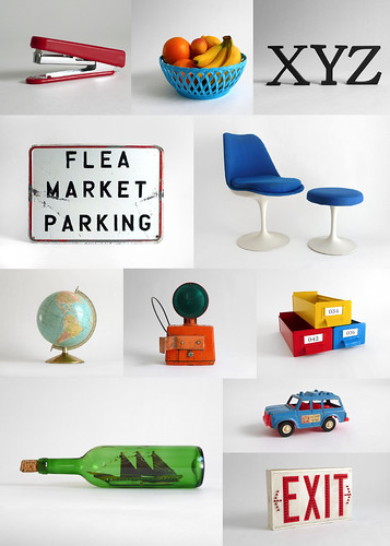
I am off to visit my family for the next couple days, so I am going to keep this quick. I know that I have been posting a lot of Etsy shops recently but I simply can't let them pass me by. When I saw 'Hindsvik' as the featured seller last week I knew I had to bring their amazing products to you. Just like the blog swissmiss is praised for her keen minimalist design sense, the folks behind Hindsvik have an incredible eye: picking the perfect products and photographing them beautifully (if anyone wants to teach me how to successfully shoot on a white background like this I would be eternally grateful). Everything in the store is brightly colored, fun and in great condition. The offerings are reasonably priced for quality pieces, with most ranging from approximately $25 to $200+ dollars (that chair and ottoman are on the very highest end at $1400).

I suggest checking it out just for the color and design inspiration. But once there you might just find something you like! Find the goodness here.

You can also check out their website/blog here.


MUSEUM TAGS

MUSEUM TAGS

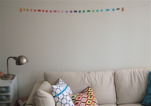
This weekend, amidst all the rain, I decided to do a little project-pick-me-up. For the last year or so I have been collecting metal museum entrance tags - the little things guards make you stick on your lapel when you walk into the museum. They come in a range of colors so people don't try to come back the next day with the same tag, claiming they already paid their ticket. The Metropolitan Museum of Art has 16 different colors, the Morgan Library has five etc. To brighten up my wall a bit I strung my collection up on baker's twine and hung above my couch. Looks cool, no? It is just temporary until I can get them framed, but for now I love it!

(Sorry for the gray photo; with the rain the lighting was pretty yucky all weekend. I'll take a new photo the first sunny day I get!)

See more on my Flickr site here.


IN THE CLASSROOM: SOCIAL UPHEAVAL

This week's 'In the Classroom' focuses on the social activism that arose in the 1960s and 1970s.

SISTER CORITA

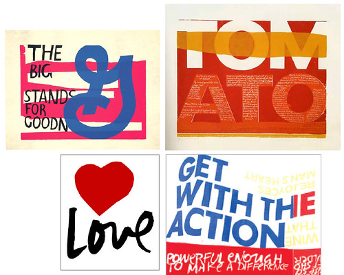
There has been an amazing amount of buzz about the graphic-artist Sister Corita, neé Corita Kent, in the blogosphere recently. Reading about her for class this week, I can understand why. As a sister in the Immaculate Heart of Mary, she ran the art department at the Immaculate College in California for years, slowly achieving renown for her creative teaching practices and brilliant serigraph poster designs. Using Pop art tactics--incorporating slogans and logos from products like Pepsi, General Mills and Wonder Bread--Sister Corita manipulated bold text and bright colors to create graphics that encouraged her viewers to find the beauty in life and God. It must also be noted that Sister Corita worked without the benefit of computers; her twisting type effects were done by drawing the type, bending and folding the paper, photographing that effect and then painstakingly recreating the photograph. The result were bold and dynamic poster designs that continue to inspire nearly 50 years later.

Learn more at the Corita Art Center here.


GRAN FURY and ACT UP

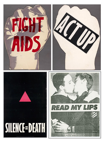
The AIDs crisis started in June 1981 when five men were diagnosed in Los Angeles with what was then known as GRID or 'Gay-Related Immuno-Difficiency'. Within a year, GRID was renamed AIDs, and the disease had become a full-fledged pandemic among gay and minorities communities around the country. Two major groups formed--Act Up and Gran Fury--to create poster and sticker campaigns that lobbied for the rights of the sick, pushing politicians to allocate money for health care and research to solve the crisis. Both groups used bold geometric designs and startling statistics to create posters that would jolt the public into getting involved. My particular favorite is the 'Read My Lips' campaign by Gran Fury. Designed to coincide with 'kiss in' events--where dozens of gay and lesbian couples would meet at a public place to make out, thereby demonstrating that homosexuality was not to blame, it was a disease that was at fault--these posters show that behind every individual was a person, not a stereotype, who deserved help and respect and who simply wanted to be able to be with the person they loved without the penalty of death.

There is so much more to learn about these two groups: more on Act Up here, and Gran Fury here.


PER YOUR SUGGESTION

I am been really impressed with the amazing comments by you all, my lovely readers, recently. I love the fact that you know my style and often send me links to stores, artists or designers I might like. Even better? Every tip is awesome! So, I thought I would start a new series composed completely of your recommendations. I am calling it 'Per Your Suggestion'.


STONE & HONEY

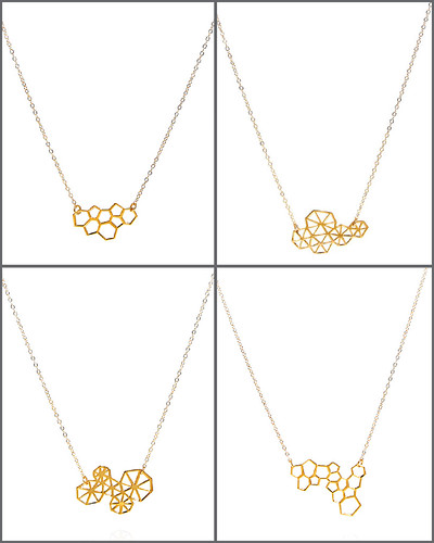
After reading my post about the Etsy store sprinthread, the lovely Kathryn sent me a link to the store stone&honey. Absolute jewelry lust immediately ensued. She sent me right to these beautiful gold pendants that feature different permutations of 'pinwheels' and 'honeycombs.' There are many versions of these delicate necklaces, each changing the number or orientation of the pinwheels or honeycombs, and for $65 they seem like a steal.

Check them out here.


STUDIOKMO
STUDIOKMO
STUDIOKMO

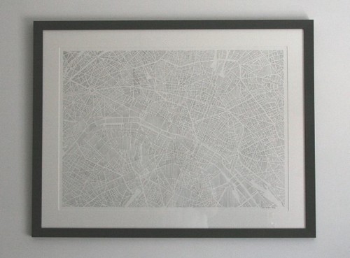
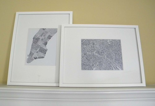
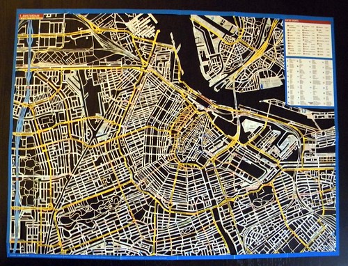
A week or two ago the sweet Karen Oleary wrote me an email suggesting I might like her shop. Clearly, she has noted my undying love of maps. Her Etsy shop, studiokmo, is chock full of beautiful map creations: city maps made totally from thousands of tiny parallel lines (or "hatching" if you are in the art biz) or from endless cut-outs, leaving only the brightly colored streets behind. The prices span a wide range, depending on the amount of labor involved, but I can assure you that her prices reflect a quality and artistry that makes every piece unique and beautiful.

Check out studiokmo here.


Thank you for all your suggestions! Keep them coming!


GRAY & GREY

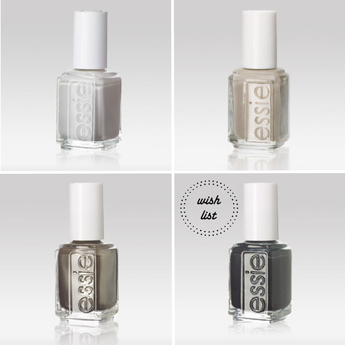
ESSIE


Gray is totally the next black. Or at least that is what it looks like based on all the lovely manicures I see on elegant women in the New York subways. I am particularly taken with the gray and silver offerings at Essie. Essie polish is sold at my local Duane Reade but can you find their full selection online here.

I am partial to the top left color, called "Chinchilly", which I used last night. It is a shimmering combination of gray and taupe with a hint of lavender thrown in.


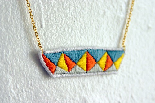
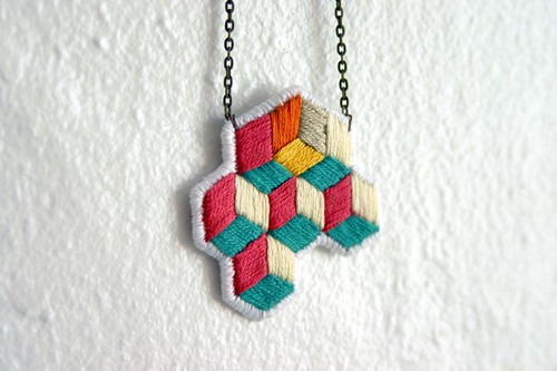
SPRINTHREAD

SPRINTHREAD NECKLACE


I am stumbled onto the Etsy store 'sprinthread' last week. It is filled with bright, beautiful, hand-stitched jewelry creations. Using embroidery thread alone, Lorena manipulates geometric patterns to produce illusionistic or graphic results. Products are priced between $40 and $50 and are made-to-order. I think they would look absolutely lovely paired with a little black dress or a dark suit, don't you?

See more here.


RED CARPET RECAP

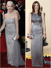
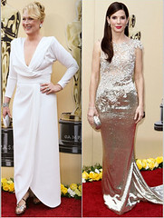
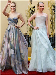
OSCARS FASHION OSCARS FASHION

Did you watch the Oscars last night? I found it to be a bit of a bore. More and more the Oscars are becoming about the actors praising themselves for hours and hours instead of being about celebrating the best movies of the year. Steve Martin and Alec Baldwin, however, were pretty funny and you have to admit that Meryl Streep is a great (and elegant) sport. My hands-down favorite speech was Sandra Bullock's - if only more winners were as earnest and funny as she was.

Having said all of that, I thought I would share some of my favorite looks from the red carpet. I was impressed by how muted most of the dresses were; lots of shimmering grey, white and gold looks. These ladies--(top to bottom, left to right) Helen Mirren, Kathryn Bigelow, Cameron Diaz, Miley Cyrus, Meryl Streep, Sandra Bullock, Rachel McAdams, and Amanda Seyfried--looked absolutely stunning. (You can click on the photos to see larger versions.)

See more Hollywood fashions on a NYTimes slide show here or the Washington Post here.


(Photos courtesy of the NYTimes.)


IN THE CLASSROOM: PSYCHEDELIA

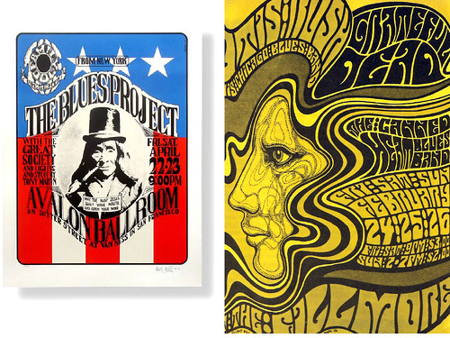
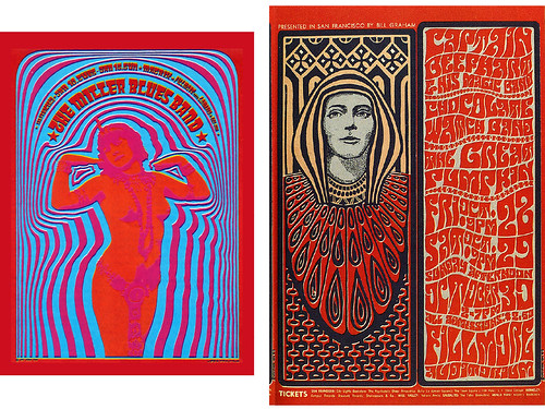
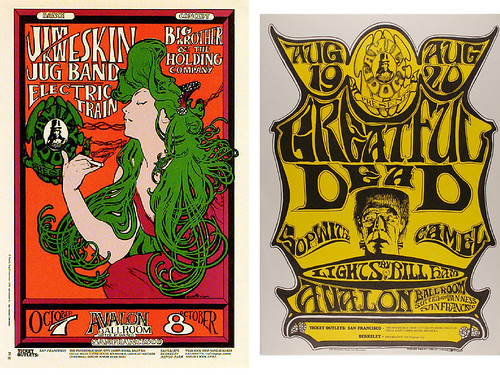
This week's 'In the Classroom' focuses on the psychedelic concert posters that abounded in San Francisco during the the mid- and late-1960s. Designed in a time of dance hall concerts, anti-war movements and widespread drug use, the designers of these posters focused on jarring and vibrating colors, nearly illegible text and bold graphics to force the reader into spending time deciphering the work. San Francisco, as a walking city, was the perfect place to jumpstart a poster tradition.


Wes Wilson

Wes Wilson was a college drop out looking for a job when he met Bob Carr in late 1960. Carr was a commercial printer who quickly took Wilson under his wing to show him the ropes of printing and graphic design. Wilson would later become one of the most renowned and respected poster designers of the 1960s, specializing in seductive figures, near liquid lettering and bold graphic imagery. As one of the biographies states on his website:
Wilson generally ignored the basic rules of poster design — simplicity and maximum readability — and created works of art related to counter cultural sensibilities and sometimes his personal experiences. Often there was a very short lead time, three to four days, for the design and printing of the posters. He delivered his art work directly to the printer; Graham [his boss] only rarely saw the design before it was printed. Wilson simply asserted the authority of art and by default was granted an extraordinary degree of artistic freedom. Such freedom became the norm of the San Francisco rock poster movement.
Read and see more about the awesome Wes Wilson on his website here.


VICTOR MOSCOSO

Victor Moscoso was one of the most famous poster artists of the 1960s. His website gives this succinct biography:
Victor Moscoso's posters for the Family Dog dance-concerts at the Avalon Ballroom and his Neon Rose posters for the Matrix were to bring his work international attention in the "Summer of Love", 1967. Within a year lightning would strike again in the form of the Underground Comix. As one of the Zap Comix Artists, Moscoso's work, once again received international attention. Moscoso's comix and poster work has continued up to the present and includes album covers for musicians such as Jerry Garcia, Bob Wier, Herbie Hancock, and David Grisman, t-shirts, billboards, animated commercials for radio stations (for which he received 2 CLIO's) and more.
Read and see more on his very psychedelic website here.


Mouse and Kelley

Last but not least is the duo Stanley 'Mouse' Miller and Alton Kelley, colloquially known as "Mouse and Kelley". Miller grew up in Detroit and kickstarted his artistic career by detailing cars and bikes with crazy, interlocking patterns and designs. By 1965 Miller had traveled to San Francisco and was soon creating posters for the Avalon Ballroom and, later, the infamous dance hall known as the Fillmore. Kelley, a native of Maine who grew up in Connecticut, had a similarly early love of hot rods and cars and quickly became known for pin-striping motorcycle gas tanks in his neighborhood. After working for Sikorsky Helicopters for a couple years, Kelley made his way out to San Francisco in 1964. He would soon meet Miller and they would help found a consortium of poets, artists, and musicians called the Family Dog. Over the years Miller and Kelley would work together to create some of the most important poster art of the era, focusing on Art Nouveau lettering and esoteric cultural references. Most notably Miller and Kelley are credited with establishing the iconic emblems for two of America's most famous bands: the skull and roses of the Grateful Dead and the beetles and wings of Journey.

Read more about Miller here and Kelley here.


BANANA REPUBLIC SPRING

BANANA REPUBLIC SPRING

BANANA REPUBLIC SPRING


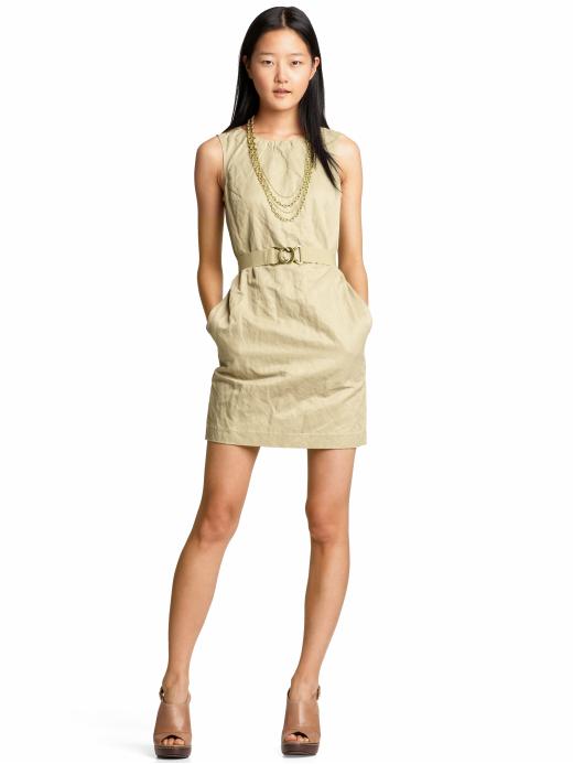
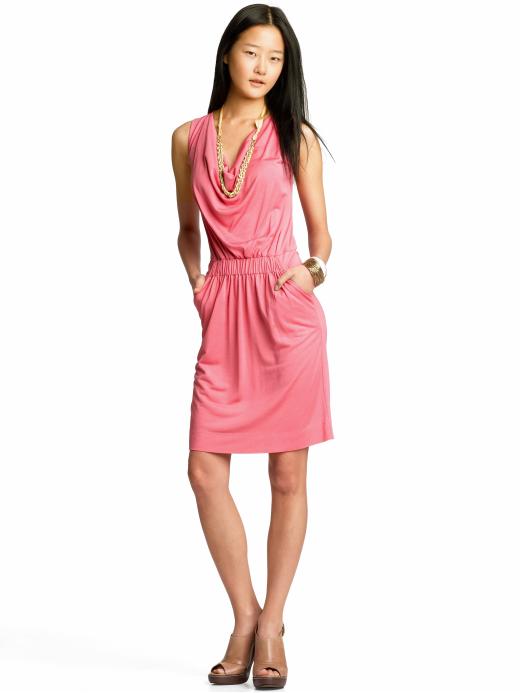
I am digging the spring dresses on offer at Banana Republic right now. They are making me completely gaga for blue skies, warm weather and strappy sandals. Can't we just fast forward to the end of April? That would be great, thanks.


Check out more of the cute dresses, all around $100, here.


p.s. I am also not big on leggings or tights, but the offerings at Banana Republic look pretty comfy.


p.p.s. Isn't this model super cute?


LETTERPRESS DICE

LETTERPRESS DICE

LETTERPRESS DICE

LETTERPRESS DICE

LETTERPRESS DICE


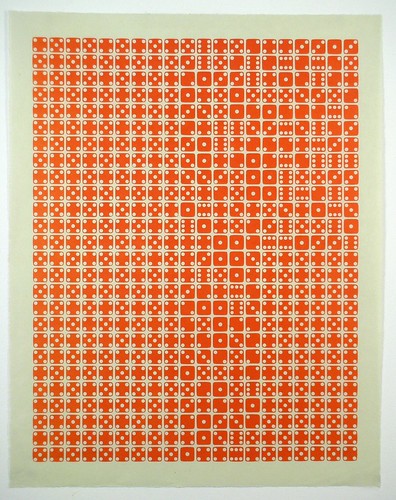
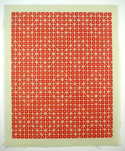
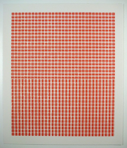
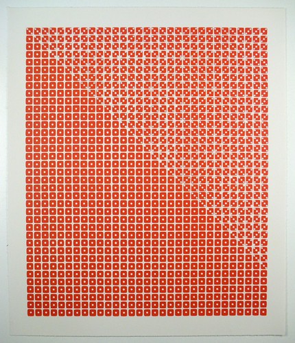
The moment I saw these prints by the Etsy store Stukenborg, I was in love. Each print is made by setting hundreds of dice in a pattern, inking them with bright red ink and putting them through a printing press. By manipulating which side of the die is inked many graphic patterns emerge. The prices range from $50 - $250 based on size. I think that they would be a great wedding or new home present; two prints side-by-side would look incredible over a sofa or bed, no?

Check out more here.


THE ARTIST SPEAKS


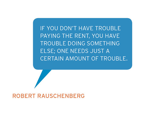
You may be wondering what this big speech bubble is all about. Well, recently I have been inspired by several other bloggers who seamlessly incorporate interesting quotes into their blogging routine. Several months ago I started a tumblr blog devoted to just that--funny and inspirational things artists say--at theartistspeaks.tumblr.com. But why not incorporate the two?

So, this quote by Rauschenberg is the first in a series that I hope will promote some thought, laughter or a little nod of agreement from you, my lovely readers. This quote about 'trouble' is particularly apt for me right now, trying to be a student and live reasonably in New York City! Still, I believe that the bits of trouble are what remind us of the untroubled parts of our life, and what remind us that those parts are worth fighting for.


MARIA HOLMER DAHLGREN

MARIA HOLMER DAHLGREN

MARIA HOLMER DAHLGREN

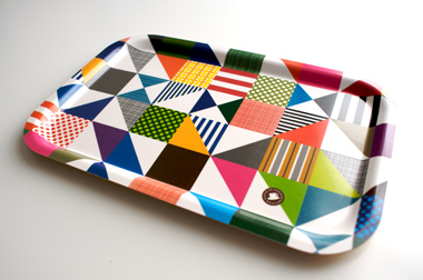
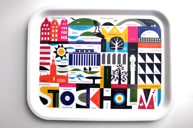
Reading my twitter feed last night I can across a a tweet by Dwell that introduced me to the awesome website FromSthlm. FromSthlm is a shop-cum-blog that features the best of Swedish design. Every month of so they post products for a different designer that you can buy straight from their site. This month they have featured the tea towels an kitchen trays of Maria Holmer Dahlgren. Some information about Dahlgren and her wares on the site:

"With her taste for adventure and zest for life, it’s easy to see where the bright playful colors and forms in Maria Dahlgren’s patterns stem from [ . . . ] With a deep love and understanding of place, she created tributes to her favorite towns through patterns that not only celebrate city landmarks, but their culture, attitude and spirit as well. To Maria every letter is unique, and every form helps to commemorate the little things that make a place or a moment special. And why trays and kitchen towels? According to Maria, 'These are perfect frames for everyday art that bring a little joy to life, without asking for much attention. My work is based on the same philosophy… there’s beautiful art all around us, if we just open our eyes to it.'"

Besides having a fabulous color sense, a great design mindset (just like my "why buy boring when you can buy beautiful?" mantra), and a super cool culture, Dahlgren also has eco-consciousness. All of her trays are made from high quality Scandinavian birch taken from sustainable forests and hand-pressed into shape. Plus they can stand up to being in the dishwasher!

See more on Maria Holmer Dahlgren here.


CLOSING CEREMONIES

RALPH LAUREN TEAM USA


So the Olympics are over. I am not sure if you were as obsessed with them as I was, but I couldn't get enough! The tragedy, the triumph, the hard work, the dedication, the passion! I love watching people achieve something they have dreamed of their whole life in a matter of seconds!

Besides the excitement of the actual competition, I was also impressed by some other things. There were some pretty great commercial series; VISA did an awesome champion series including this one with Dan Jansen's incredible story. Plus the ad series dedicated to the mothers of olympic athletes, done by P & G, was so adorable I couldn't stand it.

Even better? I loved the classy uniforms, designed by Ralph Lauren, for the US Team to wear at the closing ceremonies. It was ski lodge met preppy chic and every member of the team looked absolutely stunning. But what was with the rest of the ceremony? How awkward was the stand up? And how sad is it that all of the famous Canadian performers have all achieved fame in the US, and lived in the US, for decades?

See more photos of the closing ceremonies at the NY Times here and more olympics advertisements here and here.