RONALD DAVIS: DODECAGONS

RONALD DAVIS
RONALD DAVIS
RONALD DAVIS
RONALD DAVIS

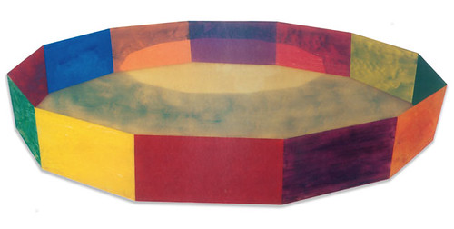
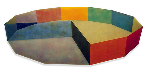
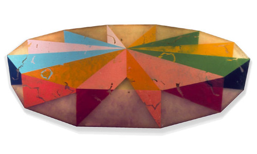
Yesterday in class my professor lectured on '60s California artist Ronald Davis. I first saw Davis' incredible work at MoMA's Color Chart show in 2008 and was super happy to be reminded of him again. All of the above pieces are among,

"Davis's "plastic paintings," which marked a departure from his works on canvas. The artist made these work "the same way one makes a fiberglass boat or car body"—by layering translucent polyester resin, fiberglass, and pigment in a Formica mold. The machine-polished surface recalls the fiberglass surfboards of 1960s Los Angeles, while the painterly brushstrokes and illusion of receding space are traditional pictorial conventions, making Ring an intersection of painting, sculpture, and the manufactured object."

Needless to say I am totally in love with their bright color palette and milky finish. I want one!

Learn more about Davis (and see more of his work) at his website here, at the Tate Modern's site here, and at MoMA's site here.

(Images from here, quote from here.)


HOUSE OF CARDS

EAMES HOUSE OF CARDS


I have often seen the Eames 'House of Cards' deck in stores and, despite my professed love for all things Eames, have never been tempted to buy it. Until yesterday.

While doing some reading for a class I am taking on art from Los Angeles post 1940, I came across this book on the oeuvre of Charles and Ray Eames, written by John and Marilyn Neuhart in 1989. True, it may be a bit outdated, with most of its reproductions in black and white. But it is incredibly thorough and has several lavishly illustrated pull-outs, including one (you guessed it!) of all the designs in the Eames 'House of Cards'. The sheer tonal and photographic range of these cards--depicting everything from feathers to fishing boats, stripes to chevrons--make it both graphically inspirational and aesthetically exciting. Wouldn't it be cool to have an elaborate house of cards, made from this exquisite deck, on some empty table in your home?

If you think so, you can pick up the cards here and learn more about the Eames' here.


ART INTERVENTION


I have been bookmarking a lot of videos about super cool street art recently. Here are three of my favorites I thought I would share with you. Enjoy!


Some background on the project:

"In 2007, the New York City Transit Authority began installing LED signs on subway platforms that display estimated wait times for arriving trains. Unfortunately the information is little more than trivia: except for a few stations, it is only visible to travelers after they’ve paid their fare, so the data has little bearing on commuter decision-making.
Their primary effect, then, is to erode faith in the system, to create expectations that can’t always be met, to raise false hopes, and to erase the mystery and magic of the wondrous system that transports more than five million riders a day.
These LED signs also threaten historical social behaviors, rendering obsolete the time-honored New York tradition of leaning over the platform edge with the hope of glimpsing headlights from an approaching train.
The Spoiler Alert signs warn waiting riders of this potentially unwanted information – allowing them to avert their eyes so they may preserve their spirit of adventure – while still leaving visible the data for travelers who wish to ruin the surprise for themselves.

Learn more about Jason Eppink (a major player in my favorite group: Improv Everywhere) and his other projects here. Found via the awesome Subway Art Blog.


Some background on the project:
"This summer mural painter Matt W. Moore created a series of live painting performances on walls in MARSEILLE, LYON, and PARIS. Directors Le Groupuscule captured the evolution of each mural, gathering over 700,000 pictures, that were edited as a stop-motion animation to an unreleased track by Monsieur Monsieur to create this music video. This collaboration of 3 artistic disciplines to make walls dance is part of the global initiative : Let's Colour Project."
Learn more about the collaborating artists here (in French) or here. Found via Wooster Collective.


Some background on the project:

"Multipraktik is a multi-disciplinary platform motivated by the pursuit of new practices at the crossover between design, photography, video production, music, events and art. We operate as an evergrowing collective of designers, artists, musicians, producers and programers. We create teams based on projects and with each project we try to challenge conventional approaches. This project was organized cross-slovenian street TapeArt actions with different artists (in particular Fejzo & Luka Ursic) as part of the new campaign for Orto (Simobil)."

Get more information on Multipraktik and the artists here and here (website under construction). Found via Wooster Collective.


WORK IS ALL SUNSHINE AND RAINBOWS

RAINBOW OFFICE
RAINBOW OFFICE

Two weeks ago swissmiss featured this amazing "rainbow office" (the DLA Piper Office) designed by Hofman Dujardin. Each office is a slightly different color—spanning the full color spectrum—to accord with the changing sunlight throughout the day. Genius!


CARTOON NETWORK OFFICE


Seeing this bright and beautiful office sent me on the hunt for similarly cheery set-ups. So far, the best match is the Cartoon Network headquarters in Atlanta. You can see more photos (including a greater than life size model of Rosie, the Jetson's maid) on the Flavorwire website here.


RAINBOW KEYBOARD

Maybe their employees use this rainbow keyboard skin? You can buy your own (so tempting, but I think it looks better against a white MacBook than my silver MacBook Pro) at the amazing Etsy store topdecal for $14.99.

Now all we need is a real rainbow at the end of this rainy day . . .


SESAME STREET REMAKES


Sesame Street has hit the news recently, unfortunately for a bit of scandal. When pop singer Katy Perry visited recently to do a musical remake of her song "Hot N Cold" with Elmo, apparently parents were dismayed by her racy outfit. No matter the scandal, Flavorwire has seized the moment to remind its readers about all of the truly clever and well-made videos on Sesame Street over the years—most notably their cheeky remakes of popular adult shows like True Blood (made into 'True Mud') and Wheel of Fortune (turned into 'Squeel of Fortune'). I have picked out three of my favorites . . . hope you like them!


'30 Rock' becomes '30 Rocks'
"As in 30 Rock, “30 Rocks” stars Lemon — here an actual lemon — saving the day by verifying the studio’s order for, you guessed it, 30 rocks."*


'Desperate Housewives' becomes 'Desperate Houseplants'

"This one — “the story of some house plants who were not getting what they needed” — might be the raciest of the bunch. It stars two dried up houseplants hoping to be noticed by a suave gardener."* Talk about satire!


"Law and Order: Special Victims Unit" becomes "Law and Order: Special Letters Unit"

"'Law and Order: SLU' follows a group of detectives who track down missing letters. In this episode, detectives seem to be confused about the difference between things that start with the letter M and the letter itself. As is to be expected, there are plenty of “chung chung” sound effects."*

See more videos on the Flavorwire website here.
(*All quotes taken from Flavorwire.)


ZIP IT

BAGGU ZIP BAGSBAGGU ZIP BAGS


After discovering the amazing reusable bag company—Baggu—this spring, I have toted a Baggu bag with me everywhere I go. Their products fold up into small convenient cases and can be easily stashed in your bag on the go. So, imagine my excitement, when I got an email announcing their new products: zippered pouches! I can imagine these would be even more useful, holding my countless daily necessities: cell phone, ipod, pens, sticky notes, etc. As usual, I love the colors and patterns on offer, especially that pink set!

Get your own set of zip bags, priced from $7 - $12, at the Baggu site here.


JUST MY TYPE

TYPOGRAPHY FOR LAWYERS
I think it is clear that I am a geek for typography. Just look at
these posts. But recently, upon discovering the amazing website 'Typography for Lawyers', I realized I don't know quite as much about typography (and its proper usage) as I think. For instance, did you know that the two-space rule after the period is a hold over from the typewriter era? Or the difference between an n-dash and an m-dash . . . and why they are called that?
While the website is directed to lawyers, it's guidance can really be helpful to pretty much any professional.

Check out the goodness here.


WHAT TYPE ARE YOU?

Along the same vein, I thought I would point you in the direction of Pentagram quiz: What Type Are You? By answering a few short questions—all posed by a mysterious, European, psychologist-like figure—the site will help you determine what typeface best suits your personality. It turns out I don't actually like the look of my typeface that much—Architype Van Doesburg—but I do completely agree with the explanation aligning its characteristics with my beliefs and views.

Try it for yourself here.
(And thanks for reminding me about it Caitlin!)


MORE TALENTED PUPS


Without going totally crazy posting videos with cute pups, I couldn't help but share one more as an addendum to yesterday's post. The fabulous band OK Go is known for its super creative music videos, most notably
this choreographed treadmill number. This video, for their song White Knuckles, features some equally great "dance" moves, aided by a troop of adorable and talented dogs. Awesome! Keep it coming OK Go!

Learn more about OK Go at their official website here.


HELLO, HARVEY!


I am running off to a busy day of work, class, reading and errands, but I wanted to leave you all with my new favorite TV ad. This ad—actually a promotion of advertising on television—is both cute and clever, playing on our superficiality, even when it comes to our pets. I love how he has his bag packed at the end: so adorable! Hope you like it.

(Have to admit that I would still be tempted to adopt the dauschund—such perfect puppy dog eyes.)


OH, JUST GOOGLE ME!

GOOGLE ME BUSINESS CARD


A while back the blogosphere was abuzz with the graphic design work of Ji Lee, particularly his brilliant "Google Me" business card. Lee, realizing a Google search for his name would immediately direct you to his website, simply decided to cut out the middle man. Creating a business card that encourages you to google him is not only a fabulously creative idea, but also a great way to ensure people check out your portfolio/website.

All that said, Ji Lee is now generously offering a download of a blank version of the 'Google Me' business card--which you can customize and print with your own name. Just make sure your website is the top search result (you wouldn't want to direct traffic to someone else's website with your business card!).

Download a copy of the business card here (it's linked to the second image) and check out his other work here.


BACK TO SCHOOL, THE SEQUEL

LISA STICKLEY PENCILS
OFFICE ICONS PENCIL CASE
Of course, as soon as I bought all my school supplies two weeks ago I fell in love with ten other pens, pencils, cases etc. Isn't that always the case, ha? Needless to say, with school now well under way, I am thinking of adding one or two extra treats to my school bag. These are my two favorites:


*this is possibly one of the cutest websites I have ever seen. Hooray for polka dots!


THE ARTIST SPEAKS

THE ARTIST SPEAKS
Learn more about the scientist and brilliant inventor of the Polaroid camera here and here.


JME FOOD

JAMIE OLIVER FOODJAMIE OLIVER FOOD

JAMIE OLIVER FOODJAMIE OLIVER FOOD

JAMIE OLIVER FOODJAMIE OLIVER FOOD


Have you all seen the amazing packaging for Jamie Oliver's preserved foods? I love the mixture of handwritten, stamped and illustrative labels. Not to mention the brightly colored jar caps! It makes each jar look like it came out of that friend-who-makes-gourmet-cooking-always-look-effortless-and-fun's kitchen: thoughtful, homemade, and personal. Brilliant! (But really, I wouldn't expect anything less from Jamie!)

Check out all of Oliver's 'Nibbles, Snacks and Gourmet Condiment' line, called Jme Food, here. And take a peak at all the great stuff--interviews, recipes, Jamie's magazine etc.--at his website proper here.


(You can also see the previous packaging for Jamie's line, which was equally fabulous, here and here.)


IT'S COLOR OCLOCK

O'CLOCK WATCHES

I realize that there are a ton of images for today's post, but I couldn't help it. When I stumbled across the minimalist yet colorful design of O Clock watches, I was floored. Made out of stretchy silicon in Italy, these beauties have no fasteners and thereby come in three sizes. And its water resistant!

But that's not the best part. The zinger is that O Clock watches are only $36! It makes it tempting to get one to match every outfit . . . .

Check them out here.


(Thanks to minimalissimo for the recommendation.)


THE GLASS HOUSE REVISITED


How was your weekend? Mine was stupendous! Saturday dawned sunny and beautiful--the absolute perfect day for a tour of Philip Johnson's Glass House and estate. If possible, the buildings and grounds were even more wonderful and inspirational than I anticipated. It made me realize that I need to learn more about modern architecture.

That said, I was trying to figure out a way to help you understand the powerful beauty and serenity of this place. The above video tour, hosted by RISD President John Maeda, begins to give you an idea of the natural oasis that is the Glass House, but I would also suggest that you watch the interview series (chronicling people's reactions to their visit) on their website here. Awesome!


WEEKEND UPDATE: THE GLASS HOUSE

THE GLASS HOUSE
THE GLASS HOUSE
THE GLASS HOUSE


Sorry for being MIA yesterday. This week, with the start of school and the continuation of several part time jobs, I have been super super busy. Hopefully my schedule will calm down and my sanity will return once I have gotten back into the swing of things. Until then I will do my best to do a post everyday. Stick with me!

Given all that, I am super excited to tell you about my weekend plans. I will be going home to Connecticut to spend the weekend celebrating my parents' birthdays. We decided, way back in March, that a fun way to celebrate would be to take a tour of Philip Johnson's Glass House in New Canaan, Connecticut. You have to book your tour tickets nearly 6 months in advance and I am so glad to see that the weather looks promising now that our day has finally rolled around.

Some information about the Glass House:

"The Glass House or Johnson house, built in 1949 in New Canaan, Connecticut, was designed by Philip Johnson as his own residence and is a masterpiece in the use of glass. It was an important and influential project for Johnson and his associate Richard Foster, and for modern architecture. The building is an essay in minimal structure, geometry, proportion, and the effects of transparency and reflection. The estate includes other buildings designed by Johnson that span his career. The house builds on ideas of German architects from the 1920s ("Glasarchitektur"). In a house of glass, the views of the landscape are its “wallpaper” ("I have very expensive wallpaper," Johnson once said.) Johnson was also inspired by the design of Mies van der Rohe's Farnsworth House."

Find out more about the Glass House, Philip Johnson and modern architecture here.

(Photos from here, here and here, and quoted information, shamefully, from here.)


WELCOME TO THE FUTURE: 2014


There isn't much to say about this video except that it is absolutely and completely awesome, chronicling the potential technological advances we can look forward to in the coming years. Frankly, this makes the iPhone 4 and the iPad look like small potatoes.

(Thanks to swissmiss again for the heads up).


BACK TO SCHOOL!

BACK TO SCHOOL


Where oh where did the summer go? I can't believe Labor Day has already come and gone! Today I start my third year of graduate school (or as my boyfriend calls it: 19th grade) and I am finally getting excited for the start of fall, mostly due to my back to school shopping! I am looking forward to buying some new clothes--there are so many cute fashions for this fall! But my favorite part about starting school is buying new, fun school supplies. I have compiled a little wish list to share with you all. Hope you like it!


KATHERINE SANDOZ

KATHERINE SANDOZ
KATHERINE SANDOZ
KATHERINE SANDOZ


Yesterday, when I discovered Katherine Sandoz's abstract paintings I nearly fell off my chair. Stunning! Sandoz's 'Waterway' series, depicted above, features brilliant swaths of color that allude to an aquatic landscape without literally depicting it. Each of these small pieces (about 7.5 inches square) are painted in water-based media on birch panels and are priced at about $1000.

Check out more of Sandoz's impressive colorful abstractions here.


p.s. Hope you all have a fun holiday weekend, enjoying the last weekend of summer. Hopefully you are going somewhere as refreshing and beautiful as the places depicted in these paintings . . .


REPRESENTING MY HOMETOWN

DESIGN*SPONGE NEW HAVEN GUIDE


Yesterday I was very happy to discover that the fabulous blog design*sponge has now written a city guide to New Haven. Having avidly read their guides to other major tourist destinations--London, Paris, New York, Boston etc.--I was super pleased to see them doing a feature on my hometown! As a lifelong resident of New Haven--which often gets a unduly bad wrap--it was quite exciting to read a thoughtful re-presentation of the city, pointing out all my favorite places to eat, shop, explore and enjoy.

You can read design*sponge's New Haven city guide here and find more of their city guides here.


p.s. My only complaint? No reference to Modern Pizza, the best brick oven pizza place in town. Oh well, I guess we will just have to save it for the locals . . . . :)