COLOR CRUSH: PAINTINGS BY ANDREW FARIS


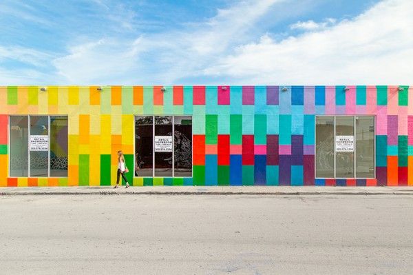
I am totally digging the graphic, chromatic paintings of Wyoming artist Andrew Faris. How cool is his decision to photograph them in contrast with the natural landscape? Major fan, all around.

Check out more of his work on his website here (and his instagram (swoon!) here). I particularly like these glass and spray paint works . . . .

(thanks to swissmiss for the tip!)


RIFLE AND PAPERLESS POST: A DYNAMIC DUO


Have you seen the new line of cards, invites and announcements by Rifle Paper for Paperless Post? I got an email about their launch recently and immediately burst into a huge smile; I have been a fan of both companies for years and always delighted to see two quality brands team up (like these, for example).

The line features everything related to baby, wedding, moving, parties, graduations, stationery—you name it and you can find it at Paperless Post in all the signature hand-illustrated style of founder Anna Bond. Here are a couple of my favorites:


I also love Rifle designed options that incorporate photos as well, as they really make many of the wedding invites and birth notices seem extra special. And, like nearly all Paperless Post products, you can get them as e-cards or physical paper cards, a nice option if you have some non-tech savvy recipients (snail mail) or last minute invitees (e-vites). Which design is your favorite?Also, don't forget to enter the Uncommon Goods giveaway! One winner will be announced on Monday, so don't delay!  

RANDOM THINGS THAT MAKE ME HAPPY, VOLUME TWO


As I near the home stretch with my dissertation, my brain increasingly feels like swiss cheese—completely full of holes. It is perhaps only fitting that I give you another 'Random Things' post, if only to accurately represent my chaotic state of mind. . . 

ONE > How fabulous are these colorful playing cards? Who knew poker could be so pretty . . . 

TWO > I rotate my desktop background regularly and am always looking for new (and free!) patterns to upload. DesignLoveFest's regular column is the best source for these and I totally fell in love with her recent post featuring this palm print by Kate Worsum.

THREE > Candy on a stick? Yes, please!

FOUR > I can't decide if one piece bathing suits are all purposefully designed to be unflattering or if they don't just work on me, but the raving reviews and pretty colors of this JCrew number have me tempted to try again . . . 

FIVE > These brightly colored beauties in Naples have me dreaming of revisiting my trip to Italy and heading down south instead. 

SIX > I collect typewriters. Have I told you that? Well I do. It's a hard hobby to keep up in my cramped NYC apartment, but oh baby this yellow number is calling my name!


FOLLOW UP: TOMMY PEREZ'S INSTAGRAM


Whoa! Yesterday, after posting about the inspiring series A to Zöe created by adorable dad Tommy Perez, I fell down a Googling black hole and go lost in the magic and colorful wonder of Perez's instagram account. Seriously, this guy is incredible! Turns out Perez not only has major typography skills, but also is a master at logo design, paper cutting and illustration. If I had taken a different fork in the road and had decided to become a graphic designer instead of an art historian, I would want to become this guy's best friend, stat. As is, I kind of want to anyway!Check out Perez's instagram account and personal website here for a look into his beautiful, vivid work.

ONE DAD'S EDIBLE TYPOGRAPHY LESSONS


Oh man, I am pretty sure Tommy Perez just won the cool dad of the year award. Turns out he is teaching his two year old daughter, Zöe, about the alphabet (and design! and food!) by shaping her snacks into letters in various beautiful styles—script, sans serif, capitalized, lowercase and more—and then photographing her adorable little hand as she samples the results.The series is called from A to Zöeand shows off Perez's impressive styling and graphic design skills. He posts his images on Instagram and I highly recommend you follow along. In the meantime, you can learn more about Perez, his daughter, and the whole series at Fast Co. here.

OFFICIALLY WISHLISTED: SEABAGS


Two summers ago my husband and I bought a small sailboat. As a Connecticut kid, I have been sailing all my life and I was delighted to discover my husband shared my enthusiasm. So now we have a small racing boat, something fun to speed along in, and we have slowly been kitting it out with fun gadgets and add ons. So when I saw this post on swissmiss yesterday, detailing the cool water tight 'Seabags' made by the Swiss companies Büro Destruct & Kitchener, I knew they would be the perfect addition to our sailboat wishlist. I mean, really, how can you resist the potent combination of utility and cuteness?

Check out all the latest Seabag designs here.


30 FOR 30: A MAD COOKIE BIRTHDAY PARTY FOR THE AGES

let's get ready to crumble cookie sign

cookie tasting table
Last weekend I threw a 30th birthday party. For myself. It was reasonably epic, thanks in large part to the wonderful turn out (thanks, friends!) and the super fun theme: chocolate chip cookies! And not just any chocolate chip cookies—the party was a 'March Madness' style bracket to determine the best chocolate chip cookies in New York City from among 30 contenders (get it? 30 for 30!). (I was inspired by this lovely lady.)

I ate so many cookies that I had a stomach ache for several hours afterwards. Now if that isn't the sign of a good party, I don't know what is!

In planning the fete I took the opportunity to put together a bunch of fun crafty decorations that I thought you might enjoy. After all, now that I have put the idea in your head you are totally going to go out and throw your own cookie party, right?

Click through the link to see some more photos of the fun!

SHAKE SHACK'S RETRO CHIC GRAPHIC IDENTITY

paula scher's design identity for shake shack

paula scher's design identity for shake shack

paula scher's design identity for shake shack

paula scher's design identity for shake shack

paula scher's design identity for shake shack
A couple months ago the beloved NYC burger spot, Shake Shack, went public on the stock market. Having in recent years expanded to cities across the country, indeed across the world, Shake Shack is looking to be our era's foodie version of McDonalds. In honor of their growing global recognition, Fast Co. Design did a very cool blogpost about the details behind the retro icons, friendly fonts and neon colors used in the business's unique graphic identity. Turns out the impressive Paula Scher of Pentagram originally planned this singular identity to match the restaurant's original location—a modernist metal shed in New York's Madison Square Park—and has been surprised to see how well the look has translated to countless other locations across the globe. Even though Shake Shack opened over a decade ago (in 2004), the identity still looks as fresh as ever—a sure sign of a job well done.Needless to say, the article is worth a read, as it provides some fascinating insights into the 'look' of a brand that seems to have every detail down pat and has always struck me as the perfect combination of sophistication and silliness.Read all about it here, and learn more about Paula Scher here.

A JOLT OF SUMMER FOR A COLD DAY

colorful wall mural, photo by studio diy
german poster design from 1962

wooden blocks on sale at the fine little day shop
be kind poster

I am officially tired of all this hangover winter weather! The calendar says it's spring but the thermometer says it's 40 degrees outside. What gives?!

I'm not waiting anymore for a punch of color and fun in the sun. So here are a couple photos that are helping me pretend shorts and summer sun are right around the corner . . . . hope they help pick you up too! Now bring on the ice cream!


OFF THE WALL: 'SMOOTHER THAN A FRESH JAR OF SKIPPY' DESKTOP WALLPAPER

off the wall free wallpaper download from the obsessive imagist

off the wall free wallpaper download from the obsessive imagist

off the wall free wallpaper download from the obsessive imagist

off the wall free wallpaper download from the obsessive imagist

Oh my goodness, is it really possible that it has been a year since I posted a new desktop wallpaper in my 'Off the Wall' series? Sheesh! I need to step up my game!

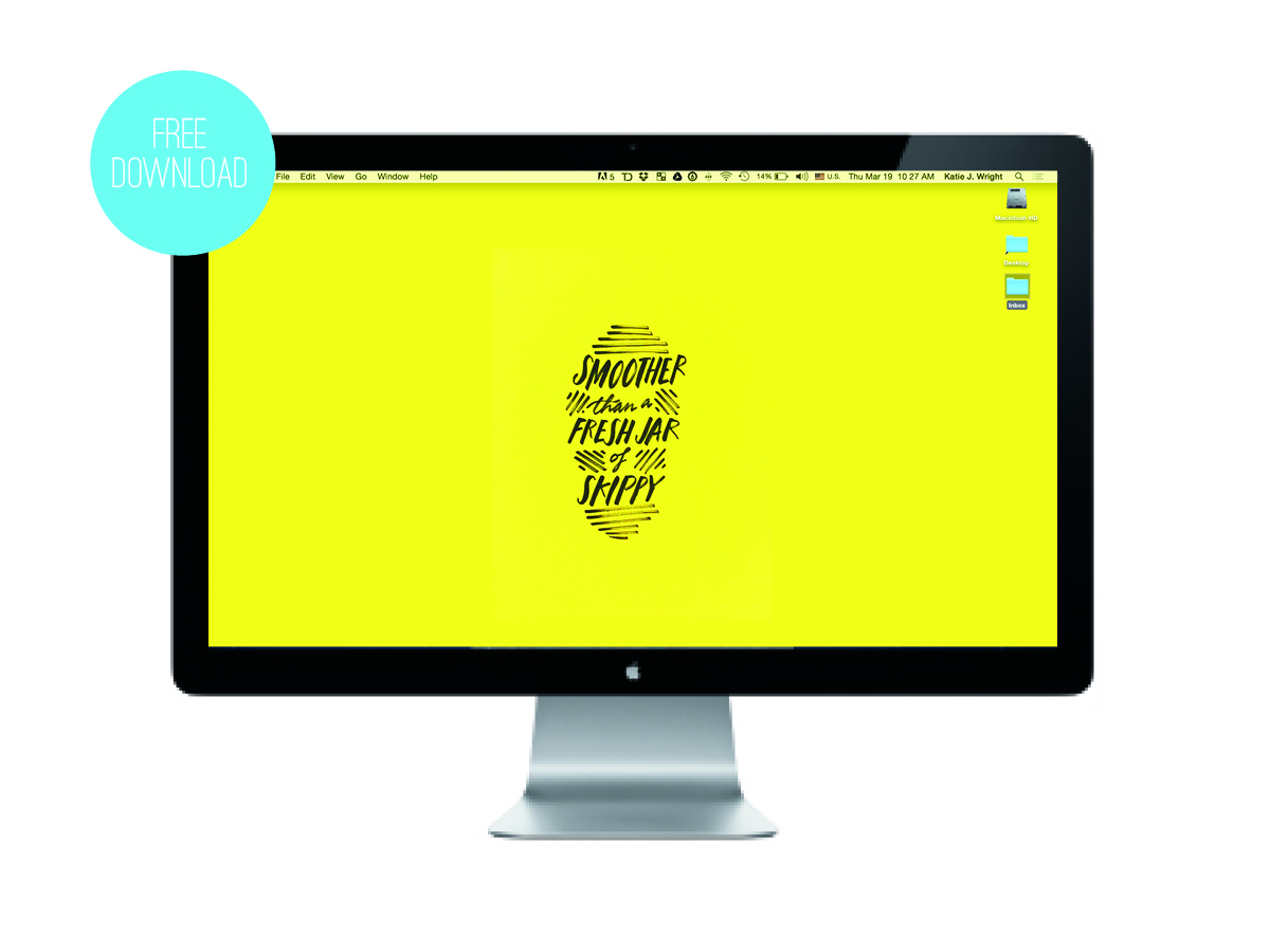
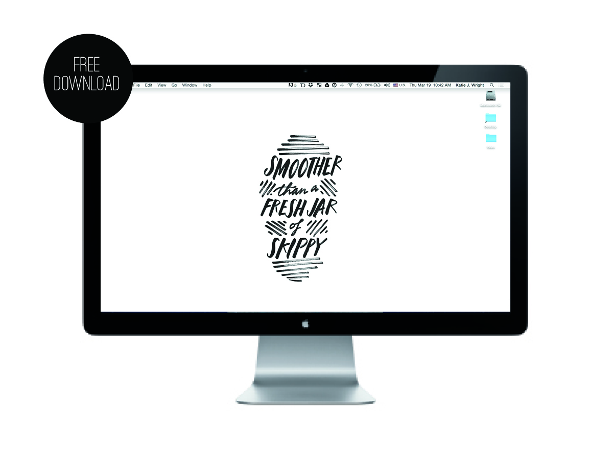
Well, like everyone on planet earth, I have been jammin' out to the fabulous 'Uptown Funk' by Bruno Mars and thought it would be fun to do the song's best line as a desktop download for you. If you like it you can grab two versions—in yellow or black/white—for free at the links below:


And, of course, you can see past 'Off the Wall' free desktop downloads here.


(Also, if you like the hand drawn typography of this design, feel free to check out all my skills with the pen in my calligraphy Etsy shop, The Wright Hand, here.)