COLOR CRUSH: PAINTINGS BY ANDREW FARIS


I am totally digging the graphic, chromatic paintings of Wyoming artist Andrew Faris. How cool is his decision to photograph them in contrast with the natural landscape? Major fan, all around.

Check out more of his work on his website here (and his instagram (swoon!) here). I particularly like these glass and spray paint works . . . .

(thanks to swissmiss for the tip!)


ART-INSPIRED TATTOOS


So I am not a tattoo girl myself—I could never decide on something I know I would like forever—but I have to say that these designs are awesome. All inspired by classic modern artworks, they are part of a round up put together by Jerry Saltz of 'the best art tattoos of all time'. Super cool, right?Read the full list—including former Whitney colleague Carter Foster's commissioned Ellsworth Kelly design!—here.


FEDERICO BABINA ROCKS


I just stumbled across the design work and illustration of artist Federico Babina. He has created several different poster series (on sale in his shop here), but my favorites are his "Archicine" works—posters featuring bold renderings of iconic buildings from classic movies—and his "Archist" works—posters that transform buildings into stylistic embodiments of the work of famous artists.


The Warhol and Fontana posters are my favorite (so dead on!). What are yours?See more on his website here.
p.s. Like colorful minimalist posters? So do I! Exhibit A, B, C, D, E, F, G . . . the list could go on and on. Go exploring in the archives (search box at right) and I guarantee you will find something fun. :) 
(thanks to Feel Desain and Dezeen for the tips)  

FROM FASHION AD TO FRAGONARD: ETIENNE LAVIE'S PARISIAN PROJECT


This is such a cool project! It proves that Paris has an almost spiritual connection to art and culture unlike any other city in the world. Created by French artist Etienne Lavie, it's called OMG Who Stole My Ads. What does it entail? Well Lavie selectively replaced the advertisements on billboards and signposts all over Paris with beautiful reproductions of canonical paintings from the annals of art history. Suddenly that old cell phone ad—which you hurried by on your way to the metro—is subsumed by Delacroix's heroic and inspirational Liberty Leading the People (coincidentally owned by the Louvre). And the metro billboard which used to feature waifish models prancing about in expensive clothing, now boasts buxom beauties in shimmering robes in the form of Fragonard's Rinaldo in the Garden of the Palace of Armida. Much better, right?I love how this takes public art to a whole new level, literally brings masterpieces to the streets. Unfortunately the images above are only mock ups; Lavie actually photographed the street scenes and then photoshopped the paintings in. But oh how lovely to have it executed in real life!Read more about the project here and see more images on Lavie's website here.
(thanks to My Modern Met for the tip


MICHELLE ARMAS SALE


I love Michelle Armas and have spoken loudly about my obsession before, so it should come as no surprise that my love still grows! Armas has a small pop up shop featured today on Furbish Studio. Comprised of original works priced between $175 and $375, they won't last long!

Interested? Head over here to pick up something pretty.

(Or check out her shop here for more selection.)


TIPS FOR THE BEST VALENTINE'S CARE PACKAGE


I have a secret super power. No, it's not laser vision or the ability to fly—though that would be awesome—it's the power to put together a kick-butt care package. What's that you say? That's not worthy enough to merit super hero status? I believe my friends and family would beg to differ. In this era of instant, impersonal digital communication, nothing beats getting a good ol' care package (summer camp style) from a loved one full of goodies.

If you are interested in joining me in super hero status with your dearly beloved, click through to learn my tips and tricks . . . . 

REMBRANDT HITS THE MALL


You know I love a good flash mob. And a great art story. But when the two worlds collide? Bam! Mind blown!

To celebrate the reopening of the Rijksmuseum after a ten year renovation the museum arranged to stage a live reenactment of its most famous work—Rembrandt's The Night Watch (1642)—to the surprise of shoppers in a Dutch mall in Breda. The painting is famous in the history of art for its dynamic take on portraiture, with each person depicted on the cusp of dramatic movement. Previously formal portraits showed their subjects still as stone; here each fellow is gesturing, moving, clamoring for our attention. See for yourself here.

So it makes perfect sense that organizers would choose this painting to literally come to life! Cool, right?

Learn more about the project here.


THE COLORFUL STOP MOTION ORCHID


As you know by now, I am pretty much obsessed with any piece of artwork that creatively employs bright areas of color. This gorgeous photographic series by Fabian Oefner, entitled Orchid, is his final set of experimentations with "paint action" artworks. 

Watch the video here to see how he puts these together; learn more about Oefner's work here (this older series is wild!).

Thanks to This is Colossal for the tip!


COLOR WITH A PUNCH


I recently stumbled across the gorgeous (I mean, gorgeous) portfolio of artist Jeffrey Gibson. His work utilizes a combination of bold pattern, vibrant color and unusual materials (the shaped paintings are done on deerskin stretched over wood, the sculptures are embellished punching bags). I love how playful and tough these pieces seem to be all at once; it should be a contradiction but Gibson makes it work! The sculptures in particular take a banal, utilitarian object to a whole new level of ceremony and beauty.

See more of his lovely work here.


PHILIP BARLOW


I am breaking the obsessive imagist radio silence, finally! Sorry I have been away so long; I got swamped at work, sick over the holidays, and then super behind on schoolwork. It all adds up, you know?

Anyway, I am back in action and will try to start posting again on a regular basis. To kick that off I have these beautiful paintings, created by artist Philip Barlow, to share with you. I love the luminosity of them, how cheerfully colorful they are, how evocative they are of a bright, sunny day at the beach.

His other series are equally lovely; check them all out on his website here.


FROM THE ARCHIVES: ART INTERVENTION


For the next three weeks I am off on an adventure—the best adventure possible! I am getting hitched, an amazing event and process that has inspired my ongoing series of posts called The Wedding Files. While I am on my honeymoon I will be featuring some of my favorite posts from past years (including this street-side number from September 2010) to tide you over until I return. Hope you enjoy them!

----------------------------------------------------------------------------------------------------

I have been bookmarking a lot of videos about super cool street art recently. Here are three of my favorites I thought I would share with you. Enjoy!


Some background on the project:
"In 2007, the New York City Transit Authority began installing LED signs on subway platforms that display estimated wait times for arriving trains. Unfortunately the information is little more than trivia: except for a few stations, it is only visible to travelers after they’ve paid their fare, so the data has little bearing on commuter decision-making.
Their primary effect, then, is to erode faith in the system, to create expectations that can’t always be met, to raise false hopes, and to erase the mystery and magic of the wondrous system that transports more than five million riders a day.
These LED signs also threaten historical social behaviors, rendering obsolete the time-honored New York tradition of leaning over the platform edge with the hope of glimpsing headlights from an approaching train.
The Spoiler Alert signs warn waiting riders of this potentially unwanted information – allowing them to avert their eyes so they may preserve their spirit of adventure – while still leaving visible the data for travelers who wish to ruin the surprise for themselves.
Learn more about Jason Eppink (a major player in my favorite group: Improv Everywhere) and his other projects here. Found via the awesome Subway Art Blog.


Some background on the project:

"This summer mural painter Matt W. Moore created a series of live painting performances on walls in MARSEILLE, LYON, and PARIS. Directors Le Groupuscule captured the evolution of each mural, gathering over 700,000 pictures, that were edited as a stop-motion animation to an unreleased track by Monsieur Monsieur to create this music video. This collaboration of 3 artistic disciplines to make walls dance is part of the global initiative : Let's Colour Project."
Learn more about the collaborating artists here (in French) or here. Found via Wooster Collective.


Some background on the project:
"Multipraktik is a multi-disciplinary platform motivated by the pursuit of new practices at the crossover between design, photography, video production, music, events and art. We operate as an evergrowing collective of designers, artists, musicians, producers and programers. We create teams based on projects and with each project we try to challenge conventional approaches. This project was organized cross-slovenian street TapeArt actions with different artists (in particular Fejzo & Luka Ursic) as part of the new campaign for Orto (Simobil)."
Get more information on Multipraktik and the artists here and here (website under construction). Found via Wooster Collective.


ART HISTORY NERD ALERT: THE GHENT ALTARPIECE AND THE GETTY

GHENT ALTARPIECE
GHENT ALTARPIECE

At work we get the Getty Institute's newsletter in the mail. Normally I page over it in search of the next stack of books I will add to my ever-growing Amazon check out cart. This time, however, I discovered a project that was far more compelling: the Getty now offers 
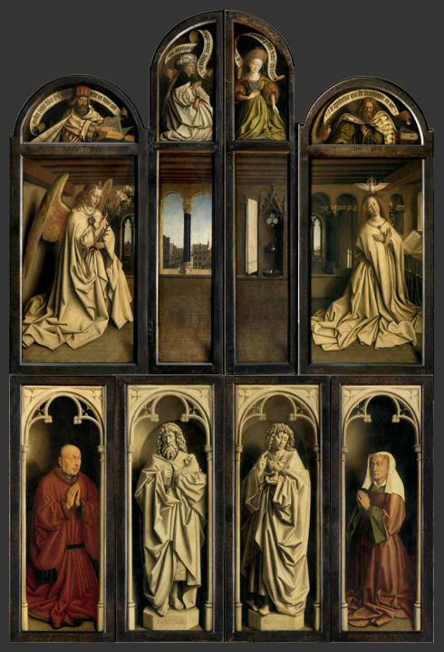
a website that represents the culmination of a year-long conservation effort of Van Eyck's seminal masterpiece the Ghent Altarpiece. For art history nerds like me, the opportunity to get up close and personal with this beautiful, important work is too good to be true.


GHENT ALTARPIECE
GHENT ALTARPIECE

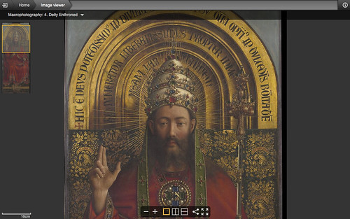
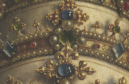
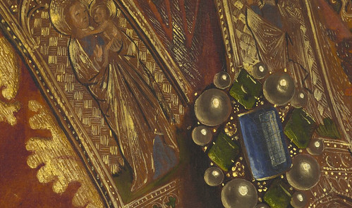
First and foremost, the website lets you zoom in ridiculously close to see every crack and perfectly rendered detail of each panel of the altarpiece. The jewels on the crowns are my personal favorite to explore.


GHENT ALTARPIECE
GHENT ALTARPIECE

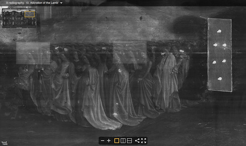
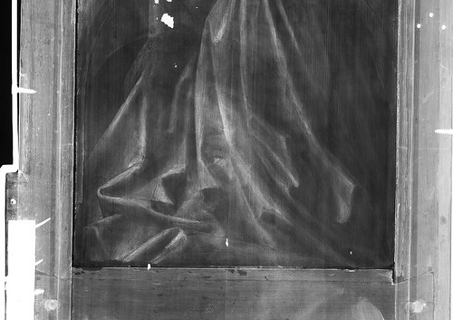
Also cool? Checking out the x-ray images to see what the artist originally painted on that panel. In the top shot you can see the nails that hold the hinge of that panel in place; in the bottom photo you can see a face (specifically an eye) hidden in the folds of the drapery.


GHENT ALTARPIECE
GHENT ALTARPIECE
GHENT ALTARPIECE

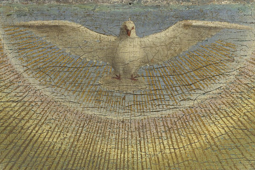
What amazes me the most about this project is not only that the website is free (awesome!) but also that it lets us have an encounter with the work that mirrors the intimacy of the moment the artist painted it. Who else can say they have gotten so close as to see the individual threads painted on the angels' coats or the eyelashes of Adam's face?

If you want to take a moment and procrastinate from work, or just take a moment to see something incredibly cool, check out the 'Closer to Van Eyck' website here.