IN THE CLASSROOM: PUSH PIN

This week's 'In the Classroom' presents one of the most famous graphic design companies of all time: Push Pin Studios and its founder Milton Glaser.


PUSH PIN GRAPHICS

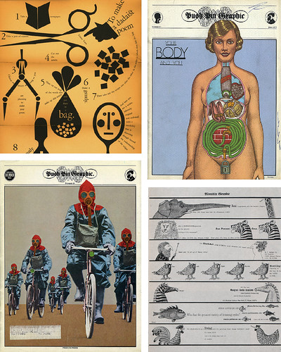
Push Pin Studios was founded in 1954 by four graduates of the prestigious art school Cooper Union: Milton Glaser, Seymour Chwast, Reynold Ruffins and Edward Sorrel. For nearly twenty years Glaser and Chwast directed this burgeoning counter culture studio whose style was eclectic and inventive, using antique illustrations and integrated typefaces. To promote their style they came up with a unique solution: a brochure mailed to potential clients that featured found texts on everything from George Bernard Shaw to Teens and Bikers. Over the years the name of this publication changed--The Push Pin Almanack, the Push Pin Monthly, The Push Pin Graphic--but the lasting influence on young designers, particularly in the wake of the sharp modern Helvetica style, has remained even today some fifty years later. See more at Seymour (accidental homophone, I swear!) Chwast's website here.


MILTON GLASER


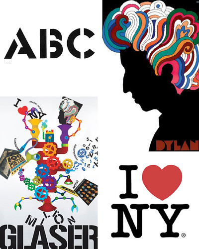
After two decades of success at Push Pin Studios Milton Glaser decided to go out on his own. In the several decades since he has become a graphic design super star, designing the iconic "I ♥ NY" logo for the the New York City board of tourism. He is also a master of fonts, book jackets, and music posters including the famous Bob Dylan poster seen above. Despite being an octogenarian Glaser is still going strong, continuing his design practice and keeping a wonderful sense of humor (his website lists three biography choices: brief, medium and interminable)!

Check out his beautifully designed website for some inspiration and a lot more information here.


PICTURING THE PAST 10 YEARS

PICTURING THE PAST 10 YEARS


I meant to post this super cool infographic in January, but somehow it escaped me. Still, it was too good not to share with you. As part of an Op-Ed column for the New York Times written by Phillip Niemeyer this chart was designed to track the trends of the first century of the millennium year by year. Want to know the biggest couple of 2003? The verb of 2006? The logo of 2009? This chart will tell you! Not only is it well designed, but its also pretty funny; the drawings that illustrate the info are quite clever!

Check it out (larger) on NYTimes here.


SO SHOE ME

ASICS GEL-FIERI
ASICS ONITSUKE TIGER


I need some help. I tend to wear shoes into the ground and I am at about that point where my beloved Pumas might need retirement. I am very particular about my sneaker styles and have narrowed it down to two Asics possibilities: the Gel-Fieri $60 (top) and the Onitsuka Tiger $80 (bottom). I like the style of the Gel-Fieri better but the colors of the Onitsuka better . . . what do you think? Let me know in the comments!


BEAUCHAMPING

BEAUCHAMPING
BEAUCHAMPING
BEAUCHAMPING


I have had the Etsy store 'beauchamping' bookmarked for a long time. I love shop owner Gregory's interest in graphic, bold shapes which he uses in clever and funny ways. These xylene transfer prints (the shop describes the process as screen printing without the screen; a laborious but unique process) are a bit pricey at $75 but wouldn't they look just lovely hung in a wood frame above a bed or desk?

Check out more great stuff (with better detail shots) here.


p.s. And isn't the name 'beauchamping' awesome? It sounds saucy and classy all at the same time . . .


IN THE CLASSROOM: BRITISH INVASION

Today I have a belated 'In the Classroom' to share with you . . .

DAVID BAILEY

In class last week we studied the photographs of David Bailey. Growing up poor in Leytonstone, Bailey worked a bunch of odd jobs as a teenager until he bought a second-hand camera during a stint in the army and viola! Inspiration. He was soon hired by the fashion photographer John French as an assistant. After several years learning the business from French, Bailey was hired as a staff photographer for British Vogue. He is credited with discovering the famous model Jean Shrimpton--a doe-like woman who would become his muse and favorite subject. Bailey is also known for bringing a pop aesthetic to fashion photography, shooting Shrimpton in front of street signs and advertisements. Read a great article about him here.


RICHARD HAMILTON

Richard Hamilton was working on a spread for Ark Magazine (a promotional publication for graphic design students at the Royal College of Art in London) when came up with this iconic collage "Just What Is It That Makes Today's Homes So Different So Appealing?" (1956). This collage launched him from painting to mixed media and became the epitome of pop art: a combination of mass-media culture and convenience with artistic practice. You can learn more about Richard Hamilton here.


NYTIMES OLYMPICS INTERACTIVE

NYTIMES SNOWBOARDING

NYTIMES SNOWBOARDING

NYTIMES SNOWBOARDING


I don't know about you all, but I have major Olympics fever. I can't seem to tear myself away from the prime time competition and yesterday completely lived up to my every hope. Five american medals in some of the most exciting events: speed skating, downhill skiing, and snowboarding half pipe. Truly awesome.

Also awesome? The NYTimes coverage of the Olympics. There have been some great interactive features, including a video series that interviewed the world's best snowboarders on things like listening to music while boarding, their first trick, training, and being a veteran.

Check out the coolness here.


UPDATE: The NYTimes just added another interactive feature that describes the tricks snowboarders use on the half-pipe and how Shaun White managed to win his second consecutive gold medal. Check it out here.


SENZ UMBRELLA

SENZ UMBRELLA


A quick post today. I wanted to share this super cool umbrella (it has been popping up everywhere!). Built aerodynamically so that it can stand up to 40 mile per hour winds, this bad boy will have no covered (get it? get it?) no matter what mother nature throws at you.

Pick your Senz Umbrella up for $54 at greener grass design here.


MOLLY MUTT DOGGY DUVET

DOG DUVET


I don't have a dog. But I love them. Just about every week I take a walk down to the dog park in my neighborhood just to ogle the cute little puppies. I am smart enough to know that my schedule and lifestyle does not permit a doggy companion in my life, but a girl can dream right?

For all of you who do have furry friends I highly suggest checking out the lovely offerings at Molly Mutt. These "doggy duvets" have been making the blog rounds recently and for good reason! They are made out of 100% cotton and come in several sizes and adorable prints. Costing anywhere from $20-$45 they are also totally reasonably priced.

Check out more here.


GETTING DOWN TO BUSINESS

BUSINESS CARD


I hope you all had a lovely Valentine's Day and long President's weekend. I spent most of it furiously researching and rewriting a paper--fun! I managed to sneak some time to watch the Olympics though which is always exciting. Also exciting was my Valentine's Day present: a subscription to UPPERCASE magazine! I have been coveting it for a while (see here) and can't wait to get my first copy in the mail.

Anyway, I wanted to share my latest project with you: a redesign of my business cards. I am pretty happy with how they came out but would love to hear what you think!

See more of my design portfolio here.


IN THE CLASSROOM: HELVETICA


This week's 'In the Classroom' focuses on the movie 'Helvetica'. Directed by Gar Hustwit, 'Helvetica' is a 2007 documentary about the famous, ubiquitous, iconic typeface 'Helvetica'. The typeface was originally known as 'Neue Haas Grotesk' but changed to 'Helvetica' (a version of the latin word for Switzerland) to appeal to a broader audience.

Some info from the website:

Helvetica was developed by Max Miedinger with Edüard Hoffmann in 1957 for the Haas Type Foundry in Münchenstein, Switzerland. In the late 1950s, the European design world saw a revival of older sans-serif typefaces such as the German face Akzidenz Grotesk. Haas' director Hoffmann commissioned Miedinger, a former employee and freelance designer, to draw an updated sans-serif typeface to add to their line. The result was called Neue Haas Grotesk, but its name was later changed to Helvetica, derived from Helvetia, the Latin name for Switzerland, when Haas' German parent companies Stempel and Linotype began marketing the font internationally in 1961.

Introduced amidst a wave of popularity of Swiss design, and fueled by advertising agencies selling this new design style to their clients, Helvetica quickly appeared in corporate logos, signage for transportation systems, fine art prints, and myriad other uses worldwide. Inclusion of the font in home computer systems such as the Apple Macintosh in 1984 only further cemented its ubiquity.
The movie is really undeniably fun. There are interviews with some of the greatest type designers in the world--Massimo Vignelli and Erik Spiekermann were my favorites--many of whom are pretty hilarious. I can promise: after watching this movie you will never look at typefaces, particularly Helvetica, the same again!

UP UP

UP UP CREATIVE
UP UP CREATIVE
UP UP CREATIVE
UP UP CREATIVE
UP UP CREATIVE


I recently discovered the glorious Etsy stationery store 'Up Up Creative'. I love pretty much everything in it! Bright colors, great patterns, reasonable prices . . . what more could you ask for? Check out the absolute loveliness here.

(I mean, really, how cute is that Valentine's Day card?)


HERB KEEPER

HERB KEEPER


Just a quick post to share a product that I have been drooling over for quite some time: the Cuispro Herb Keeper. Unfortunately the product is on back order until May but at $20 it is worth the wait! It works like this: you take your fresh herbs and stick them into a rack at the bottom of the glass, which in turn fits into a pool of fresh water. Using the handle in the middle of the glass, you simply lift open the jar and take out whatever you need! Staying in this handy container, which fits on the door of your fridge, your herbs can last several weeks!

Check out more here.


WOODNOTES HOME

WOODNOTES HOME DECOR

WOODNOTES HOME DECOR

Living in New York, I have a lot of friends who live in studio apartments. While these are not the "studios" you see in the movies or on tv, there do often feature a big open space. And what better way to break up that space, to decorate it, then with these lovely paper curtains. Woven from countless interlocking shapes, these paper beauties are extremely elegant and would look wonderful in a modern or traditional home.

Check out more here.

SUPER BOWL AD WRAP


Just like last year, I thought I would share some of my favorite commercials from the Super Bowl last night in case you missed them. I was surprised that there were no super standouts for me, though there were a bunch that had me chuckling. These four were particularly creative; I particularly love the Google 'Paris' ad for its sweetness and simplicity.

Also worth mentioning?

"Punxsutawney" Polamalu


Enjoy! Let me know which was commercial was your favorite in the comments.


IN THE CLASSROOM


Welcome to yet another installment of "In the Classroom". This week I will be talking about 1950s/1960s era magazine ad men--truly the good ol' boys seen on "Mad Men"--like Helmut Krone and George Lois.


HELMUT KRONE

Helmut Krone is like the Godfather of advertising. Everyone knows his name, his handiwork and his "family"--the agency Doyle Dane Burnbach. Among his many accomplishments, Krone is known for democratizing type by using all lowercase, basic fonts, and colloquial text. Often he would completely remove the company's logo, leaving the actual product to speak for itself (like the Polaroid camera at top right). He is best known, however, for spearheading the iconic Volkswagen "Think Small" campaign. Voted the best ad campaign in history by AdAge.com, the Volkswagen ads were near heresy to other designers (in fact there is a scene in Man Men that addresses this); you could barely see the product; the text was too jocular; the ad mocked the product. But people loved it. And pointing out that the bug is a "Lemon" or that it "Makes your house look bigger" appealed to a consumer base that was looking for an alternative to big companies and big cars and big environmental damage. Learn more about him here and here.


GEORGE LOIS

George Lois was also an icon, but his work is most often seen on magazine covers instead of within magazine covers. His covers for Esquire were always dead on--commentary on modern art and commentary on current events. He used photomontage to get to the heart of the matter: Mohammed Ali's martyr status after refusing entrance into the army, Andy Warhol's exponential fame through his use of Cambell's Soup cans. He has published several books about his career and was the subject of a MoMA retrospective in 2008. Learn more about him at his awesome website here.


SUPER BOWL COOKING

FRESH 365


I am pretty excited for the Super Bowl this weekend. My boyfriend has slowly gotten me interested in football and it will be very nice to watch a game where I don't particularly care what the outcome is. Plus we are planning to watch it in our pjs, eating lots of tortilla chips and guacamole. On top of that, I just found this awesome foodie blog "Food 365" which recently featured a tantalizing recipe for Chickpea Croquettes. I can't wait to add them to the menu for Sunday!

Check out more delicious vegetarian at Fresh 365 here.


FROM THE ARCHIVES: ITALIA


While watching the season premiere of Lost last night (I am so dork-ily excited) I decided to update my Flickr photostream with some of my travel photos. Previously I was only posting my travel photos on my personal Shutterfly account, but there are so many lovely shots--Italy really does have a transcendent light--that I couldn't help share them.

Check out more here.


GREY WITH A SPOT OF SUNSHINE

ANTHROPOLIGIE: GREY


On this wintry day, I thought I would share with you some sartorial eye candy on offer at Anthropologie. I am loosely filing these under the header "Grey with a Spot of Sunshine". I have a serious jones for grey clothes; it seems to be popping up a lot in my closet recently. I hope some of these pop up in your closet too!

  1. Moon Phase Tank, on sale for $39.95
  2. Circuitous Cardi, on sale for $69.95
  3. Filaments Boatneck, on sale for $39.95
  4. Flipside Blazer, $88
  5. Sparkle Hoodie, on sale for $49.95
  6. Falling Ribbon Cardigan, on sale for $49.95
  7. Skipping Strands Tank, on sale for $29.95