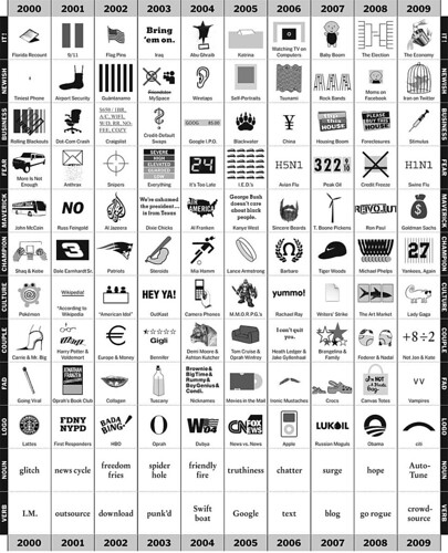
I meant to post this super cool infographic in January, but somehow it escaped me. Still, it was too good not to share with you. As part of an Op-Ed column for the New York Times written by Phillip Niemeyer this chart was designed to track the trends of the first century of the millennium year by year. Want to know the biggest couple of 2003? The verb of 2006? The logo of 2009? This chart will tell you! Not only is it well designed, but its also pretty funny; the drawings that illustrate the info are quite clever!
No comments :
Post a Comment