Did you guys watch the Super Bowl yesterday? I have to admit, it was pretty hard for me. My hubby and I are die hard Patriots fans and so we spent most of the game so nervous we could barely contain ourselves. But sports are fun, right? Ha! Needless to say, we were elated with the outcome and I now feel better about posting my annual Super Bowl round up (for a trip back in time, see the wrap ups for 2009, 2010, 2011, 2013, and 2014).
Also, what did you think of Katy Perry's halftime show? I was surprised with how much I enjoyed it; especially the Missy Elliot guest appearance and the dancing sharks!
Without further ado, click through the link below to see the best commercials from the big game.
Have you been watching the World Cup? As a sports fanatic, I have been watching the games non-stop and was, like all of America, heartbroken to see the USA team lose yesterday. Especially given the heroics of Tim Howard, our stalwart keeper, and the heart and soul the team had demonstrated in getting out of the group of death. But I was always so nervous watching their games (the Portugal matchnearly killed me!) that it will be much more relaxing to watch the games from here on out since I am not particularly invested in their outcome (though I do like the Netherlands!).
Anywho, I saw this beautiful project by Maan Design Studio that involves the creation of abstract, patterned stamps in the national colors of all 34 teams in the World Cup and thought it would be fun to share. While it is sort of hard to determine which design accords to which country—since so many flags feature the same primary colors—the linear interplay and minimal visuals still make for a gorgeous result. I particularly love how the project logo has been designed to look like a post office cancelation mark; when you scroll through the stamp images it looks like each one is being cancelled in turn. Very clever!
See all of the images here and learn more about Maan Design Studio here.
(from top to bottom, countries represented are: Argentina, the United States, Korea Republic, Greece, Colombia)
I am still working furiously to meet a dissertation deadline (which may or may not have passed two weeks ago, ha!) and finish up some archival research here in D.C. But I wanted to take a quick moment to share this beautiful video BOUNCE in honor today's opening of the 2014 World Cup. You know I have a soft spot for when sports meets design, and thus I couldn't wait to share this gorgeously shot, uplifting little film with you. Made by French filmmaker Guillaume Blanchet, it was filmed during two years' worth of Blanchet's international travels and has already been nominated for a ton of awards.
Sports can divide us, unite us, throw us in a pit of despair (holler, Prince Bride reference!) or elevate us to the joyous heights of victory. I am sure we will see all that and more on tap for the World Cup and I can't wait! But for now, back to writing!
Did you watch the Closing Ceremonies of the Olympics last night? I have been a rabid Olympics viewer for the past two+ weeks, so I knew I wouldn't miss it. And just like the Opening Ceremonies, the visuals of the event were spectacular. Like the aquatic scene (above) where thousands of performers wearing shimmering silver suits undulated through the computer animated water like a school of fish.
Or this section of the ceremony where performers took on the role of elegant, soaring cranes—a direct nod to the next winter games host: South Korea.
Where the Opening Ceremonies dealt with Russian history in general, this event was more a look at Russia's contribution to culture. There was therefore a beautiful, dream-like section devoted to Marc Chagall with tiny nods to Malevich; weirdly, there no real references to other important Russian visual artists like the Constructivists (Rodchenko anyone?). Maybe that's just the art history nerd in me wanting more!
There was also a very cool section honoring Russian literature, which uses the computerized stage to project 3D renderings of swirling, page-turning books. Very cool!
Later, during the handover to the Korean Olympic officials, the cranes returned and 'flew' below beautiful illuminated tapestries of light in the shape of large, time-honored trees.
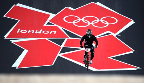
Have you been watching the Olympic Games? As you may remember (from here), I am obsessed with the Olympics and, consequently, have been glued to the events for the past several days. I think our neighbors think I am crazy with all the chanting U-S-A going on in our apartment, ha!
Anyway, I realized that I have yet to share my thoughts on the Olympic graphic identity for the Sochi Games. Have you seen the designs? The overall style is based on a traditional Russian patchwork pattern that has been faceted and digitized and reprinted in a bright rainbow of colors (ironic, no?). Not surprisingly, I love the color palette and the idea of the quilt patterning, but I think the execution is pretty busy. The individual patches in the quilt are made of patterns that contrast a bit too much, are a bit too loud, but that's just my humble opinion. What do you think?
Overall I think the design isn't the worst we've seen lately but shows a lack of imagination. Why does every Olympic logo have to have an silly overly stylized typeface? And what's with "Hot Cool Yours" as a slogan? It seems like a bad Russian translation and makes no sense. It's like an SNL parody! Generally I think the designers—this identity was done by Interbrand—would do well with following the K.I.S.S. rule: keep it simple, stupid! The final poster, above, is therefore my favorite. The elegant transition between the peaks of the mountains and the peaks of the waves works well as an all-over patterning behind the basic type treatment.
What do you think of the designs? Are there things you love? Parts you hate? Let me know in the comments!
p.s. I can't decide how I feel about the torch . . . what do you think?
p.p.s. In case you think I am just a whiny design nerd, check out this gallery of previous Olympic posters (the early ones are so gorgeous, but Torino is holding up well!) and my post about it here.
*Fun fact: did you know that the 1984 Olympics in Los Angeles—home of Hollywood—were the first to feature a mascot like that? But at least Sam the Eagle was cute!
Did you watch the Superbowl last night? I am actually a huge football nerd, so I wouldn't have missed it (I was also rooting for the Seahawks, so the outcome was awesome!). But I have to admit that most of the fun of the 'big game' yesterday—given the lopsided outcome—was the halftime show and commercials. I was skeptical about Bruno Mars performing but he was awesome! I loved the styling of the whole thing, from the costumes to the sweet dance moves. They even managed to merge his peppy swag with the angsty rock of Red Hot Chili Peppers, which I didn't think was possible!
Anyway, in keeping with my yearly tradition, here is a round up of my favorite commercials this year (and here are the past posts from 2009, 2010, 2011, and 2013). Overall, I thought the quality was not bad and was happy with the fact that there were very few objectifications of women or croaking frogs . . .
MY TOP TWO
Animal commercials get me every time!
HONORABLE MENTIONS
It's hard to beat the Muppets and Terry Crews, but the sheer silliness of the Tim Tebow 'no contract' idea might top it.
THE TEAR JERKERS
Soldiers coming home and cancer—tough themes for beer and car commercials, but these were done really well.
BEST VISUAL EFFECTS
This was a pretty simple ad, but I thought the styling and cinematography were stunning.
What were your favorite ads? Did I miss any? Let me know in the comments!
What are you up to this weekend? I am pretty much on lockdown here. It's supposed to rain in New York and I working on a two-week take home test for school—the last assignment I have to complete before I can officially call myself PhD ABD (all but dissertation).
Whatever you have planned, here are some fun links to tide you over until you can get them started.
As the events surrounding the Boston Marathon bombings continue to unfold in terrifying fashion this morning, I thought you might need a little bit of positive energy. This wonderful clip from The Colbert Report on Tuesday strikes the perfect note, a combination of disgust for the perpetrators, admiration for the city of Boston and it's strong citizens and hope for a better humanity going forward.
Let us all hope that this manhunt for the remaining suspect is resolved quickly and safely. In the meantime, for all my friends, family and fellow readers in Boston please stay inside and be careful. Our thoughts are with you.
I come from a family of marathoners. Between my parents and my in-laws they have run over ten of them. I have long been an attendee of these epic races, often finding myself with tears in my eyes at the incredible outpouring of support for the runners among the thousands of spectators. Perfect strangers cheering each other on. Helping each other. Marathons—particularly the Boston Marathon, which falls on a state-wide holiday so that the whole city seems to turn out to watch the race—are uplifting, spirit-building events. Yesterday that was shattered along with the explosions.
As President Obama said, Boston is a strong city and will certainly come together in support and healing. To do that we must follow the wise words of Mr. Rogers: when you are scared, when something bad happens, just look for the helpers. I am proud to say that my father-in-law, a surgeon at a Boston-area hospital, was among those helpers yesterday, as were countless other brave people who raced towards the blast sites to tend to the injured and ailing. As we learn more about these inhumane events, we can at least rest easy knowing that many showed the greatest humanity and selflessness in the face of the horrible acts of a few.
I hope you take time to hug the ones you love—marathoners or not—today. Normal posts will resume tomorrow. Until then, please join me in praying for all those affected.
Have you seen this new Air Jordan ad? It's so cool! I love when advertisers try to do something a little different: the illuminated ball, the funky outfits, the marching band. Very sweet.
Did you guys watch the Super Bowl last night? I was very disappointed with the results (if my beloved Tom Tom can't win, I don't want the Ravens to! Plus how epic would that 49ers comeback have been?). My hands down favorite part, despite being a die-hard football fan, was the half time show. Beyonce blew it out of the water! I wish Jay-Z had joined her instead of Destiny's Child, but the technical aspects of the show were out of control (many secretly feel she caused the blackout)! Did you miss it? Watch the whole thing show here.
My other favorite part of the game, as always, were the commercials. This year I was pleasantly surprised by the options. There were the standard sexy lady and silly options, but if you looked beyond that there were actually some very clever ideas. Here are my favorites . . .
Cheeky car commercials . . .
Funny food features:
The NFL had some amazing ideas . . .
And then there were the tearjerkers (that Bud ad, oh man!) . . .
Which ones were your favorites? Let me know in the comments!
Well, I don't know about you, but I am ready for the weekend. And what better way to kick it off then with a handful of videos to inspire, amaze and incite goofy laughter (we all need some of that every once in a while). Without further ado, I present . . .
. . . a beautiful view of our mother earth from above. NPR has used this as evidence of a fascinating (and terrifying) new source of light in the middle of the barely inhabited plains of North Dakota. No matter what caused them or what they entail, the lights in these NASA videos are breathtaking . . .
. . . a crazy video of 138 people breaking the vertical skydiving record last year and forming complex patterns in the sky while they do it (insert dumbfounded, mouth agape image here) . . .
Hope you have a lovely weekend! I am traveling all of next week in Seattle & San Francisco so posts will be sporadic. But I will be back at the end of the month with fun recaps of all my west coast escapades.
Whoa, where did this week go? I have a theory that short weeks at work are actually the craziest; at least for me, I have less time to cram in more work than usual to make up for my hedonistic laziness over the long weekend. Pair that with a very busy exhibition schedule here at the Whitney Museum and I am wiped!
Do you have anything fun planned this weekend? My in-laws are coming to visit and, given the beautiful weather forecast, I am hoping to take them here and here (maybe with a stop here for a cookie in between). Hope you are going to be taking advantage of the crisp fall air wherever you are!
For those of you who are stuck inside for the next couple days, or just want some procrastination inspiration at work today, here are some fun things to keep you busy:
Have you seen these amazing video clips by sports reporter Michael Smith for ESPN? Presenting stats through animated illustration, he creates these short segments for the show he co-hosts called Numbers Never Lie. I love them! And not just because I am a die hard Pats fan and this clip is talking about the trouble with the Jets . . .
Check more out here (and see more of my sports obsessions here).
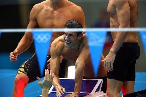
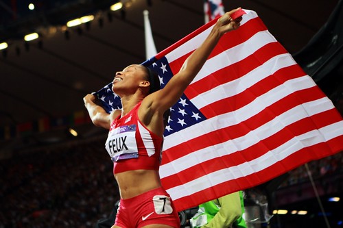
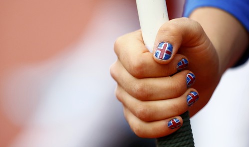
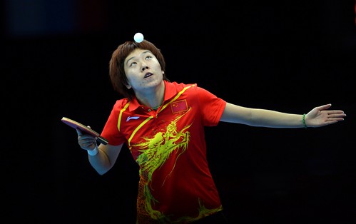
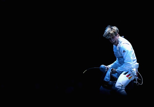
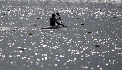
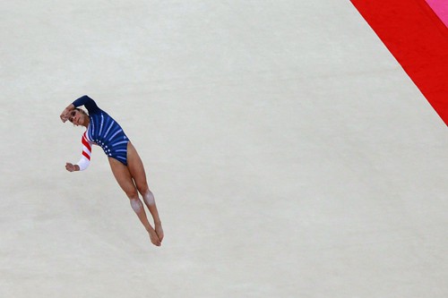
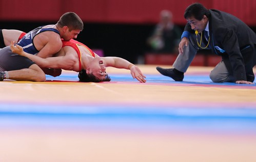
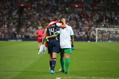
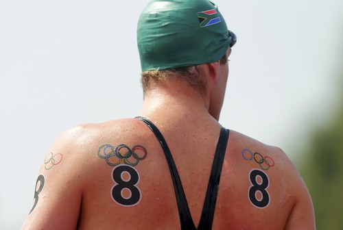
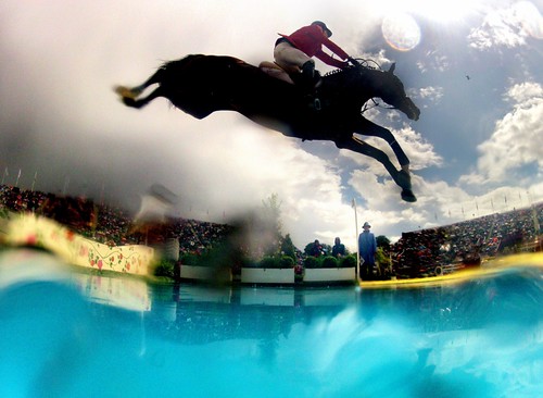
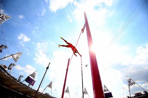
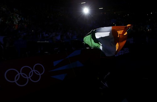
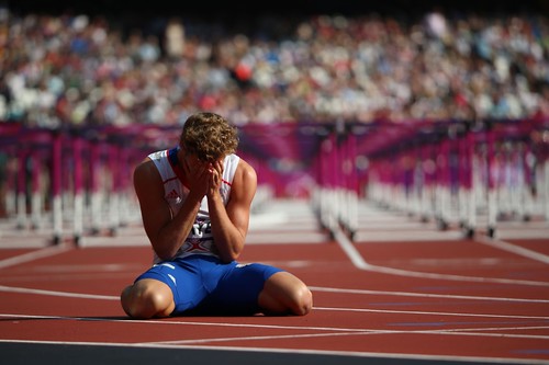
This is a long post, hope you are still with me! I am sure you are tired of my Olympics obsession by now, but maybe you aren't tired of seeing beautiful, moving photographs? One of the things that is so amazing about the Olympics is that they only come around every four years, so athletes are left alternately heartbroken or triumphant when their event is over and they look back on the years of work they put in to get to that moment. It makes for some pretty dramatic photos and the New York Times photographers have been there every step of the way. Above are some of my favorites, but you can see many more stunning shots here.
On another note, remember earlier this week when I said I was struggling to find inspiration these days? Well, no more! Here are some amazing, invigorating, fun things I have seen around the interwebs recently and wanted to share . . .