A JOLT OF SUMMER FOR A COLD DAY

colorful wall mural, photo by studio diy
german poster design from 1962

wooden blocks on sale at the fine little day shop
be kind poster

I am officially tired of all this hangover winter weather! The calendar says it's spring but the thermometer says it's 40 degrees outside. What gives?!

I'm not waiting anymore for a punch of color and fun in the sun. So here are a couple photos that are helping me pretend shorts and summer sun are right around the corner . . . . hope they help pick you up too! Now bring on the ice cream!


JOHN PHILIPPS EMSLIE


You know I love a good map or infographic. Though usually I fall for super modern, minimalist versions I have to say I love these beautiful images from the mid to late 1800s by the British artist John Philips Emslie. I love the rich detail and beautiful coloration, particularly in the 'Telescopic View of the Moon' poster. Gorgeous, right?

See more here and here.


FEDERICO BABINA ROCKS


I just stumbled across the design work and illustration of artist Federico Babina. He has created several different poster series (on sale in his shop here), but my favorites are his "Archicine" works—posters featuring bold renderings of iconic buildings from classic movies—and his "Archist" works—posters that transform buildings into stylistic embodiments of the work of famous artists.


The Warhol and Fontana posters are my favorite (so dead on!). What are yours?See more on his website here.
p.s. Like colorful minimalist posters? So do I! Exhibit A, B, C, D, E, F, G . . . the list could go on and on. Go exploring in the archives (search box at right) and I guarantee you will find something fun. :) 
(thanks to Feel Desain and Dezeen for the tips)  

FROM FASHION AD TO FRAGONARD: ETIENNE LAVIE'S PARISIAN PROJECT


This is such a cool project! It proves that Paris has an almost spiritual connection to art and culture unlike any other city in the world. Created by French artist Etienne Lavie, it's called OMG Who Stole My Ads. What does it entail? Well Lavie selectively replaced the advertisements on billboards and signposts all over Paris with beautiful reproductions of canonical paintings from the annals of art history. Suddenly that old cell phone ad—which you hurried by on your way to the metro—is subsumed by Delacroix's heroic and inspirational Liberty Leading the People (coincidentally owned by the Louvre). And the metro billboard which used to feature waifish models prancing about in expensive clothing, now boasts buxom beauties in shimmering robes in the form of Fragonard's Rinaldo in the Garden of the Palace of Armida. Much better, right?I love how this takes public art to a whole new level, literally brings masterpieces to the streets. Unfortunately the images above are only mock ups; Lavie actually photographed the street scenes and then photoshopped the paintings in. But oh how lovely to have it executed in real life!Read more about the project here and see more images on Lavie's website here.
(thanks to My Modern Met for the tip


"CHART ART" BY WEAVERSOFSOUTHSEA


I have long been a fan of what I colloquially call "chart art"—a poster or print laid out in a simple geometric grid featuring bold, graphic illustrations (see here, here, here, here or here as proof). So, needless to say, I instantly fell in love with the works on offer at the Etsy shop WeaversofSouthSea. It doesn't hurt that their designs on based on some of my favorite things like dogs (exhibit a) and Eames designs (exhibit b). Plus they have several gorgeous illustrations of city landscapes, including beautiful renditions of my own New York City at night and during the day. The icing on the cake? All of the prints are priced insanely reasonably at $19. Good design + great prices = a win win!

Check out all the graphic goodies on sale at WeaversofSouthSea here.


OSCAR FASHION OVER THE YEARS


Did you watch the Oscars on Sunday night? I watched with my friend Amanda and had a blast! I love Ellen and thought she was a really sweet response to the coarseness of Seth MacFarlene last year. The Glenda the Good Witch gag, for instance, had me in stitches.But let's be real, the true fun is always analyzing the fashion! Lupita Nyong'o's ice blue gown was my hands down favorite, but Jennifer Lawrence looked gorgeous too. Who was your pick for best dressed?No matter who you loved, this info graphic—of the gowns worn by all the best actress winners since 1929—is a fabulous look through fashion history. Check out Cher in 1968, and Loretta Young in 1948! Designed by Paul North, this graphic will be marketed as a poster soon; head over here for more information.

THE COLOR OF MUSIC


I love this idea! Created by the design collective Dorothy, this poster enumerates 154 bands with colorful band titles including obvious ones like Black Savage but also obscure options like The Blue Nile. Clearly it combines the best of all my favorite things: color wheels, bright graphic patterns, popular music and clever/humorous graphic design.

Pick up your own copy at Fab here or on the Dorothy website here. Learn more about Dorothy here.


BON VOYAGE


I am getting so excited for our trip to France this fall for our first anniversary (where does the time go?!). I have been planning our itinerary for the last several days and mentally salivating over all the delicious crepes and confections I will be eating over there. It's going to be awesome!

In the meantime, to keep my excitement running high I wanted to share these beautiful travel posters designed by Neil Stevens. These are the three main hubs of our trip—New York, Paris and Nice/Côte d'Azur—and would look gorgeous hung together on a wall, don't you think?

I love how bold and graphic they are and highly recommend you take a look at all the other gorgeous options here. Also, take a peak at his other posters here; they are fabulous!


PARIS vs. NEW YORK


Guess what, guys? I am going to France this fall! Woohoo! For Christmas my husband gave me a ten day trip to Paris (and beyond!) to celebrate our first wedding anniversary. And I am so excited! We are just starting to plan the trip so if you have any recommendations, lay them on me! We are thinking several days in Paris and then taking the TGV to Provence and the Côte d' Azur. With lots of wine tasting along the way, clearly.

Anyway, all my recent daydreams about France have made me realize I never shared this wonderful graphic series with you: Paris versus New York. What started out as a simple side-by-side look at two of the world's most cultured cities has blossomed into a book and a postcard set. I snagged the book recently and can attest that it is awesome! It's the perfect combination of bold, colorful and cleverly insightful; a great coffee table book!

 Vahram Muratyan is the graphic design genius behind the series and you can learn more about him here. And see more examples of NYC vs. Paris here.


COLORFUL CANISTERS


I agree with swiss-miss, this print is fabulous! It reminds me of this and this. Clearly I have a certain aesthetic I like, but there is something about a colorful grid of objects that always looks clean and cool.

Bonus, the print is only $11.95 at the Etsy store PigeonEditions. Check out the whole store here.


SIMON C. PAGE & RARE MINIMUM


I just discovered the very cool design work by Simon C. Page for his shop Rare Minimum. This is Colossal has a great post about Page's most recent poster (above), which creates an incredibly colorful optical illusion through geometry alone. But how great are the posters below?  


I love the bold, clever simplicity of his work and am thinking they would love pretty good on my walls . . . bonus: his shop offers prints, cards and cool silhouette cut outs for your buying pleasure.
Check out Rare Minimum here, Page's portfolio here, and his blog here.
  

I WANT THIS.


I really don't have anything more to add. I LOVE this print by Pop Chart Lab. It's a graphic history of cameras; what's not to love for a photo geek like me? Oh, and it's only $22. Yes, please.

Check it out here.


(thanks to swiss-miss for the tip)


LE TOUR ON FIRE

CRAYON ON FIRE, TOUR DE FRANCE

If you have been reading this blog for a while, you know that I am a reasonably big sports junkie. In the last couple of years, I have turned my athletic interests to the Tour de France, an epic bike race that lasts three weeks, covers over 2,170 miles and has been likened to running several marathons a week (for all three weeks) and climbing three Mount Everests. Intense! I also like it, of course, because the best climber (aka the 'King of the Mountains') of each stage gets to wear this sweet red polka dot jersey.

This year's race has been particularly exciting: lots of impressive performances and even intrigue! One stage was rocked by flat tires caused by tacks a spectator had thrown on the road. Scary.

But what does this have to do with art, design and all things obsessive imagist? Well I recently stumbled upon 
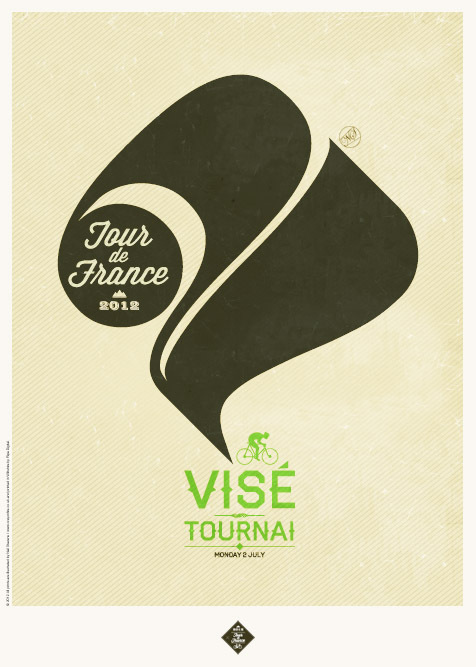
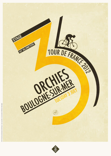
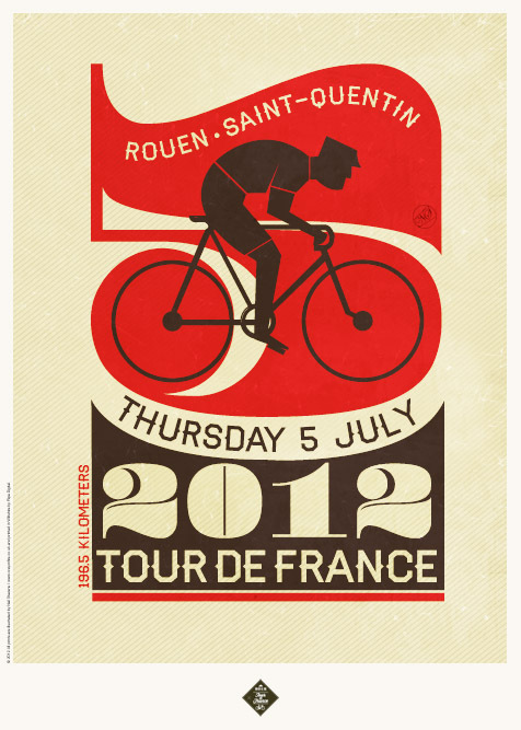
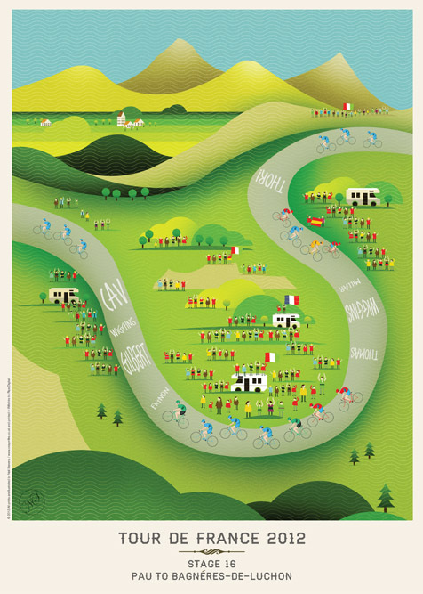
these beautiful Tour de France posters created by Neil Stevens, brilliant mind behind the Crayonfire studio, which feature typographic and illustrative designs of each stage of the race, all while capturing the drama and excitement of it all. I may just have to pick up one of these posters for my tour-obsessed Dad or Dad-in-Law . . .

Check out all of the designs for 2012 here and the rest of his portfolio here.