EMILY McDOWELL IS SENSITIVE


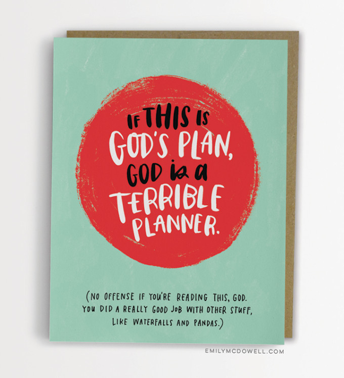
Earlier this year I wrote about Emily McDowell's hilarious line of birthday, wedding and baby cards. Well now, as a cancer survivor who knows all too well how hard it is to comfort someone going through a truly tragic occurrence, McDowell has launched a new line (actually her second such line; the first launched last year) of cards that get to the heart of the matter, providing support in a humorous yet heartfelt way. Battling my own health issues this summer, these cards really resonate with me in their unabashed takedown of all the lame (and sometimes just downright wrong!) things that people say when what is happening to you is so overwhelming (and often foreign to them) that they don't know how to comfort you even when they want to quite badly.She calls them empathy cards. And not only are they funny and honest, they are also beautifully illustrated with McDowell's characteristic handwritten typography. Check them all out here; next time you get tongue-tied by tragedy you can rely on McDowell to help you know what to say.(Thanks to A Cup of Jo for the tip.)

FOLLOW UP: TOMMY PEREZ'S INSTAGRAM


Whoa! Yesterday, after posting about the inspiring series A to Zöe created by adorable dad Tommy Perez, I fell down a Googling black hole and go lost in the magic and colorful wonder of Perez's instagram account. Seriously, this guy is incredible! Turns out Perez not only has major typography skills, but also is a master at logo design, paper cutting and illustration. If I had taken a different fork in the road and had decided to become a graphic designer instead of an art historian, I would want to become this guy's best friend, stat. As is, I kind of want to anyway!Check out Perez's instagram account and personal website here for a look into his beautiful, vivid work.

ONE DAD'S EDIBLE TYPOGRAPHY LESSONS


Oh man, I am pretty sure Tommy Perez just won the cool dad of the year award. Turns out he is teaching his two year old daughter, Zöe, about the alphabet (and design! and food!) by shaping her snacks into letters in various beautiful styles—script, sans serif, capitalized, lowercase and more—and then photographing her adorable little hand as she samples the results.The series is called from A to Zöeand shows off Perez's impressive styling and graphic design skills. He posts his images on Instagram and I highly recommend you follow along. In the meantime, you can learn more about Perez, his daughter, and the whole series at Fast Co. here.

SHAKE SHACK'S RETRO CHIC GRAPHIC IDENTITY

paula scher's design identity for shake shack

paula scher's design identity for shake shack

paula scher's design identity for shake shack

paula scher's design identity for shake shack

paula scher's design identity for shake shack
A couple months ago the beloved NYC burger spot, Shake Shack, went public on the stock market. Having in recent years expanded to cities across the country, indeed across the world, Shake Shack is looking to be our era's foodie version of McDonalds. In honor of their growing global recognition, Fast Co. Design did a very cool blogpost about the details behind the retro icons, friendly fonts and neon colors used in the business's unique graphic identity. Turns out the impressive Paula Scher of Pentagram originally planned this singular identity to match the restaurant's original location—a modernist metal shed in New York's Madison Square Park—and has been surprised to see how well the look has translated to countless other locations across the globe. Even though Shake Shack opened over a decade ago (in 2004), the identity still looks as fresh as ever—a sure sign of a job well done.Needless to say, the article is worth a read, as it provides some fascinating insights into the 'look' of a brand that seems to have every detail down pat and has always struck me as the perfect combination of sophistication and silliness.Read all about it here, and learn more about Paula Scher here.

OFF THE WALL: 'SMOOTHER THAN A FRESH JAR OF SKIPPY' DESKTOP WALLPAPER

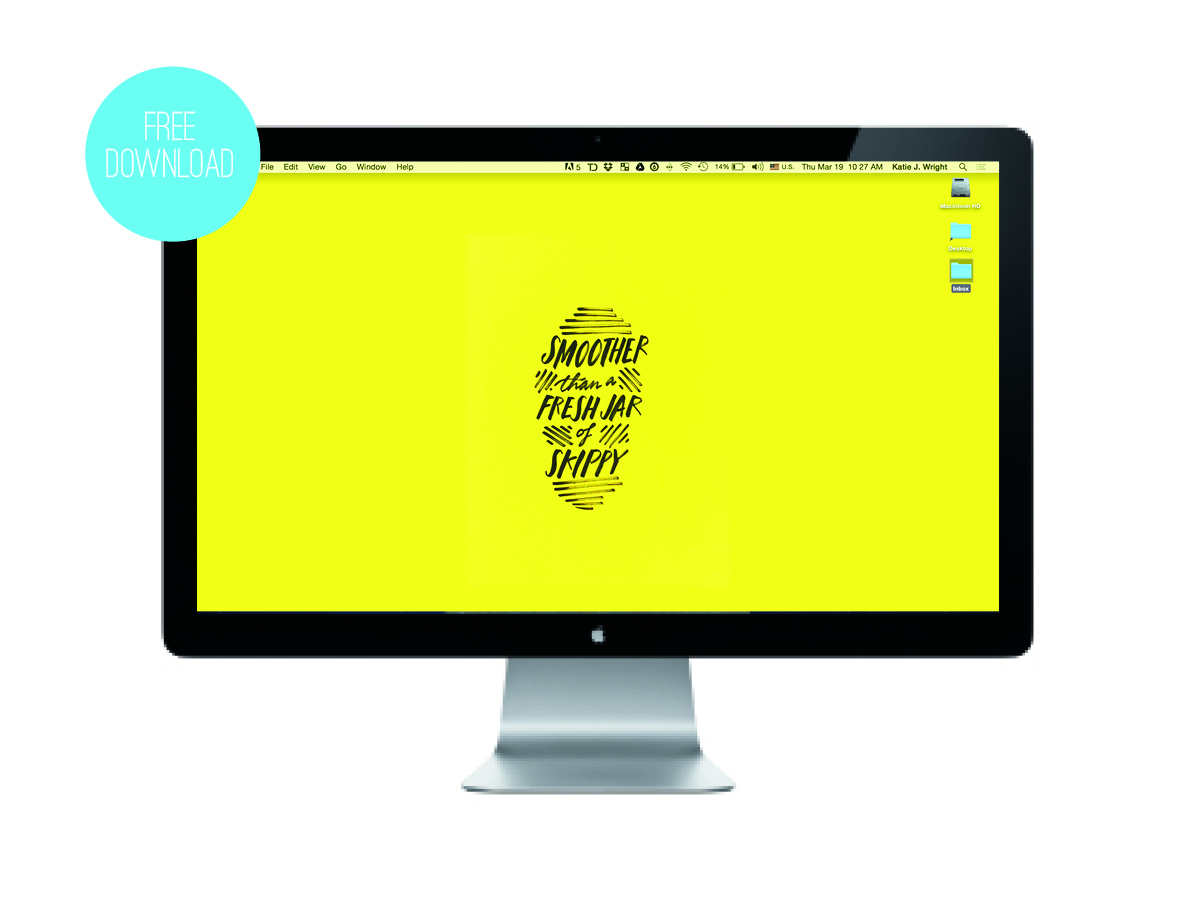
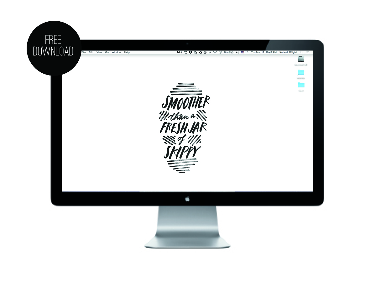
off the wall free wallpaper download from the obsessive imagist

off the wall free wallpaper download from the obsessive imagist

off the wall free wallpaper download from the obsessive imagist

off the wall free wallpaper download from the obsessive imagist

Oh my goodness, is it really possible that it has been a year since I posted a new desktop wallpaper in my 'Off the Wall' series? Sheesh! I need to step up my game!

Well, like everyone on planet earth, I have been jammin' out to the fabulous 'Uptown Funk' by Bruno Mars and thought it would be fun to do the song's best line as a desktop download for you. If you like it you can grab two versions—in yellow or black/white—for free at the links below:


And, of course, you can see past 'Off the Wall' free desktop downloads here.


(Also, if you like the hand drawn typography of this design, feel free to check out all my skills with the pen in my calligraphy Etsy shop, The Wright Hand, here.)


POP CHART LAB, REVISITED


A couple of years ago I wrote about a poster compendium of historical camera models, designed by Pop Chart Lab, that I was pining after. Recently I stumbled across an article on Design Milk chronicling the epic talents of the design duo behind Pop Chart Lab—Patrick Mulligan and Ben Gibson—and I immediately went back to check out the latest goodies they have in their shop. I immediately fell into a pit of infographic inspiration and, commensurately, now have a lot more Pop Chart items on my to do list. Below are a couple of my favorites.


Which one would you pick? There are so many more to choose from over at their shop here.


DO NOT OPEN: LETTERING BY ERIC MARINOVICH


Every once in a while I find myself in the throes of major creative envy. Spying Eric Marinovich's lettering project "Do Not Open"—wherein he will address a padded envelope to you in super fancy typography—I felt a internal pang of jealousy mixed with a major amount of awe. I mean, really, how fabulous are these? Too pretty for the mail, you would have to frame them and hang them proudly in your house, right? They would make a good housewarming gift or simply a 'hey-you-love-typography-so-here's-something-special-to-make-you-smile' gift. You know, for type nerds like me. (wink wink)
Check more of Marinovich's fancy pen styling here.


EMILY McDOWELL IS HILARIOUS


How hilarious are these cards by illustrator Emily McDowell? So after greeting can seem staid or trite—after all people have been having babies and birthdays since the beginning of time and it's hard to find new ways to say 'Yay!'. But McDowell has some pretty clever takes on celebrating those important moments in our lives, plus some lovely illustrations to boot. Bonus: she also reproduces her work onto bags, mugs, prints and more. I recommend you check them all out here.

(Thanks to A Cup of Jo for the tip!)