EMILY McDOWELL IS SENSITIVE


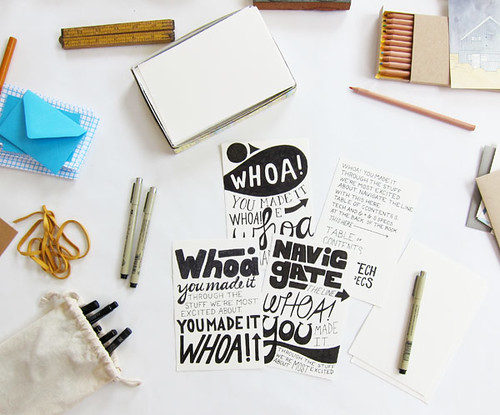
Earlier this year I wrote about Emily McDowell's hilarious line of birthday, wedding and baby cards. Well now, as a cancer survivor who knows all too well how hard it is to comfort someone going through a truly tragic occurrence, McDowell has launched a new line (actually her second such line; the first launched last year) of cards that get to the heart of the matter, providing support in a humorous yet heartfelt way. Battling my own health issues this summer, these cards really resonate with me in their unabashed takedown of all the lame (and sometimes just downright wrong!) things that people say when what is happening to you is so overwhelming (and often foreign to them) that they don't know how to comfort you even when they want to quite badly.She calls them empathy cards. And not only are they funny and honest, they are also beautifully illustrated with McDowell's characteristic handwritten typography. Check them all out here; next time you get tongue-tied by tragedy you can rely on McDowell to help you know what to say.(Thanks to A Cup of Jo for the tip.)


OFF THE WALL: 'SMOOTHER THAN A FRESH JAR OF SKIPPY' DESKTOP WALLPAPER

off the wall free wallpaper download from the obsessive imagist

off the wall free wallpaper download from the obsessive imagist

off the wall free wallpaper download from the obsessive imagist

off the wall free wallpaper download from the obsessive imagist

Oh my goodness, is it really possible that it has been a year since I posted a new desktop wallpaper in my 'Off the Wall' series? Sheesh! I need to step up my game!

Well, like everyone on planet earth, I have been jammin' out to the fabulous 'Uptown Funk' by Bruno Mars and thought it would be fun to do the song's best line as a desktop download for you. If you like it you can grab two versions—in yellow or black/white—for free at the links below:


And, of course, you can see past 'Off the Wall' free desktop downloads here.


(Also, if you like the hand drawn typography of this design, feel free to check out all my skills with the pen in my calligraphy Etsy shop, The Wright Hand, here.)


COLOR AS MEDIUM: CORRIE BALDAUF


This is just my kind of project: part art-focused, part literature-focused, all obsessive.  Since 2013, artist Corrie Baldauf has meticulously chronicled all 2,900 references to color in David Foster Wallace's magnum opus Infinite Jest, all while tracking her progress on Twitter. Marking each chromatic notation with a correspondingly colored flag, the result is a beautiful fringe along the book's edge that opens to groupings of geometric shapes on the inner page spreads. I love the visualization of Baldauf's close reading through bright stripes of color and started to get curious about the rest of Baldauf's work . . . 


 . . . needless to say, the rest of her oeuvre is equally brilliant (pun intended)! Utilizing bold contrasting color as a medium all its own, Baldauf's work plays with a bevy of materials, processes and experiences. Plus, there is some sweet hand-lettered pieces thrown in for good measure. 

I highly recommend you check out Baldauf's website here.


(thanks to Hyperallergic for the Infinite Jest tip)

DO NOT OPEN: LETTERING BY ERIC MARINOVICH


Every once in a while I find myself in the throes of major creative envy. Spying Eric Marinovich's lettering project "Do Not Open"—wherein he will address a padded envelope to you in super fancy typography—I felt a internal pang of jealousy mixed with a major amount of awe. I mean, really, how fabulous are these? Too pretty for the mail, you would have to frame them and hang them proudly in your house, right? They would make a good housewarming gift or simply a 'hey-you-love-typography-so-here's-something-special-to-make-you-smile' gift. You know, for type nerds like me. (wink wink)
Check more of Marinovich's fancy pen styling here.


EMILY McDOWELL IS HILARIOUS


How hilarious are these cards by illustrator Emily McDowell? So after greeting can seem staid or trite—after all people have been having babies and birthdays since the beginning of time and it's hard to find new ways to say 'Yay!'. But McDowell has some pretty clever takes on celebrating those important moments in our lives, plus some lovely illustrations to boot. Bonus: she also reproduces her work onto bags, mugs, prints and more. I recommend you check them all out here.

(Thanks to A Cup of Jo for the tip!)


BIG NEWS! NEW ETSY SHOP AND MAJOR GIVEAWAY!


Guys, guys! Big news! I have been keeping this little side project under wraps for a while now and am delighted to finally be able to share it with you. Are you ready?

I am opening another Etsy store! Long time readers may remember my old stationery store on Etsy and I have decided to revamp my love all of things paper with a new shop focused on my handwritten typography. Namely, the shop—entitled 'The Wright Hand'—is based on my obsessive interest in hand addressing envelopes with all sorts of pretty styles and fonts. Have a wedding, party, or holiday coming up and need to send out invites or a mailing? I am your gal! Prices start at just $2.00 an envelope and I will do as many or as few as you like. Do me a favor and check out the goodness and get all the details about making a purchase here.


To celebrate the launch of this fabulously fun new venture, I am doing a big giveaway! You could win $50 of envelope addressing services (enough to do 25 envelopes!) simply by following these easy as pie steps:

one | head over to The Wright Hand shop and pick out your favorite style of envelope

two | leave a comment here with your choice

bonus | for a bonus entry (your name will be entered in the drawing twice) tweet about the giveaway with the hashtag #thewrighthand and mention my account @katiejosephson 

bonus x 2 | for a second bonus entry (your name will be entered in the drawing three times) head over to facebook and like 'The Wright Hand' post on the obsessive imagist fan page


That's it! One winner will be choosen at random next Friday, May 16! Good luck!


WEBSITE WONDER

JEN MUSSARI WEBSITE JEN MUSSARI WEBSITE INFO JEN MUSSARI WEBSITE WORKS JEN MUSSARI WEBSITE LINKS


Have you entered gone to a website—and pow!—been smacked in the face by awesomeness? Well that's how I felt when I saw the website of graphic designer and hand-letterer extraordinaire Jen Mussari. I love how interactive it is; the thumbnail images of her works can be moved around the screen and hop out of the way when you select one of the links. It's cool and understated without skimping on personality. Brava, Ms. Mussari!

Check it all out here.


SCOUT'S HONOR

SCOUT'S HONOR CO.
SCOUT'S HONOR CO.
SCOUT'S HONOR CO.


Last week the wonderful blog frolic! introduced me to Scout's Honor: a paper company and blog that is the perfect combination of preppy and summer camp fun, complete with fabulous hand-drawn text and illustration.


SCOUT'S HONOR CO. STUDIO TOUR


As if I wasn't already completely enamored, then Brooklyn Bride featured a studio tour with Scout's Honor and introduced me to their super cool work space. And now I am completely smitten.

Check out Scout's Honor Co. yourself here.


JME FOOD

JAMIE OLIVER FOODJAMIE OLIVER FOOD

JAMIE OLIVER FOODJAMIE OLIVER FOOD

JAMIE OLIVER FOODJAMIE OLIVER FOOD


Have you all seen the amazing packaging for Jamie Oliver's preserved foods? I love the mixture of handwritten, stamped and illustrative labels. Not to mention the brightly colored jar caps! It makes each jar look like it came out of that friend-who-makes-gourmet-cooking-always-look-effortless-and-fun's kitchen: thoughtful, homemade, and personal. Brilliant! (But really, I wouldn't expect anything less from Jamie!)

Check out all of Oliver's 'Nibbles, Snacks and Gourmet Condiment' line, called Jme Food, here. And take a peak at all the great stuff--interviews, recipes, Jamie's magazine etc.--at his website proper here.


(You can also see the previous packaging for Jamie's line, which was equally fabulous, here and here.)