DIANA BELTRAN HERRERA: BIRDS OF A (PAPER) FEATHER

paper sculpture, bright colors, birds, stamps, art

paper sculpture, bright colors, birds, stamps, art

paper sculpture, bright colors, birds, stamps, art

paper sculpture, bright colors, birds, stamps, art

paper sculpture, bright colors, birds, stamps, art

paper sculpture, bright colors, birds, stamps, art

paper sculpture, bright colors, birds, stamps, art
How gorgeous are these sculptures by Colombian artist Diana Beltran Herrera?!! I have regularly been accused by my friends of being 'obsessive' (a descriptor I have eponymously embraced!) with a crazy dedication to all things paper. But Beltran Herrera takes this to a whole new level. She uses countless tiny, intricately cut pieces of paper to craft impressively lifelike and expressive sculptures of flora and fauna. She is a particular master of birds, pursuing a series of sculptures on British birds, hummingbirds, birds of paradise and more. And how cool are those 3D stamp scenes? I want to own one sooooo bad . . . . Check out more of her truly breathtaking work on her (beautiful!) website here.Thanks to Miss Moss for the tip
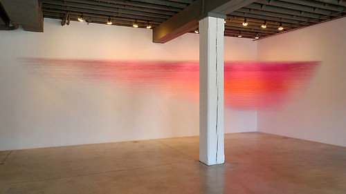
p.s. Beltran Herrera's work totally reminds me of this!

COLOR AS MEDIUM: CORRIE BALDAUF


This is just my kind of project: part art-focused, part literature-focused, all obsessive.  Since 2013, artist Corrie Baldauf has meticulously chronicled all 2,900 references to color in David Foster Wallace's magnum opus Infinite Jest, all while tracking her progress on Twitter. Marking each chromatic notation with a correspondingly colored flag, the result is a beautiful fringe along the book's edge that opens to groupings of geometric shapes on the inner page spreads. I love the visualization of Baldauf's close reading through bright stripes of color and started to get curious about the rest of Baldauf's work . . . 


 . . . needless to say, the rest of her oeuvre is equally brilliant (pun intended)! Utilizing bold contrasting color as a medium all its own, Baldauf's work plays with a bevy of materials, processes and experiences. Plus, there is some sweet hand-lettered pieces thrown in for good measure. 

I highly recommend you check out Baldauf's website here.


(thanks to Hyperallergic for the Infinite Jest tip)

THROUGH THE WIRE


How cool are these? Artist Gavin Worth creates beautiful line drawings out of wire and mounts them onto simple wooden bases (reminds me of these!). With just a few short strokes he can communicate the essence of human emotion and interpersonal relationships. The result is both moving and poignant and I would love to have one of these on my mantle.

Check out his gorgeous portfolio here.

And have a great weekend!


LETTERHEAD LOVE

LETTERHEADY

My amazing friend, Kat, turned me onto the super cool blog Letterheady a couple of months ago and I have been meaning to post about it since. Letterheady is basically a tumblr-style blog dedicated to the beauty of personal and corporate stationery over the years. For paper-minded and graphic design-focused nerds like myself, it is pure visual heaven.

Let's take a look at just a sampling of some awesome examples, listed by their writers/owners, shall we?

Above: Andy Warhol, from an unknown date


LETTERHEADY   LETTERHEADY

Left: Groucho Marx, 1943
Right: Bob Kane, the creator of Batman, c. 1943


LETTERHEADY

Above: Ray Charles, 1990 (tied for my favorite, with FLW's below)


LETTERHEADY   LETTERHEADY

Left: Ben Chapman, actor who played Gillman in 1954 film The Creatures of the Black Lagoon, 1981
Right: Muppets, Inc., later to be known as Jim Henson Productions, 1963


LETTERHEADY

Above: Frank Lloyd Wright, 1946 (totally awesome, right?)


LETTERHEADY   LETTERHEADY

Left: Woody Harrelson, 1988
Right: Daily Planet, fictional stationery used during Superman: The Movie, 1978


LETTERHEADY

Above: Charles Schultz, 1958


Cool, right? See many many more examples at Letterheady here.


LONDON UNDERGROUND: ARTISTS' TUBE MAP

        LONDON TUBE MAP
LONDON TUBE MAPLONDON TUBE MAP
          LONDON TUBE MAP
LONDON TUBE MAPLONDON TUBE MAP
        LONDON TUBE MAP

Boy is New York behind the times! Apparently the London Transport Authority has been commissioning artists to design the cover of their underground map since 2004. How cool is that? And the artists they have worked with are big names: such as David Shrigley, Liam Gillick, Barbara Kruger and now (bottom-most image) Yayoi Kusama. Oh and did I mention that the Whitney Museum is hosting a Kusama retrospective this summer? As the queen of polka dots, Kusama is pretty much my artistic hero. I can't wait to see the show!

In the meantime, I would advise you to check out all the other artist maps for Art of the Underground here.


STRING IT UP: ANNE LINDBERG

ANNE LINDBERG
ANNE LINDBERG
ANNE LINDBERG
ANNE LINDBERG
ANNE LINDBERG
ANNE LINDBERG
ANNE LINDBERG


No matter how popular string art gets, I still find myself amazed by the complexity and craftsmanship some artists can achieve with the medium. Anne Lindberg's installations (above) are no exception. I love how she manages to make transform the series of strings into a luminous cloud; I am sure they are positively gorgeous in person.


Check out more of Lindberg's work on her website here. Watch a video about her installation for an exhibition at the Bemis Center for Contemporary Arts (in Omaha, NE) here.


Thanks to minimalissimo for the tip.


DAVID SMITH: CUBES AND ANARCHY

DAVID SMITH
DAVID SMITH
DAVID SMITH
DAVID SMITH


For the past several months I have been working on an amazing exhibition—David Smith: Cubes and Anarchy—as part of my job at the Whitney Museum of American Art. The show opened yesterday and, if I do say so myself, it looks great! The idea behind the exhibition is to trace the artist's geometric impulse throughout his career, trying to debunk the myth that Smith was purely an Abstract Expressionist who only turned to concrete form at the end of his life. With that said, the show features exquisite examples of the artist's work from the 1930s through the 1960s, including his rarely exhibited, but thoroughly fascinating, photographs.


David Smith: Cubes and Anarchy is on view until January 8, 2012. Learn more about the exhibition here.


Image credits (bottom three works):

David Smith (1906-1965)

Zig III, 1961 (detail)
Painted steel
93 x 124 x 61 in. (236.2 x 315.0 x 154.9 cm)
The Estate of David Smith, New York, Courtesy Gagosian Gallery
© The Estate of David Smith/Licensed by VAGA, New York.
Photo by Jerry L. Thompson

David Smith (1906-1965)

Cubi I, 1963
Stainless steel
124 x 34 ½ x 33 ½ in. (315 x 87.6 x 85.1 cm)
Detroit Institute of Arts, Founders Society Purchase, Special Purchase Fund
© The Estate of David Smith/Licensed by VAGA, New York.
Photo © Detroit Institute of Arts/licensed by The Bridgeman Art Library

David Smith (1906-1965)

Untitled, 1963
Spray enamel on paper
14 x 19 in. (35.6 x 48.3 cm)
Jon and Mary Shirley
© The Estate of David Smith/Licensed by VAGA, New York.
Photo courtesy of the Estate of David Smith, NY