THIS AMERICAN (GRAPHIC) LIFE

THIS AMERICAN LIFE INFOGRAPHIC


THIS AMERICAN LIFE INFOGRAPHIC


THIS AMERICAN LIFE INFOGRAPHIC


THIS AMERICAN LIFE INFOGRAPHIC


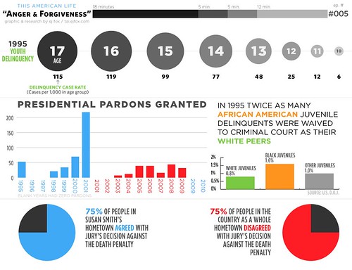
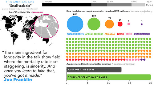
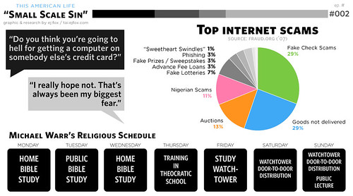
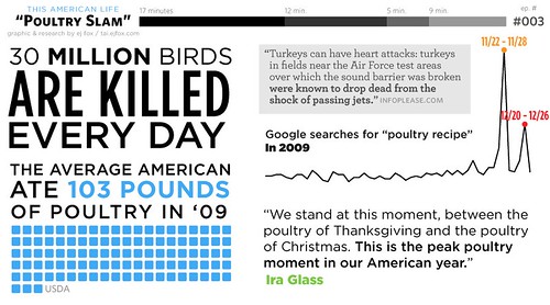
I am a huge 'This American Life' nerd. I listen to a lot of NPR shows, but 'This American Life' is by far my favorite. Ira Glass may be dorky, but he feels like a old friend and I could listen to him tell stories all day.

That said, I was pretty excited to come across a website that has devoted itself to representing, in graphic form, every 'This American Life' episode ever made. I love it.

Check out the goodness here.

(Update: all graphs are researched and designed by E. J. Fox. Thanks for the heads up Elizabeth!)


HAPPY FOURTH OF JULY!

Let Freedom Ring: A Fourth of July Infographic from Quicken Loans


Are you guys celebrating the Fourth of July? This evening my husband and I are headed to Vermont with his family for the week. I am looking forward to cookouts, lazy afternoon naps, diving into good books, and cold swims in the pond. I hope you have something equally fun, summery and relaxing planned!

To get you in the spirit, I wanted to share this cool infographic designed by Ghergich & Co. for Quicken Loans. My favorite part about infographics is how they manage to teach us in a dynamic and visually-engaging way; there are lots of cool facts in this one that I didn't know (the Fourth of July didn't become an official holiday until 1870!). Maybe you will learn something new too!

Have a great holiday! I will see you back here next Monday!


JOHN PHILIPPS EMSLIE


You know I love a good map or infographic. Though usually I fall for super modern, minimalist versions I have to say I love these beautiful images from the mid to late 1800s by the British artist John Philips Emslie. I love the rich detail and beautiful coloration, particularly in the 'Telescopic View of the Moon' poster. Gorgeous, right?

See more here and here.


WHAT COLOR WILL BE IT TODAY IN MILAN?


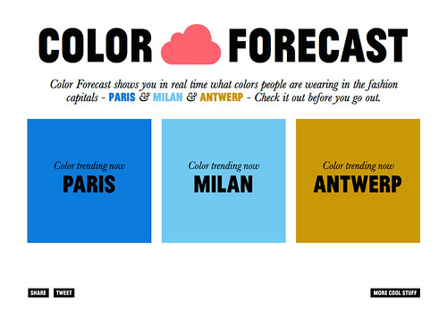
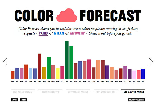
How cool is this concept? The French clothing line Pimkie has used selectively placed web cams and high tech programming to analyze the latest colors in fashion in Paris, Milan and Antwerp* in real time. Crazy, right? Their site updates every ten minutes with a live reading of the most popular color people are wearing in each city. Here was this morning's forecast, as of 8:30am EST:

COLOR FORECAST 8


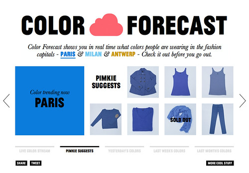
It also lets you go one level deeper and buy clothes in that day's color. Smart, right?

COLOR FORECAST 9

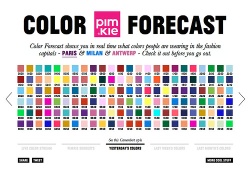
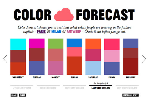
And, for infographic lovers like me, they also show you all the colors they collected the day before, the week before and the month before. The overall results are a little bit more earth toned than I might wear myself (my outfits have been compared to sherbet by my coworkers), but the overall design is still super cool.

COLOR FORECAST 3
COLOR FORECAST 4
COLOR FORECAST 5


Check it all out for yourself here.


(thanks to Design Mom for the tip)


*My question is where is New York's forecast?! And how can you tell when people are wearing stripes? :)


POP CHART LAB, REVISITED


A couple of years ago I wrote about a poster compendium of historical camera models, designed by Pop Chart Lab, that I was pining after. Recently I stumbled across an article on Design Milk chronicling the epic talents of the design duo behind Pop Chart Lab—Patrick Mulligan and Ben Gibson—and I immediately went back to check out the latest goodies they have in their shop. I immediately fell into a pit of infographic inspiration and, commensurately, now have a lot more Pop Chart items on my to do list. Below are a couple of my favorites.


Which one would you pick? There are so many more to choose from over at their shop here.


PICTURING THE PAST 10 YEARS

PICTURING THE PAST 10 YEARS


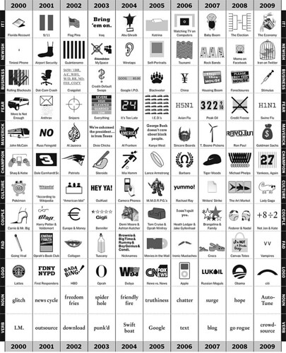
I meant to post this super cool infographic in January, but somehow it escaped me. Still, it was too good not to share with you. As part of an Op-Ed column for the New York Times written by Phillip Niemeyer this chart was designed to track the trends of the first century of the millennium year by year. Want to know the biggest couple of 2003? The verb of 2006? The logo of 2009? This chart will tell you! Not only is it well designed, but its also pretty funny; the drawings that illustrate the info are quite clever!

Check it out (larger) on NYTimes here.


BLOG CRUSH: DESIGNWORKLIFE

KATIE EVANS
DELANE MEADOWS
NATHAN GODDING
HYPERAKT


In August I wrote this post about a blog I had a crush on. Well, recently I have realized that I have a new crush (see this post): designworklife. designworklife is written by the people behind the incredible New York City-based design firm Seamless Creative (check out their portfolio here). They update it daily with amazing projects ranging from student portfolios to corporate commissions. Do yourself a favor and bookmark it pronto!

Some of my favorite posts from designworklife of late, top to bottom:

(totally going on my wedding inspiration board!)

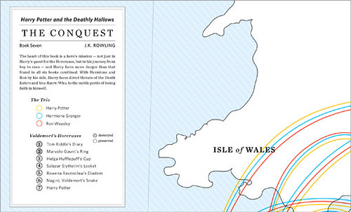
The Conquest by Delane Meadows, an infographic of the travels by characters in Harry Potter and the Deathly Hollows (awesome!)

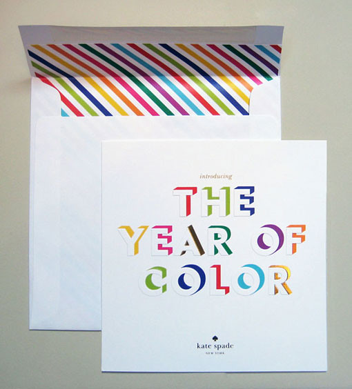
(can you tell I LOVE bright colors?!)

(sometimes I think everything should be produced in graphs and charts, like this book that I got for christmas)


p.s. Hope you all had a great weekend!