As promised, here is my recap of the talk I gave at the symposium in Toronto last weekend.
Hope you enjoy it! (Stick with me; it's a bit long!)
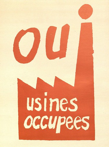
From the spring through the fall of 1968, students and workers across Asia, Europe and North America were emboldened to speak out against political and social injustice in their countries, demanding meaningful and immediate change. These protestors overwhelmingly relied on visual media to promote their cause; as a result the demonstration poster became a consummate example of the intersection between document and fine art, progress and subversion.
Specifically considering the student-led protests in Paris and Mexico City, this study argued that graphic art—in particular mass-produced silkscreen posters—provided the ideal platform for exposing corruption, rallying support, and distributing information amongst protesters. Posters were inexpensive and quick to produce, allowing movement leaders to constantly respond to events as they occurred. Using bold single-color graphics, these signs developed a visual vocabulary of dissent—replete with raised fists, barred mouths, zombie-like eyes, and helmeted police brutes—that helped to refine the character and ideals of the movement. Above all the protest poster was fittingly democratic, allowing the people involved to circumvent established, often government-run, media outlets, relay the important issues and reinvent the system from the ground up.
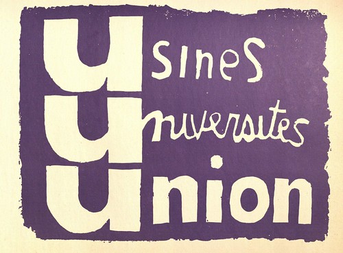
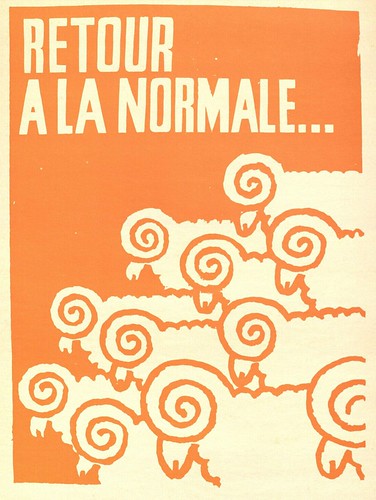
The posters above, created in Paris, represent the output of the anonymous art student collective the 'Atelier Populaire'. The Atelier took up residence in the Sorbonne’s art studios and quickly began making graphic art that responded to the developments of each day’s demonstrations. The simple slogans, clear yet casual style, and bold graphics of the above posters would become trademarks for the Atelier, in large part because they provided facile and enticing visual means of delivering information to any person passing by.
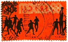
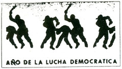
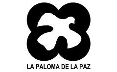
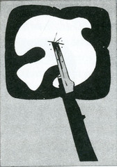
Amidst escalating violence in Mexico during the fall, an anonymous group of Mexican university students created an artistic collective modeled after the Atelier Populaire. Inspired by the artistic output in Paris, these students created posters that drew upon the Atelier visual language: clear stencil-like graphics, single-color printing, and short clever phrases. Yet beyond the inspiration gleaned from their French forerunners, the Mexican protestors also developed poster imagery in response to the promotional materials slowly being unveiled in preparation for the Olympic Games. A series of stamps featuring silhouetted athletes, designed to be placed end to end to create a continuous stream of motion, was re-conceived to show an unending stream of police beatings with the caption ‘Año de la Lucha Democratica’ (Year of the Democratic Fight). When the Olympic Design Committee started a campaign that flooded Mexico City with a stylized dove and the slogan "Everything is Possible in Peace", the student protestors riled against the government's hypocritical message, creating posters that showed the dove being stabbed. In this way, the poster reminded visitors that the staging of the Olympic Games came at great cost: the brutal suppression of the needs and rights of Mexican citizens.
I don't have the space (and you probably don't have the time!) to recount the complete argument of the paper. There is a lot more background that you should know about. Read more here and here. Still want to know more? Email me or leave a comment I will tell you anything you want to know!