DIANA BELTRAN HERRERA: BIRDS OF A (PAPER) FEATHER

paper sculpture, bright colors, birds, stamps, art

paper sculpture, bright colors, birds, stamps, art

paper sculpture, bright colors, birds, stamps, art

paper sculpture, bright colors, birds, stamps, art

paper sculpture, bright colors, birds, stamps, art

paper sculpture, bright colors, birds, stamps, art

paper sculpture, bright colors, birds, stamps, art
How gorgeous are these sculptures by Colombian artist Diana Beltran Herrera?!! I have regularly been accused by my friends of being 'obsessive' (a descriptor I have eponymously embraced!) with a crazy dedication to all things paper. But Beltran Herrera takes this to a whole new level. She uses countless tiny, intricately cut pieces of paper to craft impressively lifelike and expressive sculptures of flora and fauna. She is a particular master of birds, pursuing a series of sculptures on British birds, hummingbirds, birds of paradise and more. And how cool are those 3D stamp scenes? I want to own one sooooo bad . . . . Check out more of her truly breathtaking work on her (beautiful!) website here.Thanks to Miss Moss for the tip. 
p.s. Beltran Herrera's work totally reminds me of this!

TIPS FOR THE BEST VALENTINE'S CARE PACKAGE


I have a secret super power. No, it's not laser vision or the ability to fly—though that would be awesome—it's the power to put together a kick-butt care package. What's that you say? That's not worthy enough to merit super hero status? I believe my friends and family would beg to differ. In this era of instant, impersonal digital communication, nothing beats getting a good ol' care package (summer camp style) from a loved one full of goodies.

If you are interested in joining me in super hero status with your dearly beloved, click through to learn my tips and tricks . . . . 

NSS: RECAP, PART FOUR

I am super behind on my National Stationery Show recaps. I'm sorry! Somehow being on summer vacation is a big time commitment!

(This is the second to last recap and then we will fully return to our regularly scheduled programming . . . )


NSS: INK + WIT
NSS: INK + WIT
NSS: INK + WIT

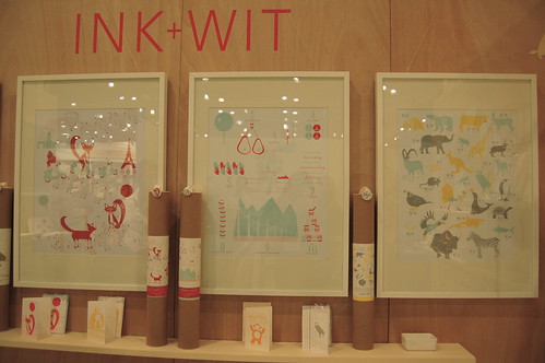
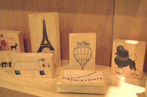
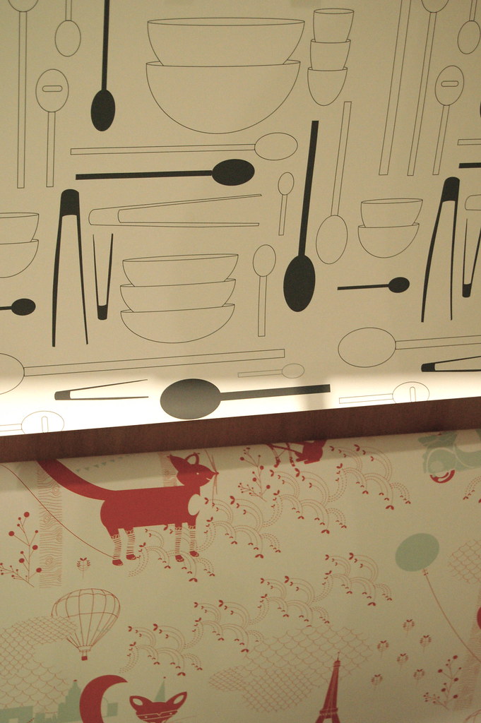
I had a great time talking with Tara at the lovely Ink + Wit booth. I loved her bright combos of light blue and red, interspersed with adorable animals and alphabet prints. Even so, the feeling behind Ink + Wit is sophisticated, fresh and modern. I would love to receive a present wrapped in one of their lovely papers and would absolutely die to own a set of the 'Paris'-themed rubber stamps. See more eye candy and inspiration here.


NSS: ALBERTINE PRESS & ANGELA LIGUORI

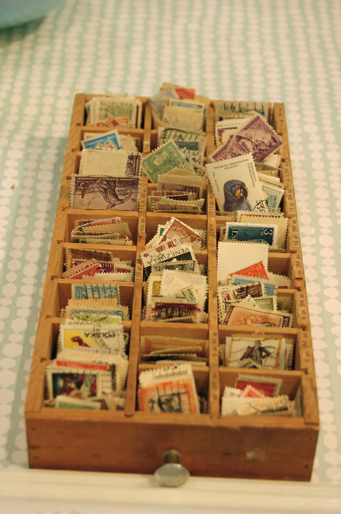
Another super source of eye candy was the booth featuring Boston-area Albertine Press and Carta Inc. The booth was beautifully decorated with light blue walls and bright white frames, all around paper products festooned with vintage stamps. They even encouraged visitors to page through their stamp collection and take a few samples with them! I left the booth with a tiny glassine envelope filled with stamps: a fabulous marketing tool and super-cool giveaway!

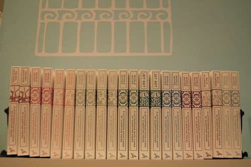
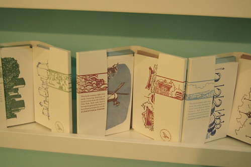
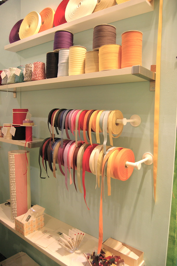
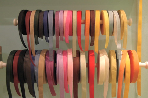
Accordingly, both studios are very inspired by vintage ephemera and stamps. Albertine had a huge display of card sets with brightly colored letterpress illustrations that reminded me of 1950s-era encyclopedias. I love the way they look in a row on a book shelf--so pretty! Angela Liguori's side (Carta Inc.) featured spools of beautiful Italian cotton ribbon and hand-lettered cards with vintage stamps. All in all, everything from both studios looked bright and fresh and visually stunning. I would highly recommend a visit to the Albertine website here and the Carta Inc site here.


NSS: SUSYJACK*
NSS: SUSYJACK*
NSS: SUSYJACK*
NSS: SUSYJACK*
NSS: SUSYJACK*

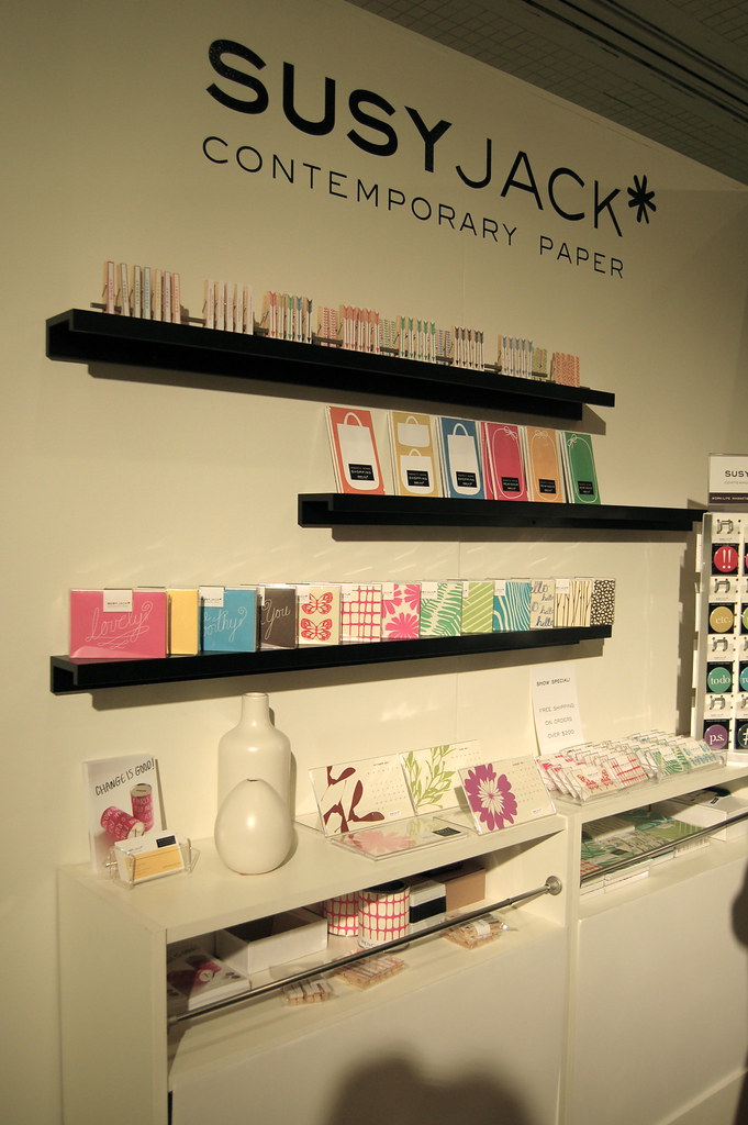
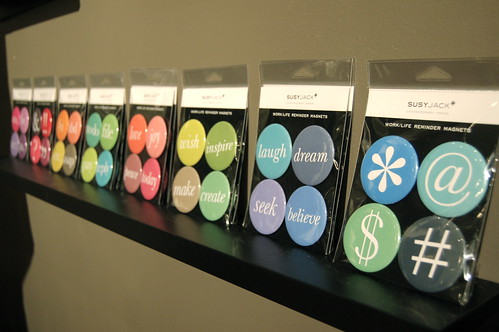
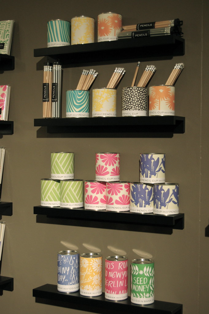
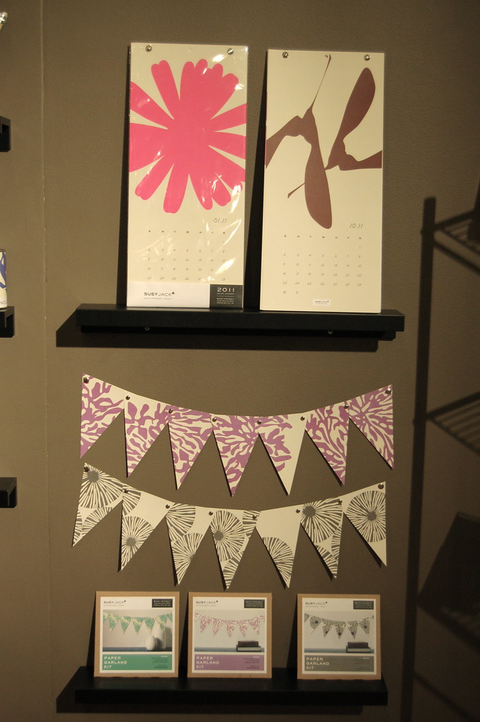
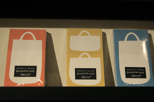
Another huge locus of inspiration and visitor buzz was the susyjack* booth. I had an amazing chat with owner and designer Susan Connor (who writes one of my favorite blogs, heysusy*, here), who kindly spent a long time sharing some of her trade secrets with me. And boy is she on point! Every single product in the susyjack* line fits into a unique style: bold, graphic shapes and clean, bright colors. I was almost giddy to see some of her new goods; I love the shopping bag note pads (perfect for grocery lists!), the paper pennants/garlands, and the growing line of magnets. Lovely, lovely, lovely. Check out more here.


The final NSS post will be on Thursday. Thanks for bearing with me!


NSS 2011: BOLD AND BRIGHT

This post is part of an ongoing round up of my favorite vendors at this year's National Stationery Show. Head here to find out more about the series.
NSS 2011: Up Up Creative

NSS 2011: Up Up Creative NSS 2011: Up Up Creative
NSS 2011: Up Up Creative


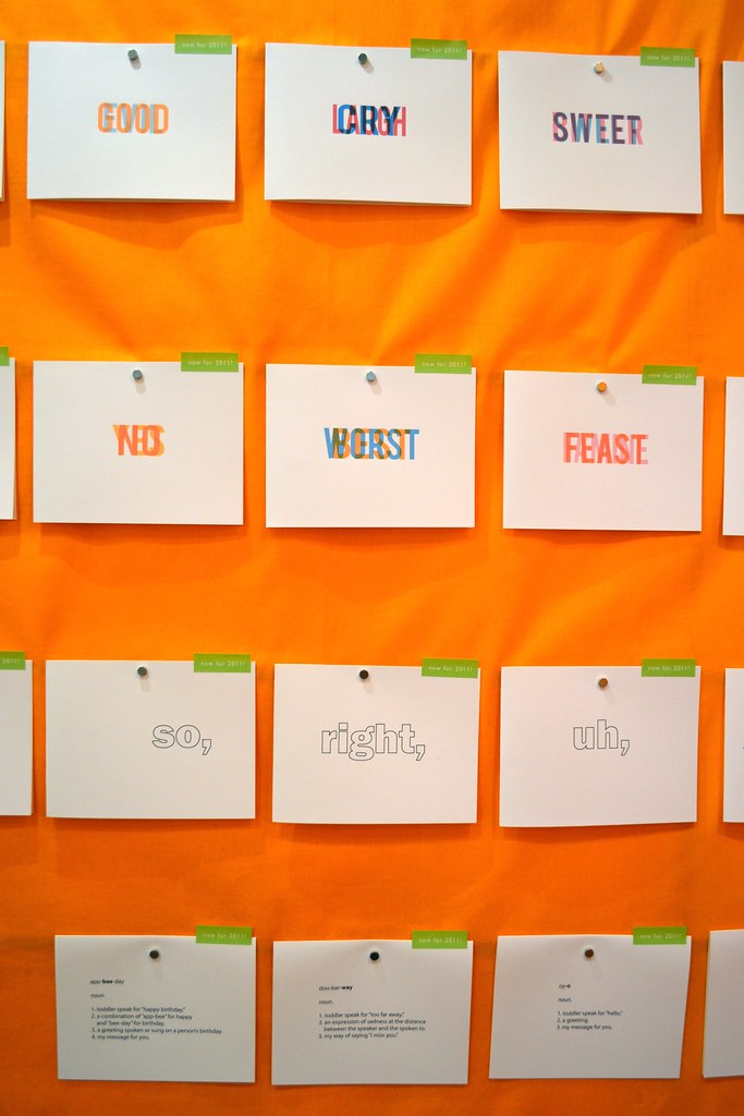
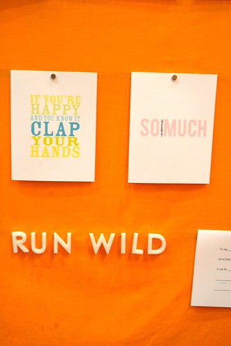
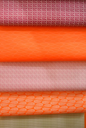
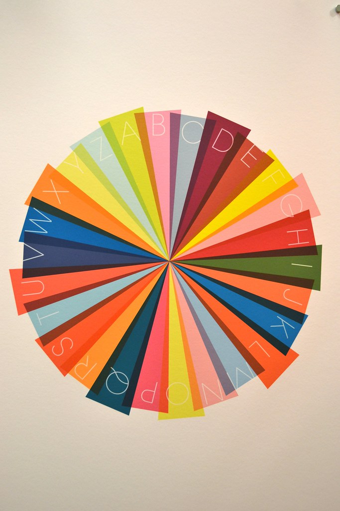
If you read this blog you know that I am obsessed with bright colors. Not surprisingly, Up Up Creative's orange-a-licious (yes, I just made that up and, yes, that is the only way to adequately convey my point) booth full of beautiful wrapping paper, bold block letter cards and (GASP!) a color wheel totally stole my heart. And if the products didn't do enough, it turns out owner and designer Julie Green is super lovely. What a treat to meet her!

Check out all the stuff on the up and up here.


NSS 2011: Mr. Boddington's Studio
NSS 2011: Mr. Boddington's Studio NSS 2011: Mr. Boddington's Studio
NSS 2011: Mr. Boddington's Studio
NSS 2011: Mr. Boddington's Studio NSS 2011: Mr. Boddington's Studio
NSS 2011: Mr. Boddington's Studio


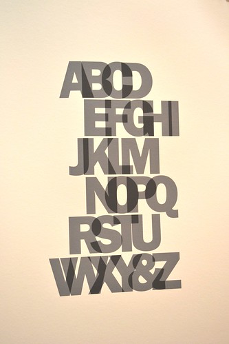
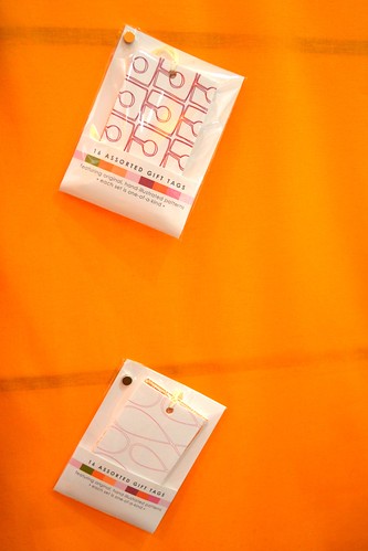
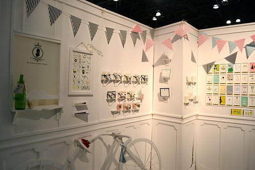
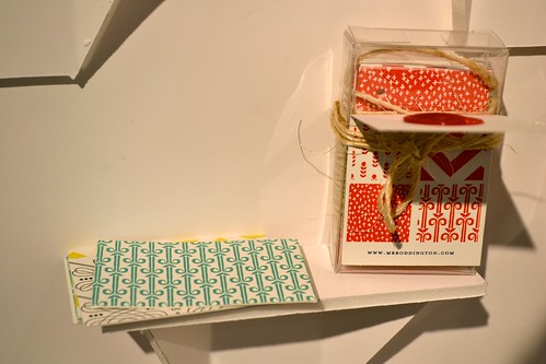
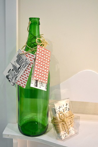
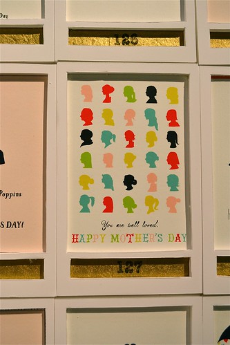
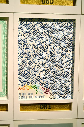
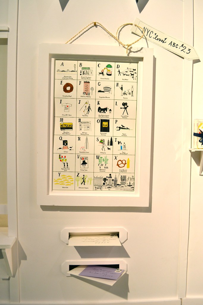
On that note, the sweet Jessie behind Mr. Boddington's Studio has reason to be especially proud this year. Not only was her booth beautiful as usual, but the new line is great! I love the patterns and colors of the new hang tags, the wonderful new cards (how great is that rainbow design) and the illustrated alphabet poster. All of the Boddington goods have this sweet, fun, sophistication that I totally love. Even better? Jessie has informed me that Mr. Boddington's Studio has a new offshoot: Mr. Boddington's Nephew, a group of e-cards for Paperless Post. I am currently planning an engagement party for this summer and I will totally be using one of their designs!

Check out the new goodies at the Boddington studio here.


GUILFORD CRAFT FAIR 2014


This past weekend, amidst grey skies and perfectly cool nap weather, I went on my annual pilgrimage to the Guilford Craft Fair. As always, I managed to find a lot of fun things to buy and even more fun things to drool over. Without further ado, here are some talented craftspeople with work you should definitely check out . . .

above, Hoist Away Bags are made with recycled sails in bold, bright colors. Every detail has been taken into consideration for these totes, pouches and dop kits—from a detailed label that explains where your sails came from to zippered pockets and drawstring tops to keep everything in order. Each bag even comes with a bottle opener keychain! As a sailing nerd I couldn't live without one of these and I suggest you check out their Etsy shop to pick up your own.


I also discovered the beautiful ceramic work of Kiara Matos. I love the sophisticated colors, patterns and organic references in her work. Couldn't you just picture these on your dresser or side table?

As usual, however, the majority of my drool worthy moments were from jewelry vendors. Here are some pieces I had my eye on:


The setting on this ring is an innovative take on a solitaire setting, no? It's not quite my style but I still think its amazing! Made by Stephen Leblanc.


I have written about Dana and David's work before and their work continues to impress. How gorgeous is this pendant necklace?


Dahlia Kanner was another new-to-me jeweler with very cool things this year. I particularly love her collections focused on dots and scribbled lines. Pretty, right?


Rachel Atherley's jewelry deals with natural patterns like snakeskin and leopard spots to create a lovely interplay between light and shadow. How chic is that cuff bracelet?


I also fell in love with Naomi Grace McNeill's jewelry featuring hexagon and honeycomb patterns. Somehow she manages to make her work seem tough and delicate, abstract and scientifically exacting at the same time. A mean feat with spectacular, unique results.


Last but not least, I wanted to share the work of Martha Sullivan—another new discovery for me. I fell instantly in love with her simple rings and bought one in silver for myself. Now I have my eye on one of those diamond bands, but isn't that petal pattern pretty too? Decisions, decisions!

That's all folks! Back to regular posts tomorrow.