This week's 'In the Classroom' focuses on the psychedelic concert posters that abounded in San Francisco during the the mid- and late-1960s. Designed in a time of dance hall concerts, anti-war movements and widespread drug use, the designers of these posters focused on jarring and vibrating colors, nearly illegible text and bold graphics to force the reader into spending time deciphering the work. San Francisco, as a walking city, was the perfect place to jumpstart a poster tradition.
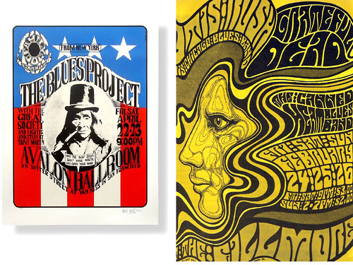
Wes Wilson was a college drop out looking for a job when he met Bob Carr in late 1960. Carr was a commercial printer who quickly took Wilson under his wing to show him the ropes of printing and graphic design. Wilson would later become one of the most renowned and respected poster designers of the 1960s, specializing in seductive figures, near liquid lettering and bold graphic imagery. As one of the biographies states on his website:
Wilson generally ignored the basic rules of poster design — simplicity and maximum readability — and created works of art related to counter cultural sensibilities and sometimes his personal experiences. Often there was a very short lead time, three to four days, for the design and printing of the posters. He delivered his art work directly to the printer; Graham [his boss] only rarely saw the design before it was printed. Wilson simply asserted the authority of art and by default was granted an extraordinary degree of artistic freedom. Such freedom became the norm of the San Francisco rock poster movement.Read and see more about the awesome Wes Wilson on his website here.
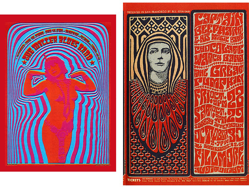
Victor Moscoso was one of the most famous poster artists of the 1960s. His website gives this succinct biography:
Victor Moscoso's posters for the Family Dog dance-concerts at the Avalon Ballroom and his Neon Rose posters for the Matrix were to bring his work international attention in the "Summer of Love", 1967. Within a year lightning would strike again in the form of the Underground Comix. As one of the Zap Comix Artists, Moscoso's work, once again received international attention. Moscoso's comix and poster work has continued up to the present and includes album covers for musicians such as Jerry Garcia, Bob Wier, Herbie Hancock, and David Grisman, t-shirts, billboards, animated commercials for radio stations (for which he received 2 CLIO's) and more.Read and see more on his very psychedelic website here.
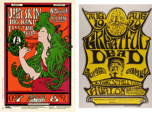
Last but not least is the duo Stanley 'Mouse' Miller and Alton Kelley, colloquially known as "Mouse and Kelley". Miller grew up in Detroit and kickstarted his artistic career by detailing cars and bikes with crazy, interlocking patterns and designs. By 1965 Miller had traveled to San Francisco and was soon creating posters for the Avalon Ballroom and, later, the infamous dance hall known as the Fillmore. Kelley, a native of Maine who grew up in Connecticut, had a similarly early love of hot rods and cars and quickly became known for pin-striping motorcycle gas tanks in his neighborhood. After working for Sikorsky Helicopters for a couple years, Kelley made his way out to San Francisco in 1964. He would soon meet Miller and they would help found a consortium of poets, artists, and musicians called the Family Dog. Over the years Miller and Kelley would work together to create some of the most important poster art of the era, focusing on Art Nouveau lettering and esoteric cultural references. Most notably Miller and Kelley are credited with establishing the iconic emblems for two of America's most famous bands: the skull and roses of the Grateful Dead and the beetles and wings of Journey.
This is great post. Thanks for putting this out.
ReplyDeleteI always thought there was a connection between the Broadside movement and the poster movement.
Pre and intersecting the broadsides were usually collaborations between graphic artists and poets that started showing up in clubs in the 60S.
Know anything about them?
Thank you for your kind words. The original idea behind this blog was to chronicle things that inspire me and this graphic design class seems to be a wellspring of inspiration! I am glad to hear that it is exciting for others too.
ReplyDeleteYour thoughts are broadsides are really interesting. I do think there is a connection since both served as pivotal sources of information in their day - modern news criers if you will. I wish I could say I know a lot about them, but I don't. I can tell you that these artists were also playing off the broadside/poster style of early 20th circus and carnival ads with bright, often patriotic, colors and intriguing graphics. But the contemporaneous broadsides of the 1960s are certainly worth looking into.
Thanks for the great comment!