
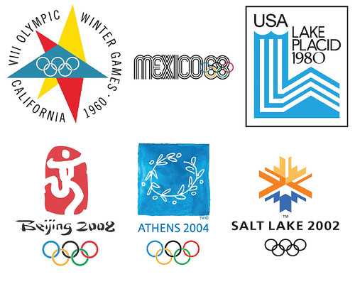
Because I am on spring break from grad school this week, this 'In this Classroom' is taking a slightly different tack. Instead of chronicling what we would have discussed in class yesterday, I wanted to tell you a little bit about what I am researching for my final paper. While my actual argument is still undefined, I will give you a general idea of what I am interested in studying. Having watched the Vancouver Olympics religiously (as noted here), I started to realize the importance of the overall graphic design program to the advertisement, history, and purpose of the games. I hope to study the Olympic emblem (logo plus Olympic rings) and poster design of some of the more famous, graphically speaking, games over the last century. Specifically, I am interested in learning how and when the design team uses the emblem/poster as a way of portraying host city, host country or international communities. For countries like the United States, who has hosted a total of eight Winter and Summer Games, how does the design change from venue to venue and what does that say about our changes in values over the years?
In turn, I want to find out whether the designers reference current politics or fine art trends. Is the design abstract or literal? At point does the interruption of technology--the advent of television, the internet and digital media--begin to change the way designs are conceived, implemented and understood?
I hope this post hasn't bored you. There isn't a lot written on this subject and I am really interested to hear what you think of my ideas. Leave me a note in the comment section! If I get some positive feedback maybe I will do another post to share what I have discovered once I finish my research.
(Also, if you are brave, you can check out the controversial emblem for the London 2012 games here. I have to say that I think it is terrible!)
I would give my right arm for that '72 Munich poster. RIGHT ARM! Great blog, Katie!
ReplyDeletelove the Stockholm one... very cool post!
ReplyDeleteThanks for the kind words! I am glad you like the posters. These five are some of my favorites though I am surprised at how much the designs have varied from year to year. Keep up the comments; I love them!
ReplyDelete