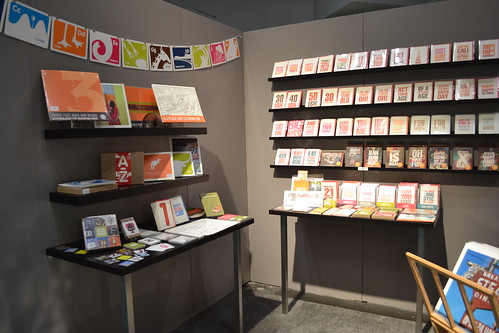
Guess what, guys? Today is the last National Stationery Show post! Remember yesterday's whirlwind wrap up? Well today is part two! So strap in, get psyched and click through a big ol' batch of eye candy . . .
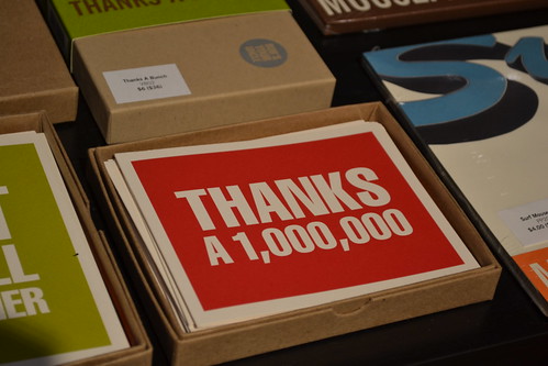
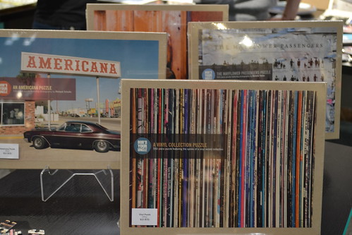
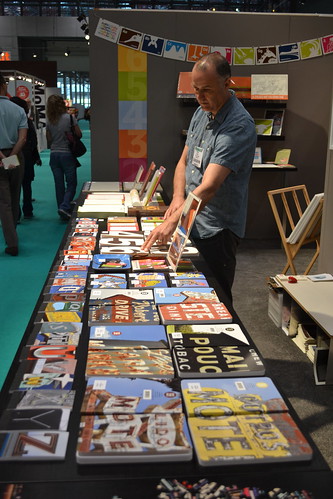
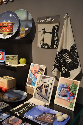
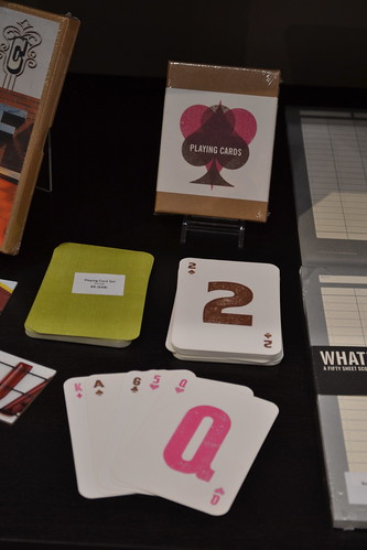
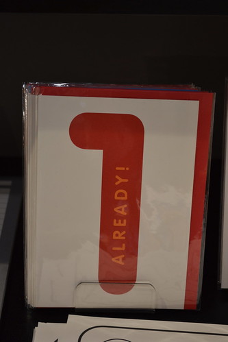
Bob's Your Uncle has been an o.i. favorite since long before my trips to NSS. And somehow their amazing stuff never fails to disappoint. This year's lineup was overflowing with amazing goodies that maintained their distinctive style: a bit quirky, a touch of vintage, and a whole bunch of fun!
main attraction: the new puzzles (especially the record album puzzle, which is a photo of the owner's collection!) and the bold thank you cards
get more of info on their: website
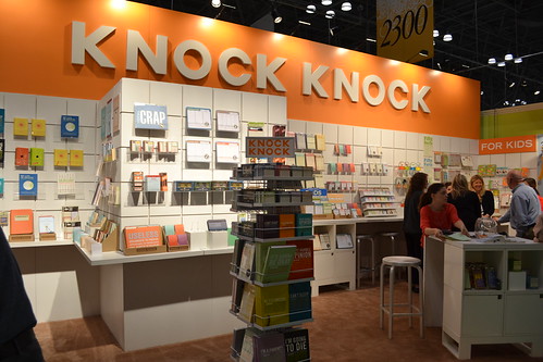
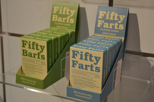
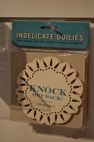
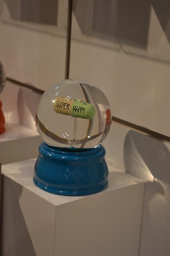
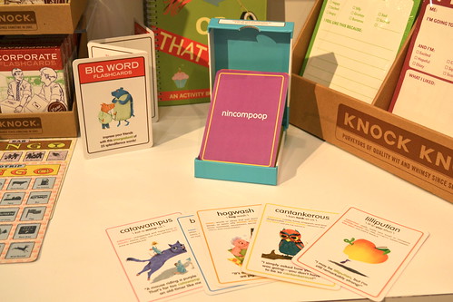
Much like Bob's Your Uncle, Knock Knock has long been my go to place for unique, funny gifts and this year's products proved to be more cheeky and exciting than ever. I loved seeing tons of new products for kids (including the hilarious vocab cards above; catawampus!) and the even sillier ones for adults (there was definitely a 'pills' and 'booze' theme).
main attraction: 'big word' flashcards and bingo cards
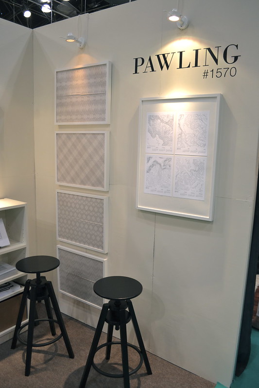
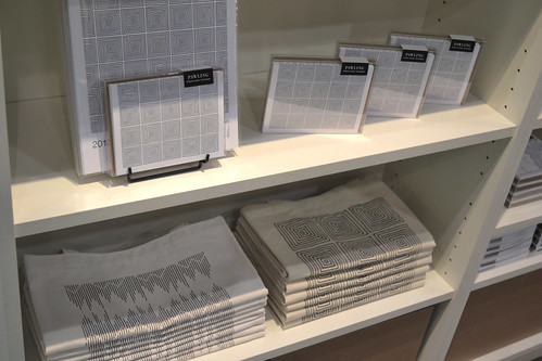
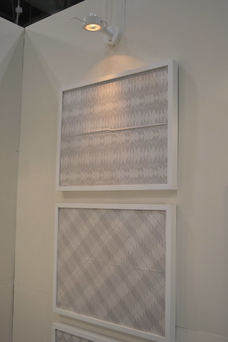
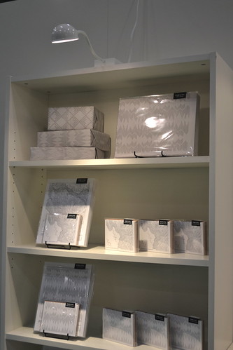
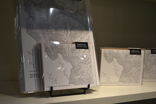
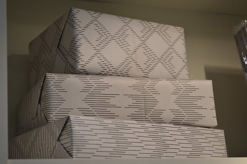
Although Pawling was making its NSS debut this year, I am listing them among the old favorites because I have been toting their wares around for years. And I can happily report that their booth totally delivered on the clean design and quality manufacturing I have come to expect from them. Their black and white palette was subtle and elegant and a nice respite from the otherwise chaotic visual field that is the NSS.
main attraction: everything was beautiful but I am hands down in love with those topographical cards
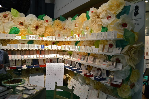
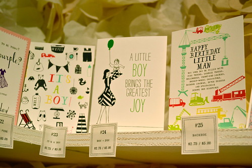
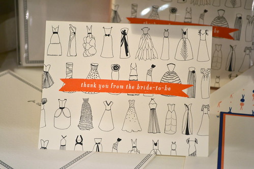
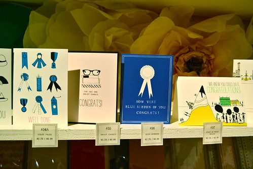
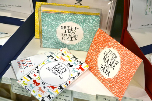
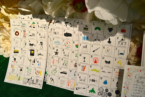
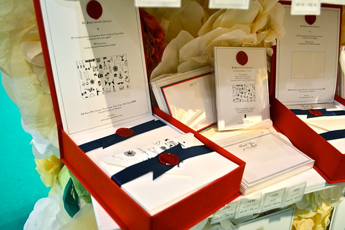
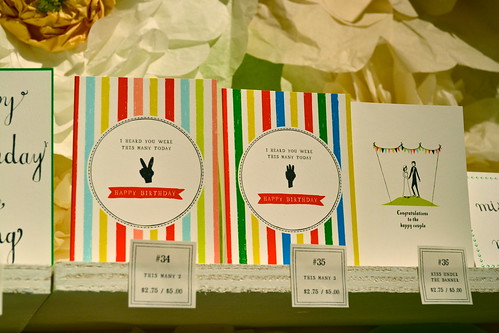
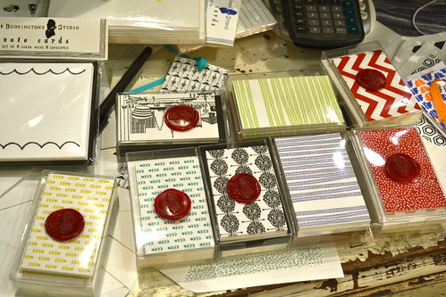
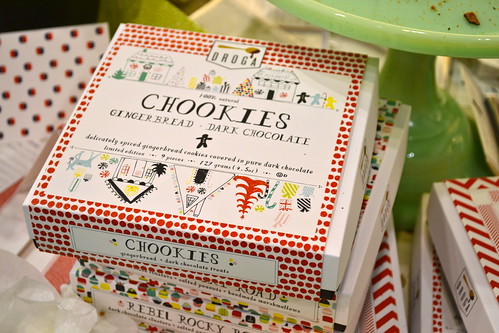
The Mr. Boddington's Studio booth is always a visual feast. I always try to save it for last because I want to spend ages and ages just exploring every little wondrous thing on display. You can tell I was feeling super inspired because I took a million photos and couldn't narrow them down for you. I was quite happy to see them branching out to boxed stationery, gift enclosure cards and even food packaging!
main attraction: very very difficult to decide this, but I will have to go with Boddington's wonderful wedding-related products; they now offer illustrated marriage certificates, table cards and (my personal fav) bridal thank you notes
get more of info on their: website
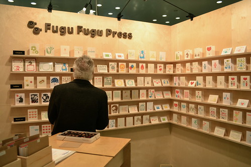
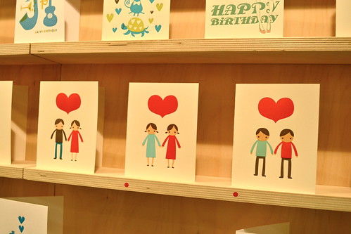
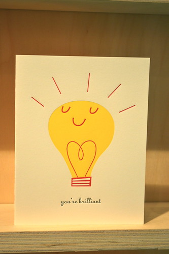
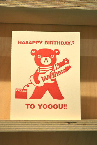
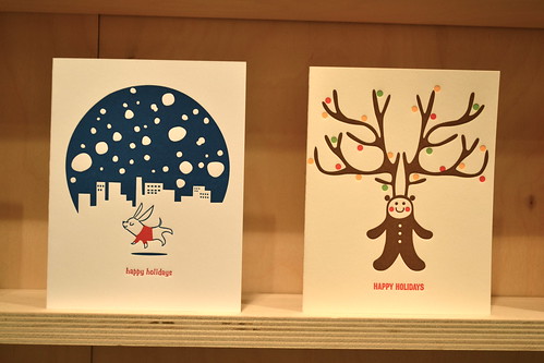
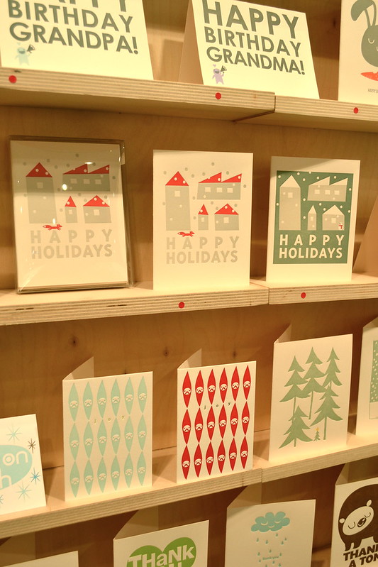
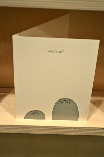
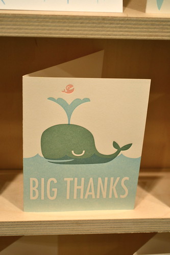
The Fugu Fugu Press booth is always a delight as it manages to deliver simple graphics mixed with a sweet, children's book like sincerity and joy. With this approach almost little to no text is required and characters start to emerge and re-emerge over the course of different cards and different seasons. A recurring favorite has been the teddy bear; I love his rocking red birthday card near the top.
main attraction: a toss up between the gorgeous holiday cards and the unbelievably adorable seal card (what's up?), which can be used for a million different occasions and pretty much guarantees a smile from any recipient
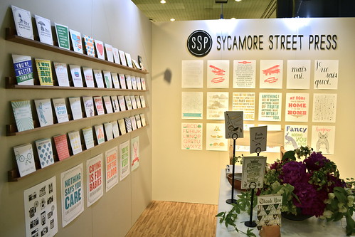
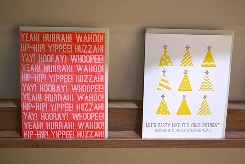
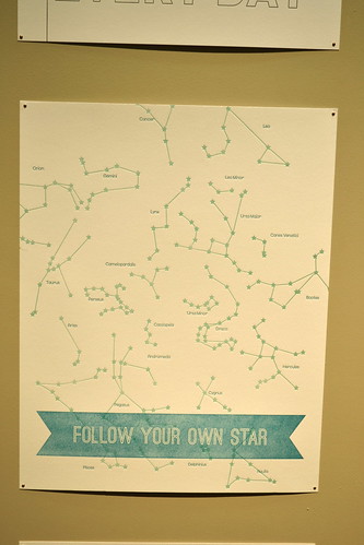
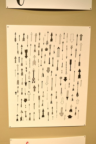
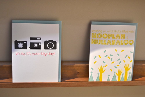
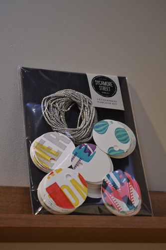
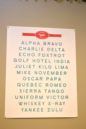
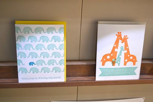
Just like Pawling, I am adding Sycamore Street Press to the 'old favorites' category because they first popped up on the o.i. radar last year. I have previously fallen for their beautiful animal and alphabet prints and at NSS was impressed by the array of other goodies in their booth: colorful cards, gift tags and really lovely poster designs. Paired with great typography and perfect patterns, the Sycamore products were definitely a highlight of the show.
main attraction: the posters, especially the phonetic alphabet and the arrow designs
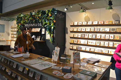
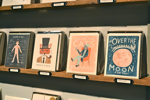

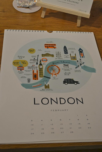
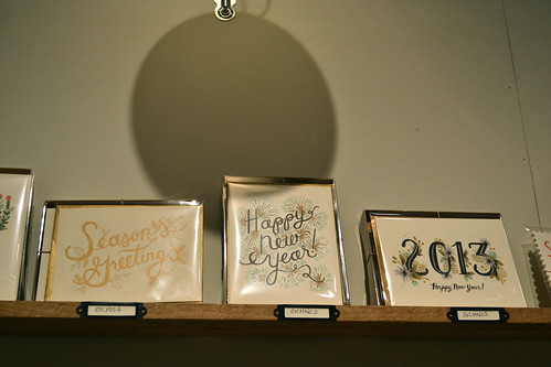
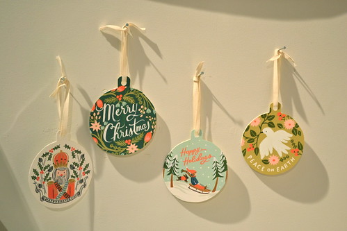
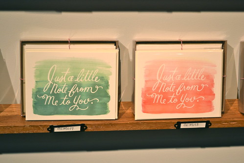
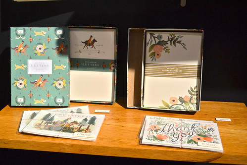
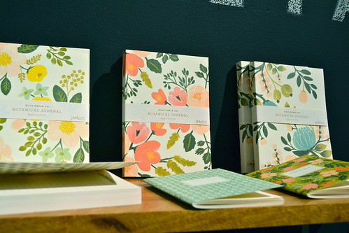
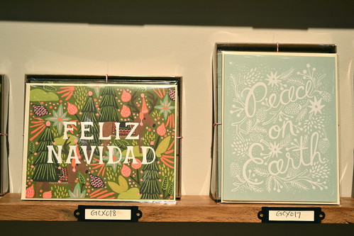
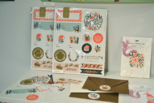
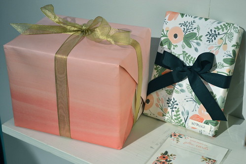
Ahhhh, Rifle Paper Co. An amazing company run by a husband and wife team that has completely taken the stationery world by storm in just a few short years. I have bought dozens of cards from them over the years, even happily dishing some out as gifts. So I was overjoyed to see their impressive array of gift wrap and package toppers, not mention their beautiful holiday cards and new stationery and notebook sets.
main attraction: I absolutely cannot choose (I would take every. single. thing. home if I could), so I will have to say that the portrait buttons they were handing out were my favorite. They even helped me find one that looked just like me!
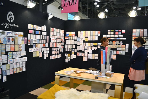
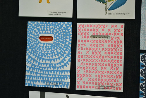
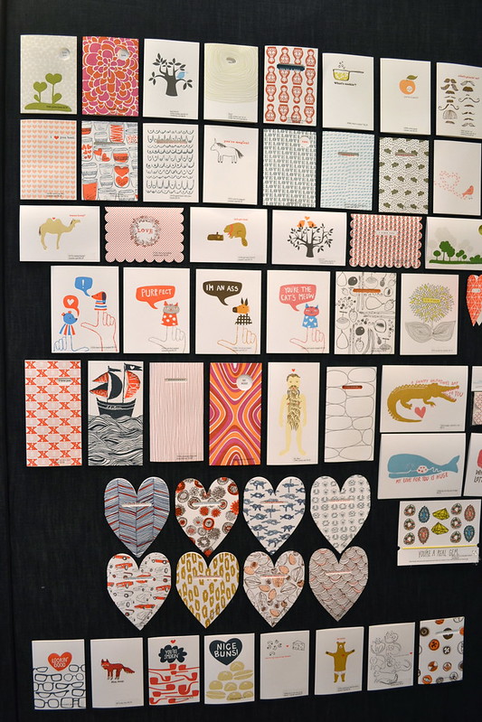
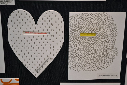
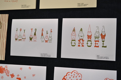
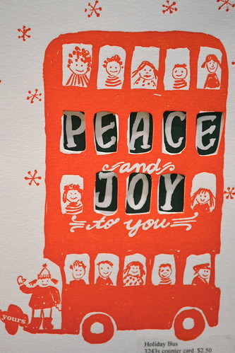
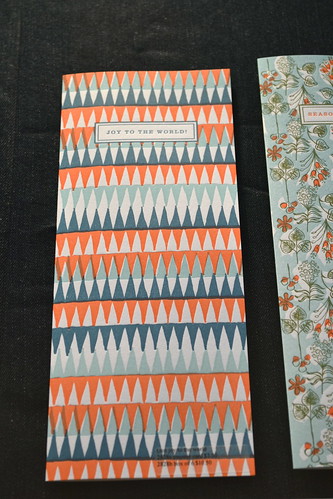
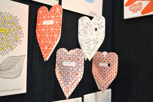

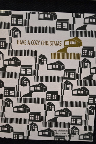
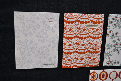
Like Rifle, egg press is so full of eye candy you have to believe that the cards are created by magical design elves to meet our every stationery need and desire. I can't say enough about how much I love their stuff (I think I have bought four of their cards in the last month), but I can say that the booth was filled to the brim with awesome pattern, cool cut out cards and adorable holiday wishes.
main attraction: the 'eat drink and be merry' card and the 'have a cozy christmas' card
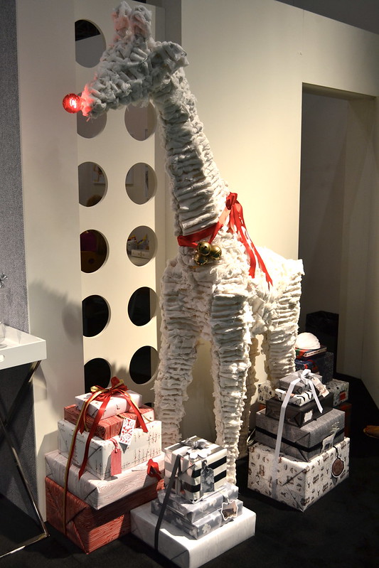
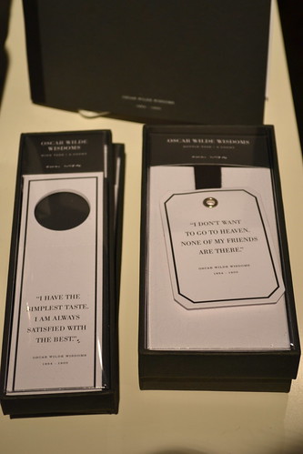
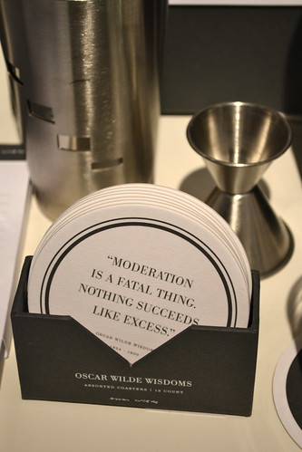
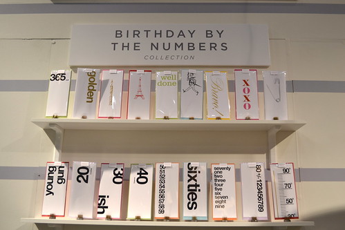
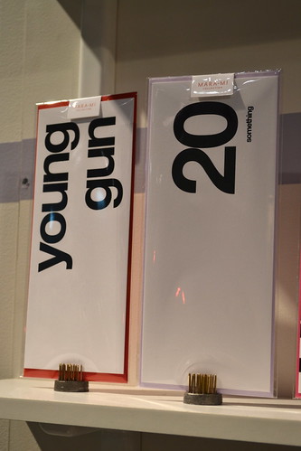
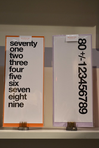
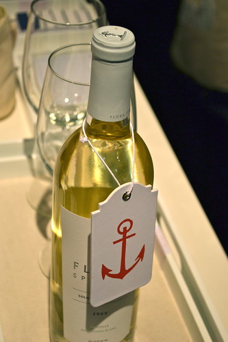

I have stalked the Russell & Hazel booth for some time now, so when I found out they had a sister line called Mara Mi I knew I had to check it out. Not surprising, everything in the booth was understated and classy with a pinch of humor, color and preppiness thrown in. My kind of place! Plus the booth was styled perfectly (parts of it looked ready for a swanky party) and the ladies responsible for it all were super sweet.
main attraction: the Oscar Wilde wisdom coasters and the nautical wine bottle tags
get more of info on their: website
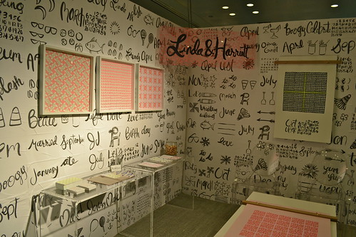
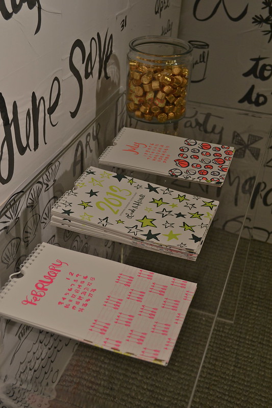
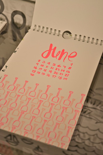
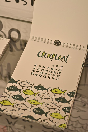
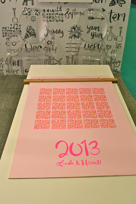
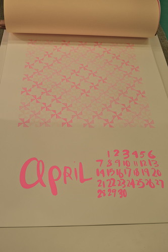
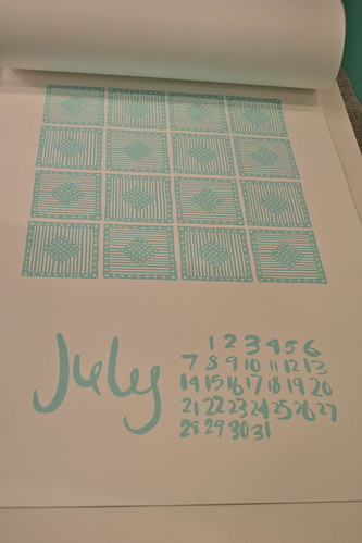
Not much to say about Linda & Harriett except that their booth is always kick ass and their calendars are always right-on-the-money cool. This year they were full of fun, hand-drawn patterns and were created so that you can frame them as illustrations to enjoy for years to come. Brilliant!
main attraction: the 'august' page of the smaller, hanging calendar . . . after all, you will be almost headed back to school come august! (get it? 'school' of fish? terrible pun, I know)
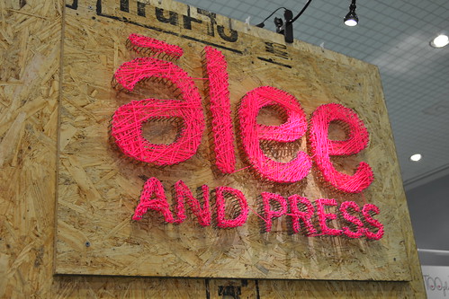
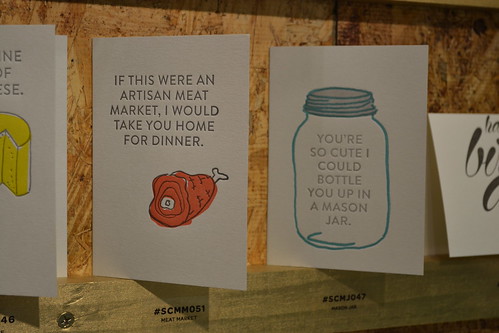
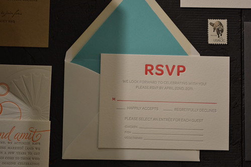
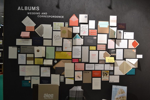

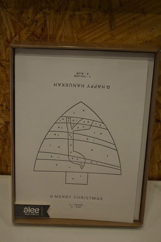
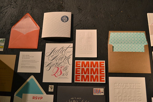
Last but absolutely in no way ever least, I present to you the alee + press booth, a perfect panoply of paper-based pleasure (say that five times fast!). I think I actually embarrassed myself at their booth because I was gushing over every little thing they had up. Simply put, if I designed a stationery line this is what I would want it to look like: a clever combo of color, typography, pattern and personal touches. Oh, and though I haven't written about them on the blog, I have been drooling over their designs on pinterest for ages, so they totally count as an 'old favorite'. :)
main attraction: so difficult to choose, but the most impressive was definitely the double duty christmas and hanukkah card (second photo from the bottom, to the right); flip it one way and it is a christmas tree; flip it the other it is a dreidel!
get more of info on their: website and blog
So that's it for NSS 2012! Hope you enjoyed the wrap ups. If, for some crazy reason, you need to see more NSS craziness you can see past posts here. Back to regular posts tomorrow!
So that's it for NSS 2012! Hope you enjoyed the wrap ups. If, for some crazy reason, you need to see more NSS craziness you can see past posts here. Back to regular posts tomorrow!
No comments :
Post a Comment