
Are you ready for a whirlwind wrap up of NSS? Since I am so behind on my recaps, I thought I would break down the remaining booths into two monster posts. So without further ado, follow me to post number one: new talent . . .
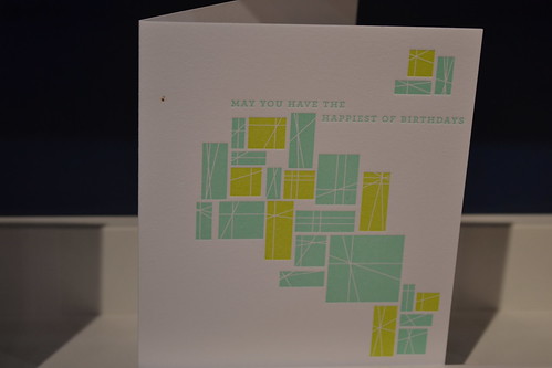
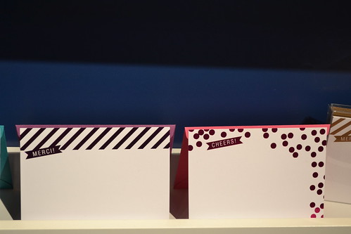
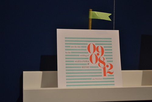
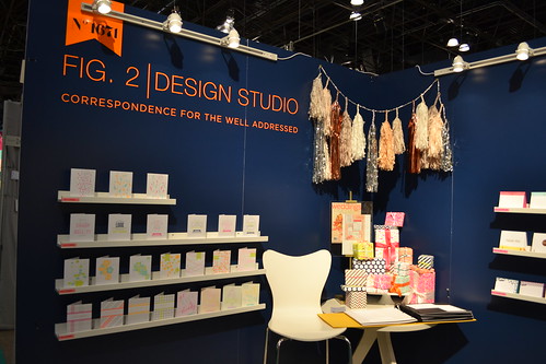
Fig. 2 Design Studio's booth was chock full o' neon, metallic and stripey goodness. Clearly this company is run by stylish folks who know what's hot right now.
main attraction: the line of beautiful wedding invites (see the design immediately above), paired with adorable wash pennant flags
get more info on their: website, shop, and blog

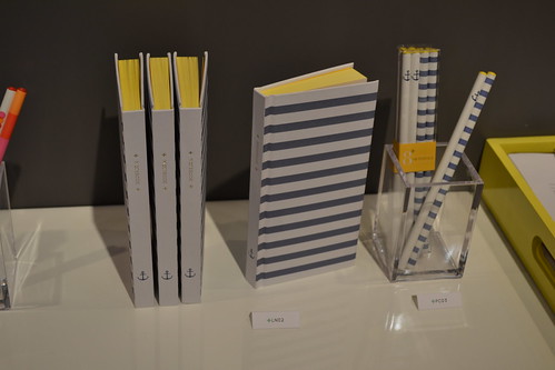
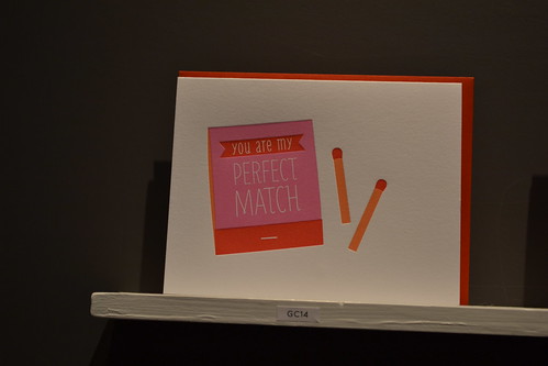
Pei Design was hands-down one of my favorite NSS booths of all time. It was one of those magical places were each and every product was more adorable and enticing than the last. Plus it was manned the adorable owner/designer and her even more adorable husband (he literally told me, 'oh no, I don't know anything, I am just the husband!' ha!).
main attraction: if I had to choose (and it is difficult!), I would say the sweet notebook/pencil sets and the 'perfect match' card.
get more info on their: beautiful website and blog
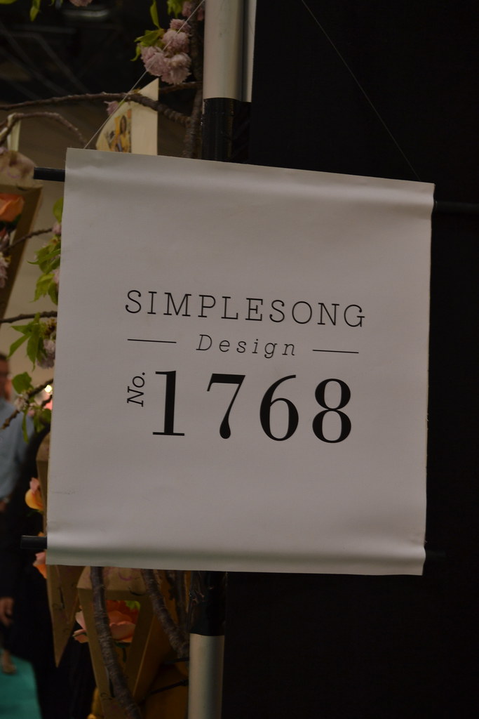
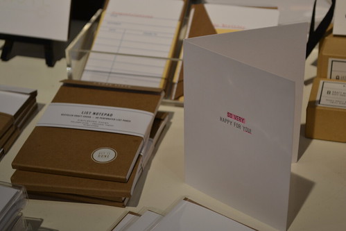
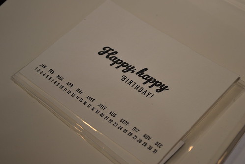
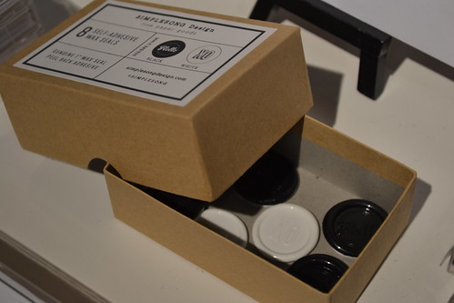
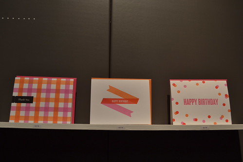
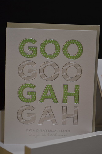
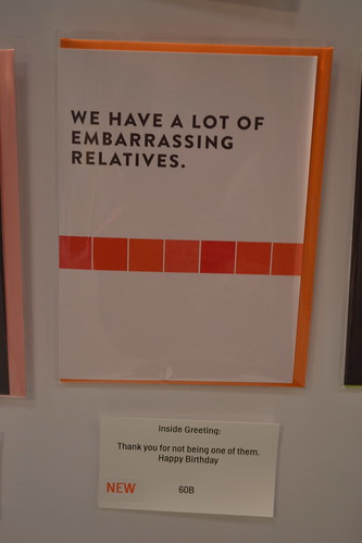
The SIMPLESONG booth was all the buzz and rightfully so. Suann, the brilliant mind behind the blog simplesong, has translated her chic, clean-lined aesthetic to stationery and the result is astounding.
main attraction: the customizable birthday cards and the stick on wax seals (reading 'OX' and 'hello')
get more info on their: website, blog, and brick and mortar store, fifteen eleven, website
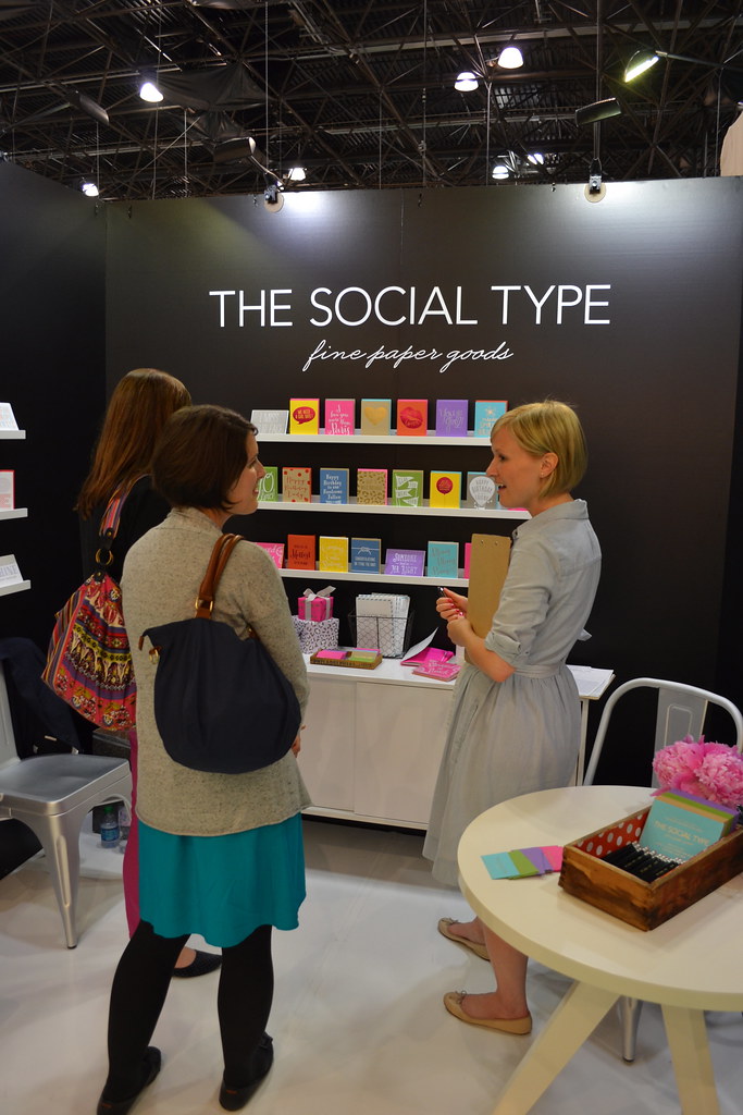
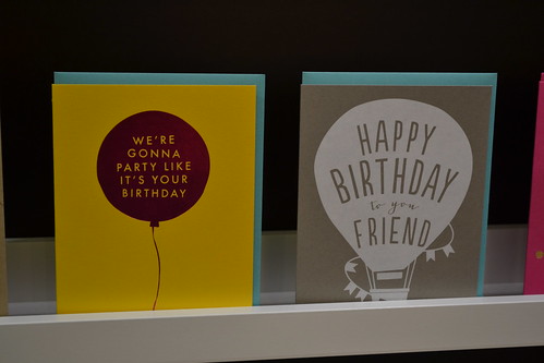
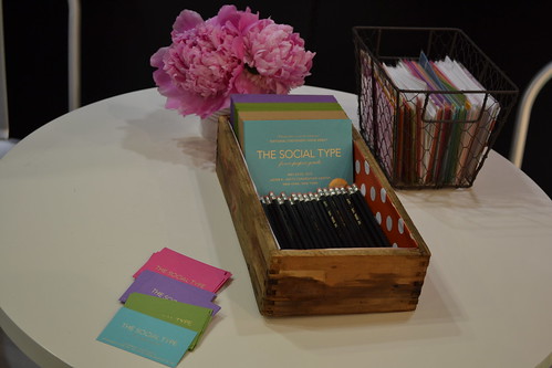

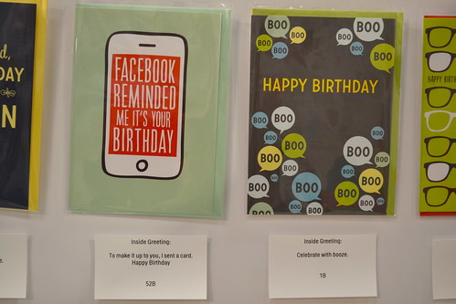
The Social Type booth was pure excitement, full of my favorite things: peonies, nice ladies and lots and lots of bright color. It was their first year showing at NSS but you would never know they weren't total veterans. The booth was styled perfectly (check out those perfect packages!) and all the cards looked awesome.
main attraction: tie between that orange polka wrapping paper and the 'we're gonna party like it's your birthday' card
find out more info on their: website and blog
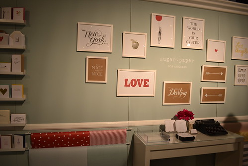
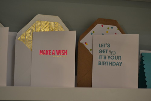
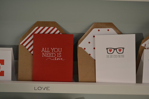
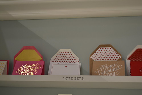
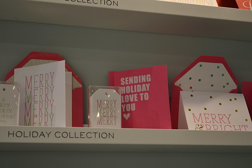
The Sugar Paper booth was another major source of eye candy. Everywhere I turned there was another beautiful card paired with an adorably lined envelope (polka dots! stripes! chevrons! oh my!). I love the fact that they are happy to take color 'risks' like making a holiday card in yellow and black. So cool!
main attraction: the merry merry merry holiday card line and the 'i've got eyes for you' card
find more info on their: (super lovely) website and blog
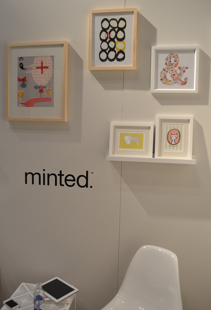
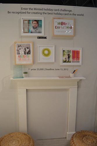
Minted, the creators of my fabulous holiday card last year, was also a popular spot, partially because the booth was adorable (think faux fireplace mantel and photo wall) and partially because they commission/sponsor artwork from a lot of wonderful artists showing in other booths. To top it off, everyone on the Minted team were incredibly friendly and fun to talk to.
main attraction: the new line of art prints (there may be a follow up post about that soon!)
find out more info on their: website and blog
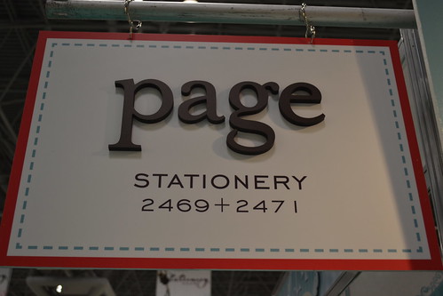
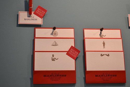
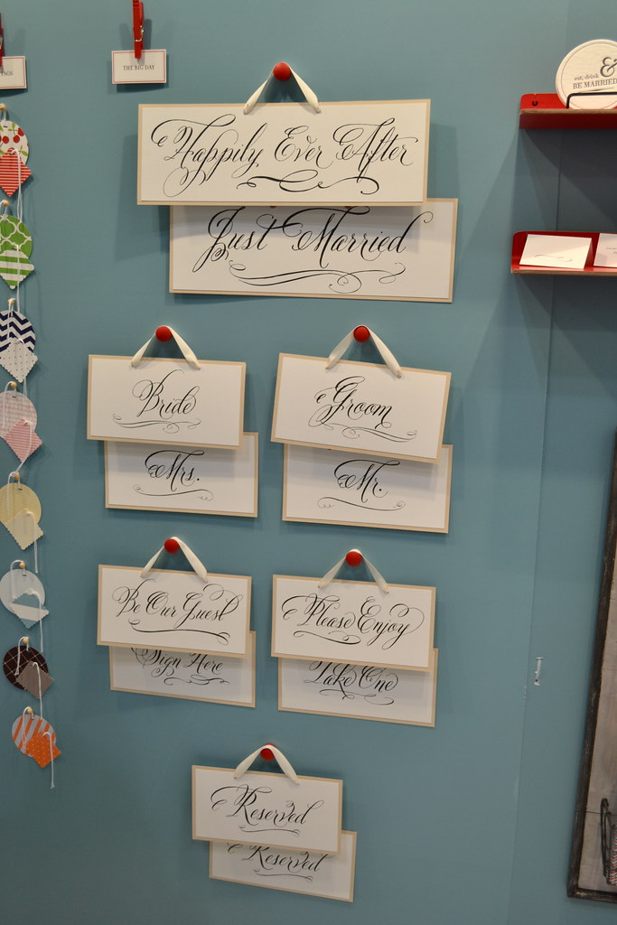
I was only at the Page Stationery booth for a couple minutes, but it was long enough to fall in love with their wedding line (how cool are those calligraphed signs?) and their 'manly' stationery (second photo), a line made especially for men.
main attraction: the 'art of manliness' guy's stationery line
find out more info on their: website and blog
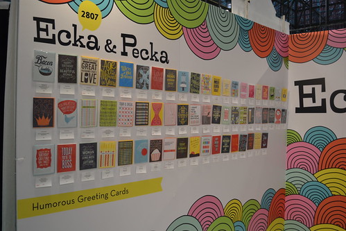
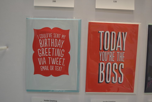
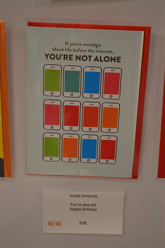
Last, but most certainly not least, I present to you the Ecka & Pecka booth. Full of riotous color and equally riotous card sentiments, it looked like what Dr. Seuss would create if he had been a fabulous stationer.
main attraction: besides the booth design it was hands down the brilliant color palette and the amazing hand-lettered type style
find out more info on their: website
No comments :
Post a Comment