
So I am finally finished with finals. Thank goodness! That means that it is now official . . . drum roll, please . . . I have my Masters degree! Hooray! And I have been accepted to stay on for the PhD program. So I am a PhD candidate! Pretty darn cool.
Anyway, I thought I would share the final result of the paper I was working on (see previous post here) as a way of wrapping up my 'In the Classroom' series until next fall. Sound good? Hope so!
The paper concentrated on the graphic identity programs of the Olympics, specifically studying the 1968 Olympics in Mexico City and the 1984 Olympics in Los Angeles. Today I will tell you about Mexico City; tomorrow I will move on to LA.
Mexico City was facing myriad problems when it was given the bid to host the Games of the XIXth Olympiad. All over the world people were voicing concerns over the safety of hosting the Games at such a height altitude (it turned out to be great for sprinters and terrible for distance events), hosting them in a 'Third World' country, and hosting them with a country stereotyped for its "get it done tomorrow" attitude. Thus, a comprehensive design program was established as a way of presenting the city and the Games as organized, colorful, festive, and exciting. And it worked! Even today, some forty-two years later, the 1968 Olympics are renowned for their impeccable design solutions.
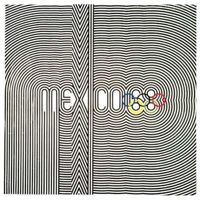
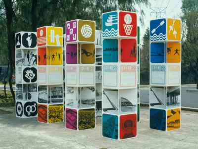
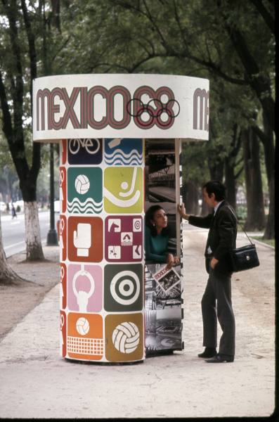
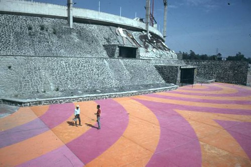
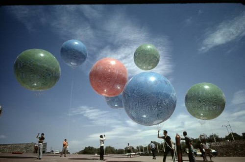
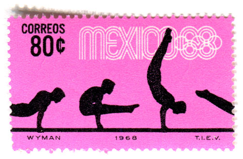
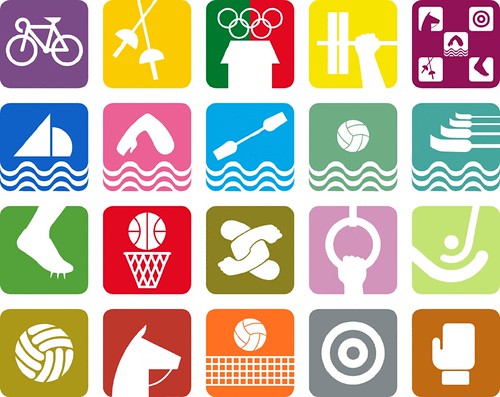
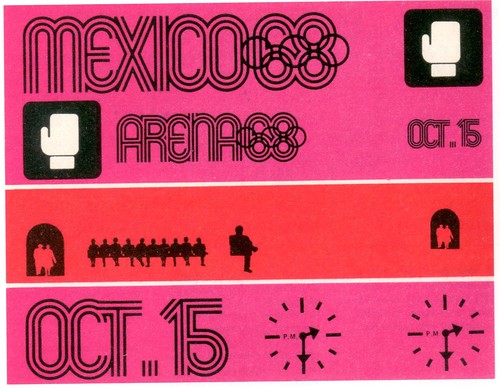
Organized by Pedro Ramirez Vazquez with help from Beatrice Trueblood, Eduardo Terrazas, Lance Wyman, and Peter Murdoch, the design team carefully crafted the "look" of everything from the emblem to the tickets, uniforms to the signage, decorations to the stamps. All material related to the presentation of the Games was exceedingly colorful and simple, giving the visitor the impression that Mexico was a country of great "fiestas". Based on the official emblem (which is comprised of the host site's logo plus the Olympic symbol, as see at the top), the designers developed a graphic, linear typeface; this helped transcend the language barrier by acting as an iconic visual tool rather than a written form of communication. Similarly the tickets, maps, and pictograms were organized under a clear color coding system, allowing visitors from all nations to navigate the city easily and efficiently (without language!) by following Candy Land-like paths of colors. As the first Olympics to broadcast the Games on color television, the chromatic symphony that blanketed the city was spread throughout the world, making an indelible impact on spectators watching from the stadium or the living room.
I could ramble on and on about this truly incredible design program, but I will cut myself off here. If you want to find out more about the project you can read the official report here, read a fabulous article in 'Eye' magazine (complete with interviews!) here, or check out Lance Wyman's beautiful website here. You can also see more images on my Flickr gallery here. If you are still interested after all that, you can drop me an email (linked in the side bar) and I will answer any questions you may have.
(As always, let me know what you think of the project in the comments!)
No comments :
Post a Comment