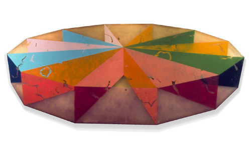
RONALD DAVIS: DODECAGONS

RONALD DAVIS
RONALD DAVIS
RONALD DAVIS
RONALD DAVIS

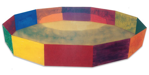
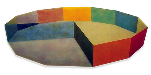
Yesterday in class my professor lectured on '60s California artist Ronald Davis. I first saw Davis' incredible work at MoMA's Color Chart show in 2008 and was super happy to be reminded of him again. All of the above pieces are among,

"Davis's "plastic paintings," which marked a departure from his works on canvas. The artist made these work "the same way one makes a fiberglass boat or car body"—by layering translucent polyester resin, fiberglass, and pigment in a Formica mold. The machine-polished surface recalls the fiberglass surfboards of 1960s Los Angeles, while the painterly brushstrokes and illusion of receding space are traditional pictorial conventions, making Ring an intersection of painting, sculpture, and the manufactured object."

Needless to say I am totally in love with their bright color palette and milky finish. I want one!

Learn more about Davis (and see more of his work) at his website here, at the Tate Modern's site here, and at MoMA's site here.

(Images from here, quote from here.)


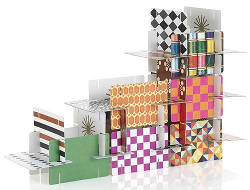
HOUSE OF CARDS

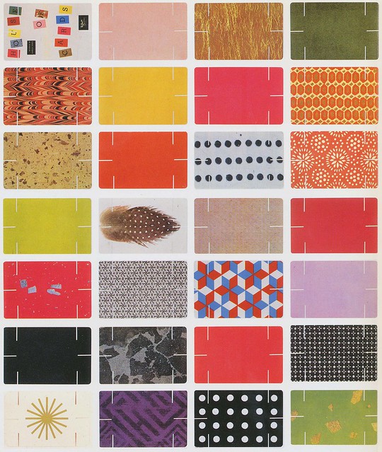
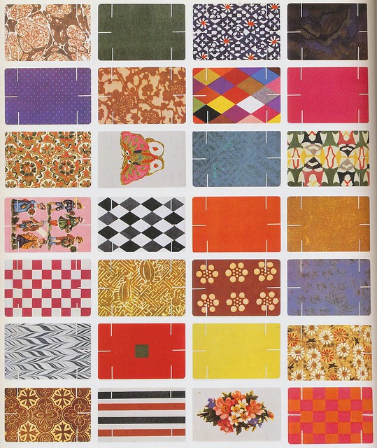
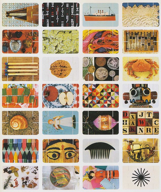
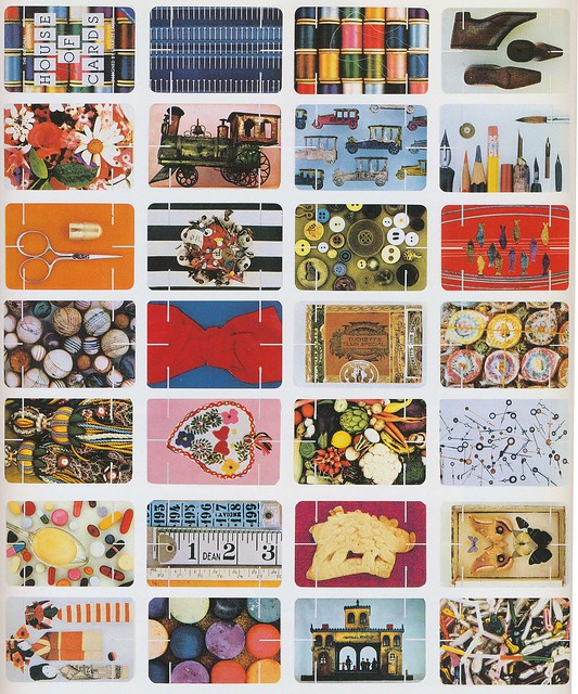
EAMES HOUSE OF CARDS


I have often seen the Eames 'House of Cards' deck in stores and, despite my professed love for all things Eames, have never been tempted to buy it. Until yesterday.

While doing some reading for a class I am taking on art from Los Angeles post 1940, I came across this book on the oeuvre of Charles and Ray Eames, written by John and Marilyn Neuhart in 1989. True, it may be a bit outdated, with most of its reproductions in black and white. But it is incredibly thorough and has several lavishly illustrated pull-outs, including one (you guessed it!) of all the designs in the Eames 'House of Cards'. The sheer tonal and photographic range of these cards--depicting everything from feathers to fishing boats, stripes to chevrons--make it both graphically inspirational and aesthetically exciting. Wouldn't it be cool to have an elaborate house of cards, made from this exquisite deck, on some empty table in your home?

If you think so, you can pick up the cards here and learn more about the Eames' here.


ART INTERVENTION


I have been bookmarking a lot of videos about super cool street art recently. Here are three of my favorites I thought I would share with you. Enjoy!


Some background on the project:

"In 2007, the New York City Transit Authority began installing LED signs on subway platforms that display estimated wait times for arriving trains. Unfortunately the information is little more than trivia: except for a few stations, it is only visible to travelers after they’ve paid their fare, so the data has little bearing on commuter decision-making.
Their primary effect, then, is to erode faith in the system, to create expectations that can’t always be met, to raise false hopes, and to erase the mystery and magic of the wondrous system that transports more than five million riders a day.
These LED signs also threaten historical social behaviors, rendering obsolete the time-honored New York tradition of leaning over the platform edge with the hope of glimpsing headlights from an approaching train.
The Spoiler Alert signs warn waiting riders of this potentially unwanted information – allowing them to avert their eyes so they may preserve their spirit of adventure – while still leaving visible the data for travelers who wish to ruin the surprise for themselves.

Learn more about Jason Eppink (a major player in my favorite group: Improv Everywhere) and his other projects here. Found via the awesome Subway Art Blog.


Some background on the project:
"This summer mural painter Matt W. Moore created a series of live painting performances on walls in MARSEILLE, LYON, and PARIS. Directors Le Groupuscule captured the evolution of each mural, gathering over 700,000 pictures, that were edited as a stop-motion animation to an unreleased track by Monsieur Monsieur to create this music video. This collaboration of 3 artistic disciplines to make walls dance is part of the global initiative : Let's Colour Project."
Learn more about the collaborating artists here (in French) or here. Found via Wooster Collective.


Some background on the project:

"Multipraktik is a multi-disciplinary platform motivated by the pursuit of new practices at the crossover between design, photography, video production, music, events and art. We operate as an evergrowing collective of designers, artists, musicians, producers and programers. We create teams based on projects and with each project we try to challenge conventional approaches. This project was organized cross-slovenian street TapeArt actions with different artists (in particular Fejzo & Luka Ursic) as part of the new campaign for Orto (Simobil)."

Get more information on Multipraktik and the artists here and here (website under construction). Found via Wooster Collective.


WORK IS ALL SUNSHINE AND RAINBOWS

RAINBOW OFFICE
RAINBOW OFFICE

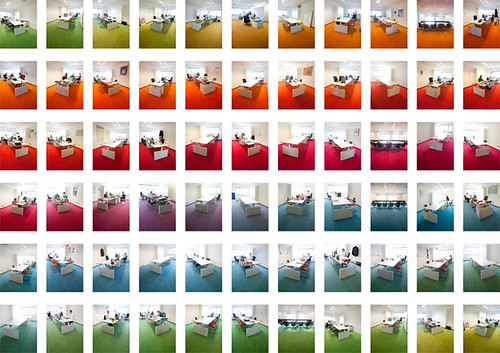
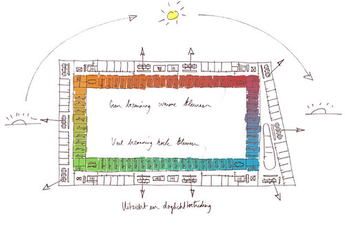
Two weeks ago swissmiss featured this amazing "rainbow office" (the DLA Piper Office) designed by Hofman Dujardin. Each office is a slightly different color—spanning the full color spectrum—to accord with the changing sunlight throughout the day. Genius!


CARTOON NETWORK OFFICE


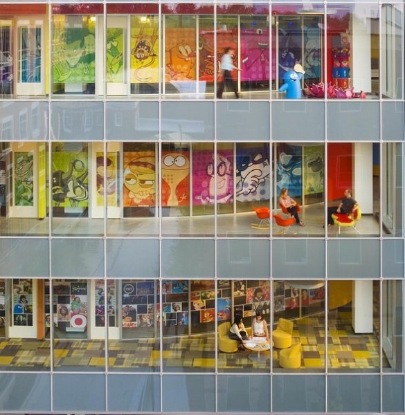
Seeing this bright and beautiful office sent me on the hunt for similarly cheery set-ups. So far, the best match is the Cartoon Network headquarters in Atlanta. You can see more photos (including a greater than life size model of Rosie, the Jetson's maid) on the Flavorwire website here.


RAINBOW KEYBOARD

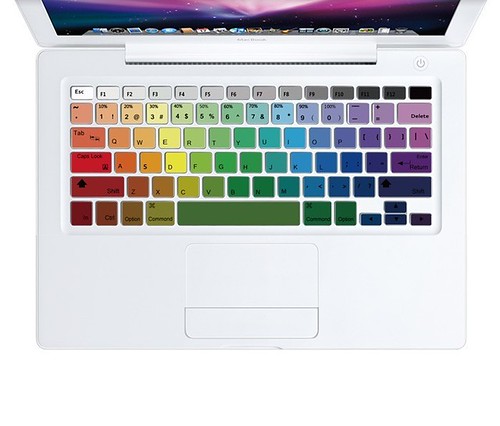
Maybe their employees use this rainbow keyboard skin? You can buy your own (so tempting, but I think it looks better against a white MacBook than my silver MacBook Pro) at the amazing Etsy store topdecal for $14.99.

Now all we need is a real rainbow at the end of this rainy day . . .


SESAME STREET REMAKES


Sesame Street has hit the news recently, unfortunately for a bit of scandal. When pop singer Katy Perry visited recently to do a musical remake of her song "Hot N Cold" with Elmo, apparently parents were dismayed by her racy outfit. No matter the scandal, Flavorwire has seized the moment to remind its readers about all of the truly clever and well-made videos on Sesame Street over the years—most notably their cheeky remakes of popular adult shows like True Blood (made into 'True Mud') and Wheel of Fortune (turned into 'Squeel of Fortune'). I have picked out three of my favorites . . . hope you like them!


'30 Rock' becomes '30 Rocks'
"As in 30 Rock, “30 Rocks” stars Lemon — here an actual lemon — saving the day by verifying the studio’s order for, you guessed it, 30 rocks."*


'Desperate Housewives' becomes 'Desperate Houseplants'

"This one — “the story of some house plants who were not getting what they needed” — might be the raciest of the bunch. It stars two dried up houseplants hoping to be noticed by a suave gardener."* Talk about satire!


"Law and Order: Special Victims Unit" becomes "Law and Order: Special Letters Unit"

"'Law and Order: SLU' follows a group of detectives who track down missing letters. In this episode, detectives seem to be confused about the difference between things that start with the letter M and the letter itself. As is to be expected, there are plenty of “chung chung” sound effects."*

See more videos on the Flavorwire website here.
(*All quotes taken from Flavorwire.)


ZIP IT

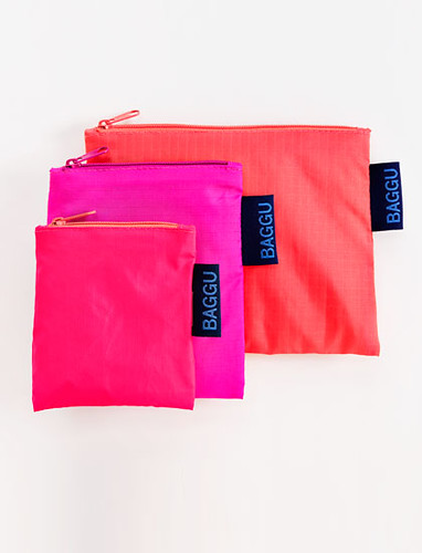
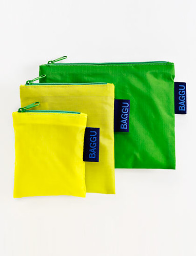
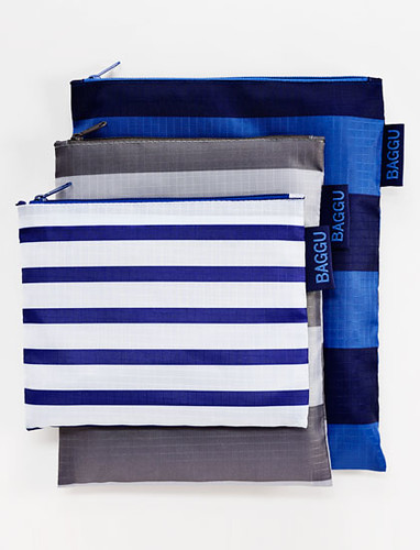
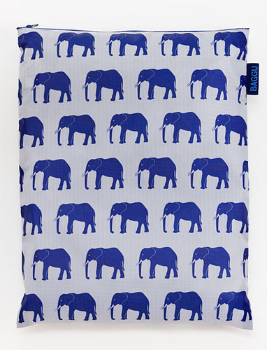
BAGGU ZIP BAGSBAGGU ZIP BAGS


After discovering the amazing reusable bag company—Baggu—this spring, I have toted a Baggu bag with me everywhere I go. Their products fold up into small convenient cases and can be easily stashed in your bag on the go. So, imagine my excitement, when I got an email announcing their new products: zippered pouches! I can imagine these would be even more useful, holding my countless daily necessities: cell phone, ipod, pens, sticky notes, etc. As usual, I love the colors and patterns on offer, especially that pink set!

Get your own set of zip bags, priced from $7 - $12, at the Baggu site here.


JUST MY TYPE

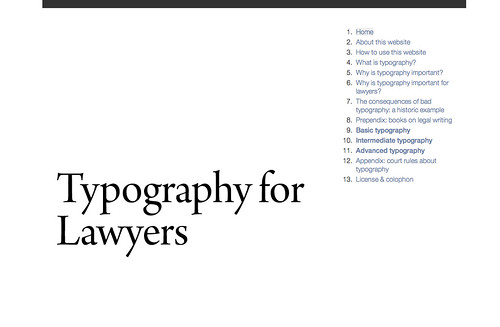
TYPOGRAPHY FOR LAWYERS
I think it is clear that I am a geek for typography. Just look at
these posts. But recently, upon discovering the amazing website 'Typography for Lawyers', I realized I don't know quite as much about typography (and its proper usage) as I think. For instance, did you know that the two-space rule after the period is a hold over from the typewriter era? Or the difference between an n-dash and an m-dash . . . and why they are called that?
While the website is directed to lawyers, it's guidance can really be helpful to pretty much any professional.

Check out the goodness here.


WHAT TYPE ARE YOU?

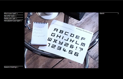
Along the same vein, I thought I would point you in the direction of Pentagram quiz: What Type Are You? By answering a few short questions—all posed by a mysterious, European, psychologist-like figure—the site will help you determine what typeface best suits your personality. It turns out I don't actually like the look of my typeface that much—Architype Van Doesburg—but I do completely agree with the explanation aligning its characteristics with my beliefs and views.

Try it for yourself here.
(And thanks for reminding me about it Caitlin!)